Rubrication Design Examples
A gallery of typographic and graphics design examples of rubrication, a classic pattern of using red versus black for emphasis.
Dating back to medieval manuscripts, text has often been highlighted using a particular distinct bright red. The contrast of black and red on a white background is highly visible and striking, and this has been reused many times, in a way which I have not noticed for other colors. I call these uses rubrication and collate examples I have noticed from many time periods. This design pattern does not seem to have a widely-accepted name or be commonly discussed, so I propose extending the term “rubrication” to all instances of this pattern, not merely religious texts.
Why this rubrication design pattern? Why red, specifically, and not, say, orange or purple? Is it just a historical accident? Cross-cultural research suggests that for humans, red may be intrinsically more noticeable & has a higher contrast with black, explaining its perennial appeal as a design pattern.
Regardless, it is a beautiful design pattern which has been used in many interesting ways over the millennia, and perhaps may inspire the reader.
Red is among the most arresting and classiest of colors, as a glance through fine book editions reveals. What is snazzier than a good dropcap which has been “rubricated” (sometimes called “printer’s red”)? And yes, rubrication is usually red—hardly ever orange, or green, or purple, or any of the other possible choices.
Rubrication is not merely coloring everything red, but a careful use of some red against mostly black in order to emphasize important elements. Western rubrication goes back to ancient Greece & Rome, including official documents like the fasti calendar. We have red letter days for holidays, Christians will subconsciously associate red text with the words of Jesus Christ in typesetting the New Testament (critical annotations in red being an ancient tradition), many personal Book of Hours, some editions of the Qur’an put Arabic diacritics in red; maps or charts may highlight key destinations in red while every other location is printed in black; losses in finance are traditionally printed in red; emphasis in business typewriting were done with red ink if available; and corrections to written material are traditionally in red ink.
Further, I noticed that these all seem to use not just red, but almost the same shade of red: a certain bright but medium red, never another shade like a pink or a deep scarlet. That might be an artifact of traditionally using iron gall ink (eventually upgrading to “minium” lead pigments) and then everyone imitating it, but once I began paying attention to red/black combinations, like the famous “law of fives”, I began noticing it everywhere—as Bringhurst remarks, red is “the typographer’s habitual second color”.1 Indeed, the use of red seems to have become quite common on the Internet these days. (One place I haven’t seen rubrication used well is in predominantly black settings, such as the increasingly popular “dark mode”.2)
Why Red?
This [red bicycle] is three times faster than the usual bicycle!
I could imagine that being true in medieval times when rubrication started (iron gall-based rust/oxide pigments are surely extremely cheap compared to many things), but that seems like it should have stopped being a problem at least by the 1800s when synthetic dyes & inks were invented. It also wouldn’t explain the prestige of vermilion not merely as a red in general, but as a vermilion ink reserved for imperial use in calligraphy & documents in both the Byzantine & Chinese empires.
Edward Tufte, who highlights many examples like Florence Nightingale in his data visualization books and is a skillful user of rubrication himself3, notes in Envisioning Information 199036ya (chapter 5, “Color and Information”, pg83–86), apropos of Byrne’s unique color-diagram book interpretation of Euclid’s Elements4:
Byrne’s colors keep in mind the knowledge to be communicated, color for information. Use of the primary colors and black provides maximum differentiation (no four colors differ more).5 This yellow, broken with orange, is darkened in value, sharpening the definition of its edge against white paper; and the blue is relatively light (on a value scale of blues), reinforcing its distance from black. In the diagrams, the least-used color is black, and it is carefully avoided for large, solid elements—adding to the overall coherence of the proofs by muting unnecessary contrasts.6
One possible answer comes from anthropology, investigating cross-cultural perceptions of colors. Berlin & Kay found, as summarized by Wikipedia7:
…in languages with fewer than the maximum eleven color categories, the colors followed a specific evolutionary pattern. This pattern is as follows:
All languages contain terms for black and white.
If a language contains 3 terms, then it contains a term for red.
If a language contains 4 terms, then it contains a term for either green or yellow (but not both).
If a language contains 5 terms, then it contains terms for both green and yellow.
If a language contains 6 terms, then it contains a term for blue.
If a language contains 7 terms, then it contains a term for brown.
If a language contains 8 or more terms, then it contains terms for purple, pink, orange or gray.
In addition to following this evolutionary pattern absolutely, each of the languages studied also selected virtually identical focal hues for each color category present. For example, the term for “red” in each of the languages corresponded to roughly the same shade in the Munsell color system. Consequently, they posited that the cognition, or perception, of each color category is also universal.4
Are there deep evolutionary reasons for red being so important to human color vision, perhaps because red is overrepresented in nature in important things like blood or berries (Humphrey 1976)?8 I have to wonder why a color like green is not more psychologically important, though, as green is surely even more common than berries (which often aren’t red)—thanks to the inefficiency of chlorophyll in absorbing those particular wavelengths of visible light from our sun9—and human eyes are in fact physically most sensitive to green light in night vision. Why aren’t humans most attuned to green, the better to navigate jungles etc.? (Is Rayleigh scattering involved somehow?) So this is a little puzzling.
Examples
Many years ago—but not that many!—one of our printing & typesetting instructors said with great gravitas that “there are only two colors: red and black.”
MyFonts, 2020-03-8
Below is a gallery of rubrication typographic or diagrammatic examples, which I’ve selected for their appearance or subject; they sorted in reverse chronological order, from roughly post-WWII, post-Renaissance, and Renaissance/medieval.
to hide apparatus like the links, you can use reader-mode ().
Contemporary
“Red has to be in every poster.”
Stedelijk poster principles #2, Willem Sandberg (cf. Isotype)
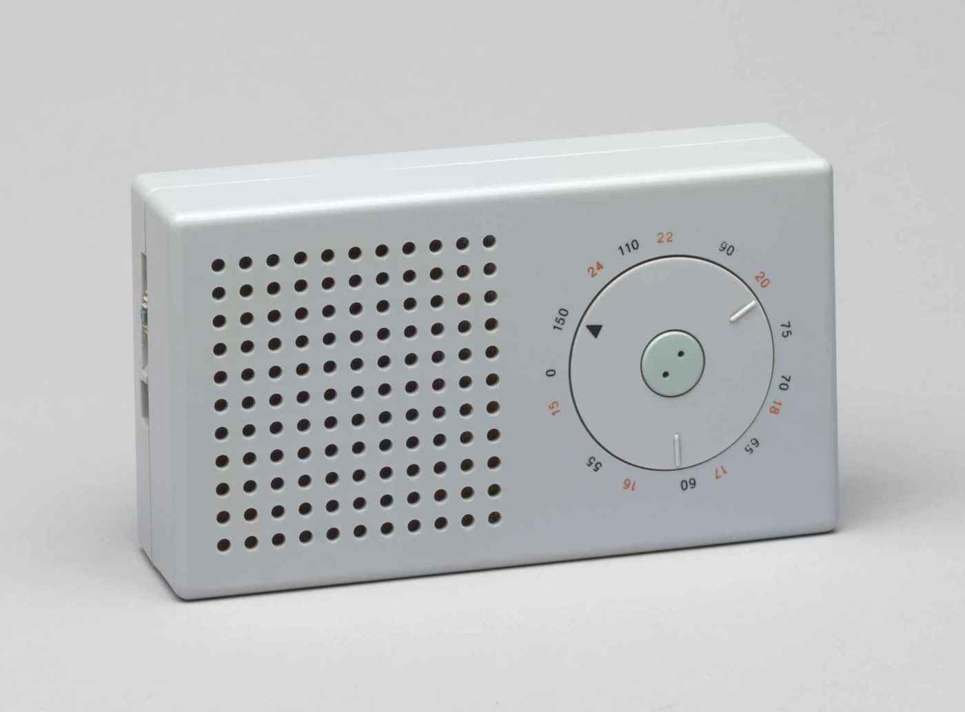
The iconic Braun T3 pocket transistor radio, designed by Dieter Rams (195868ya; MoMA photo); though somewhat faded, the red (one of only 3 colors on the device) numerals still clearly denote longwave radio frequencies (black for medium wave length). It strikingly resembles the Apple iPod, which, however, is all-white.10
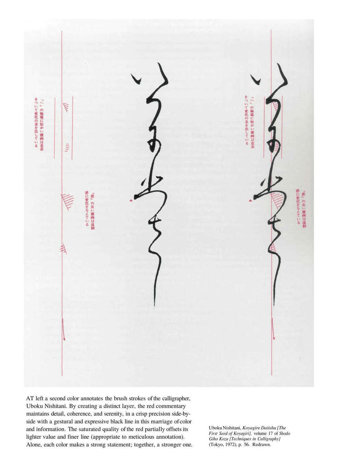
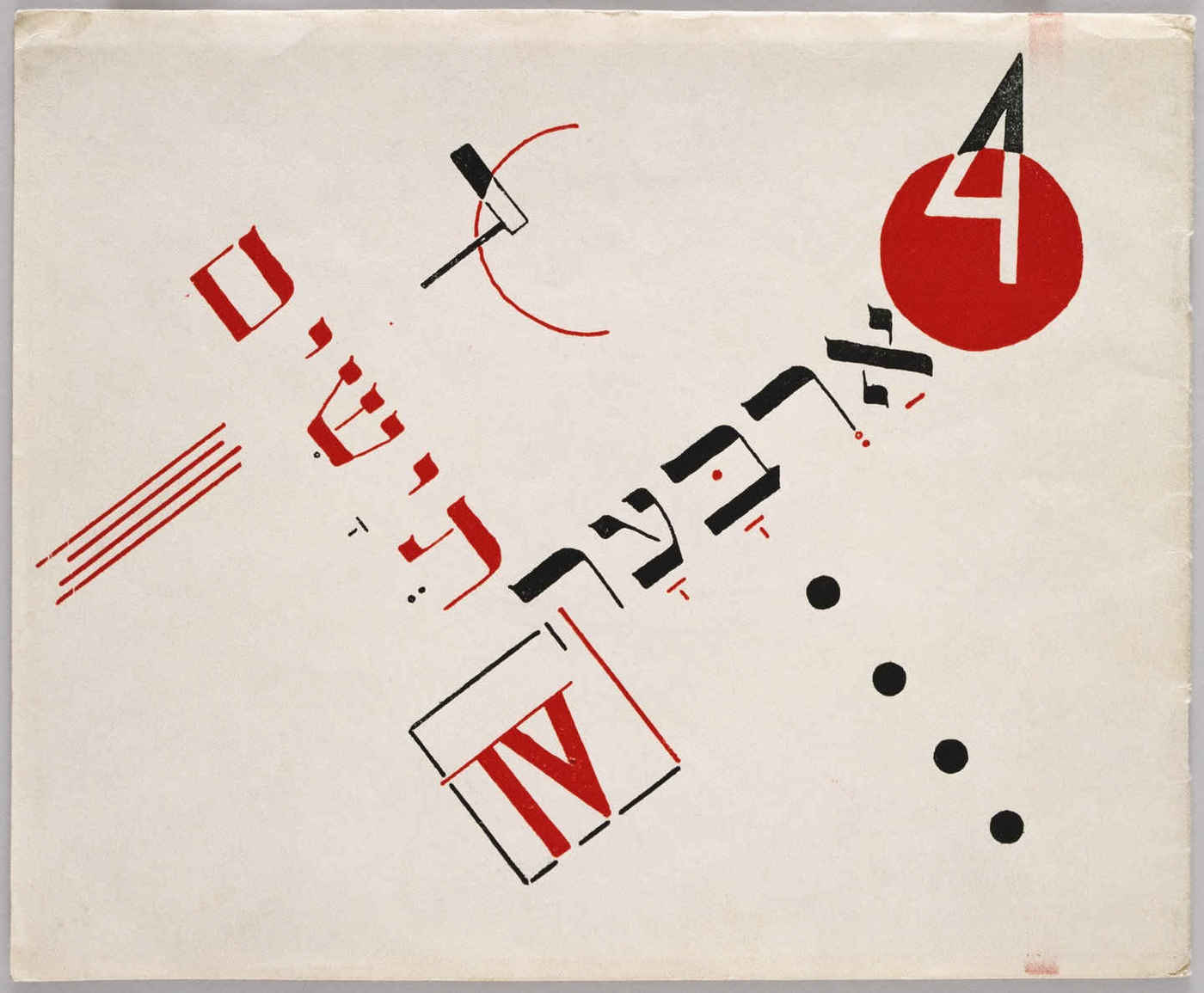
Japanese calligraphy with rubrication commentary, Uboku Nishitani 197254ya (“The First Seed of Koyagiri”, v17 Techniques in Calligraphy); from pg54 of chapter 3, “Layering and Separation” of Envisioning Information, Tufte 1990
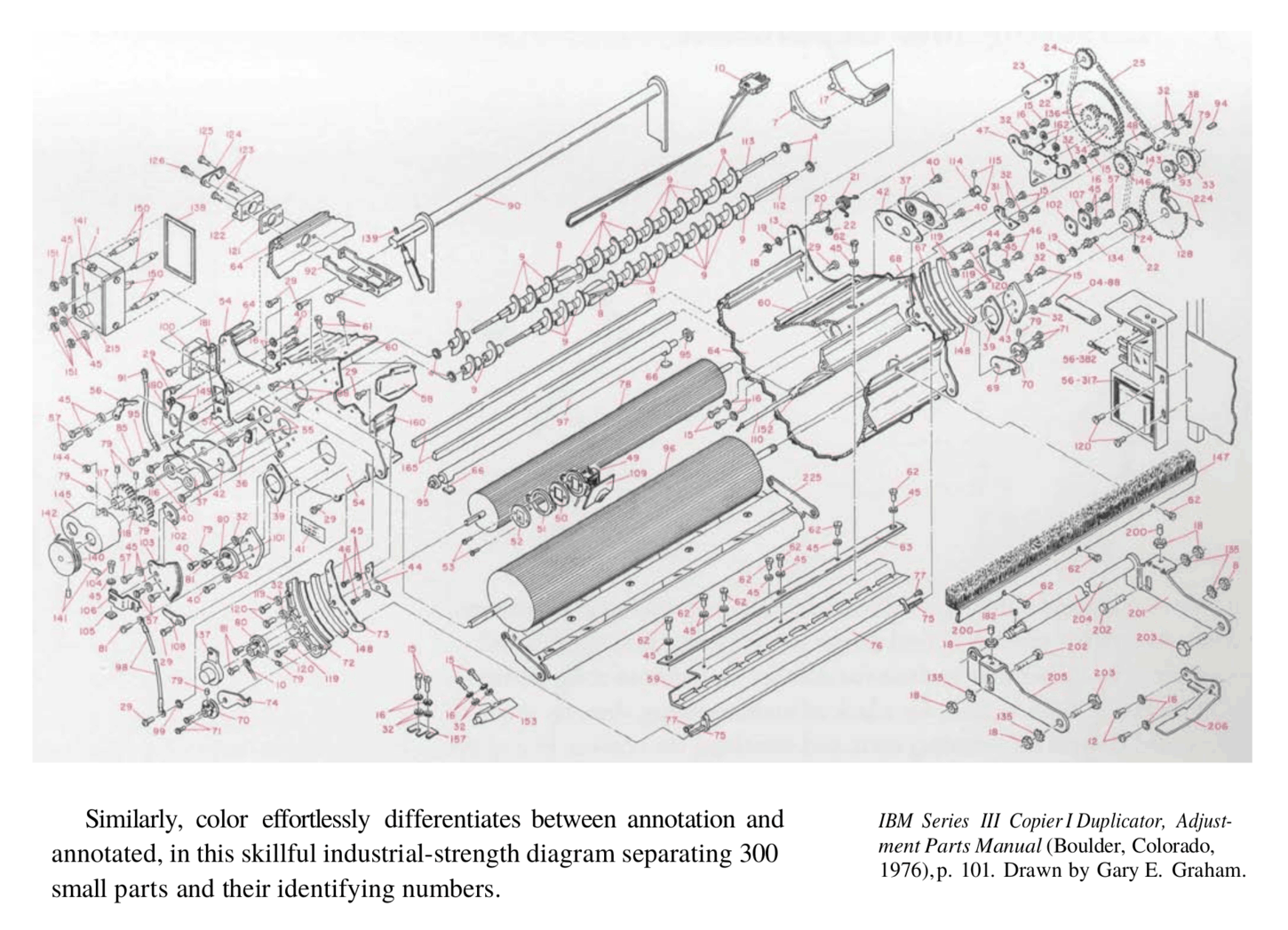
IBM parts diagram from a 197650ya manual for photocopiers; pg52–53 of chapter 3, “Layering and Separation” of Envisioning Information, Tufte 199036ya; rubrication links hundreds of parts to their IDs

Cover of the 197749ya science-fiction tabletop RPG Traveller, first edition/classic (commentary on design & writing)
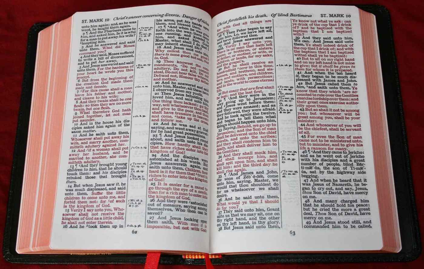
Photograph of a Cambridge KJV Concord Reference Bible (199927ya?), showing ‘red letter verses’; by Randy A. Brown, 2011
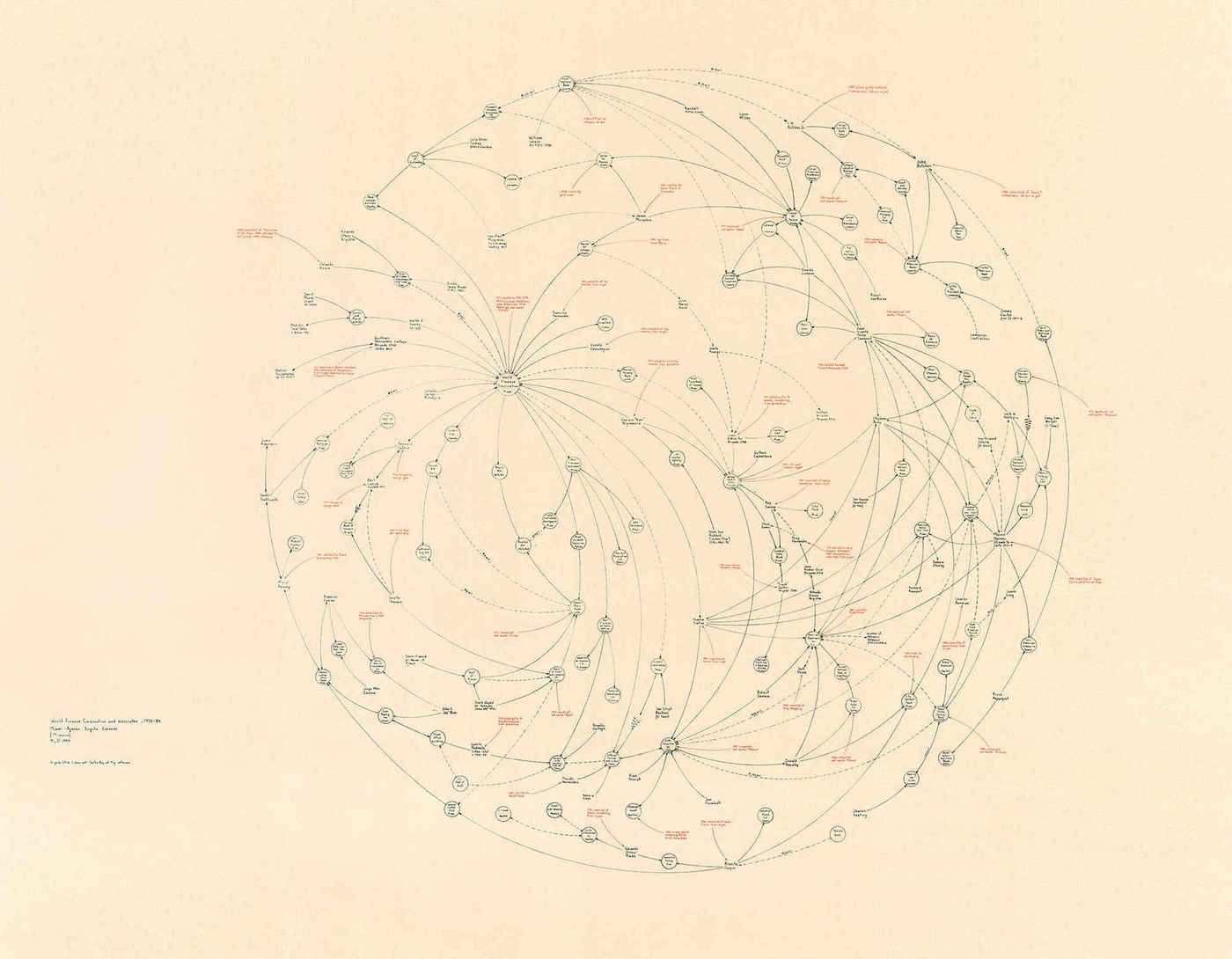
Data-visualization artist Mark Lombardi often used red to highlight key details of the conspiracies he documented, such as the Miami drug-smuggling ring World Finance Corporation11
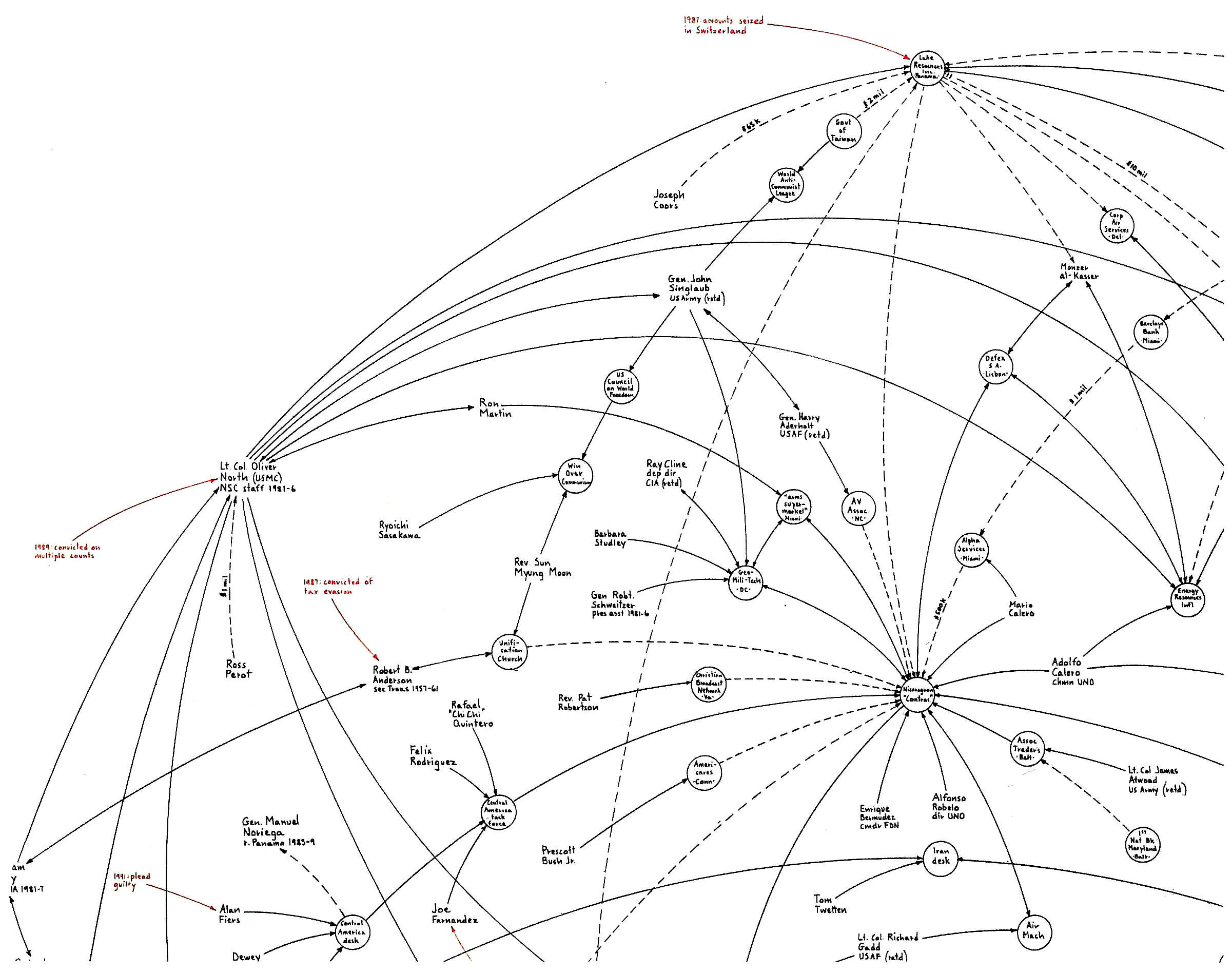
Mark Lombardi, close up of section of “Oliver North, Lake Resources of Panama, and the Iran-Contra Operation, ca. 1984–86”, fourth version (zoom to see red highlights)
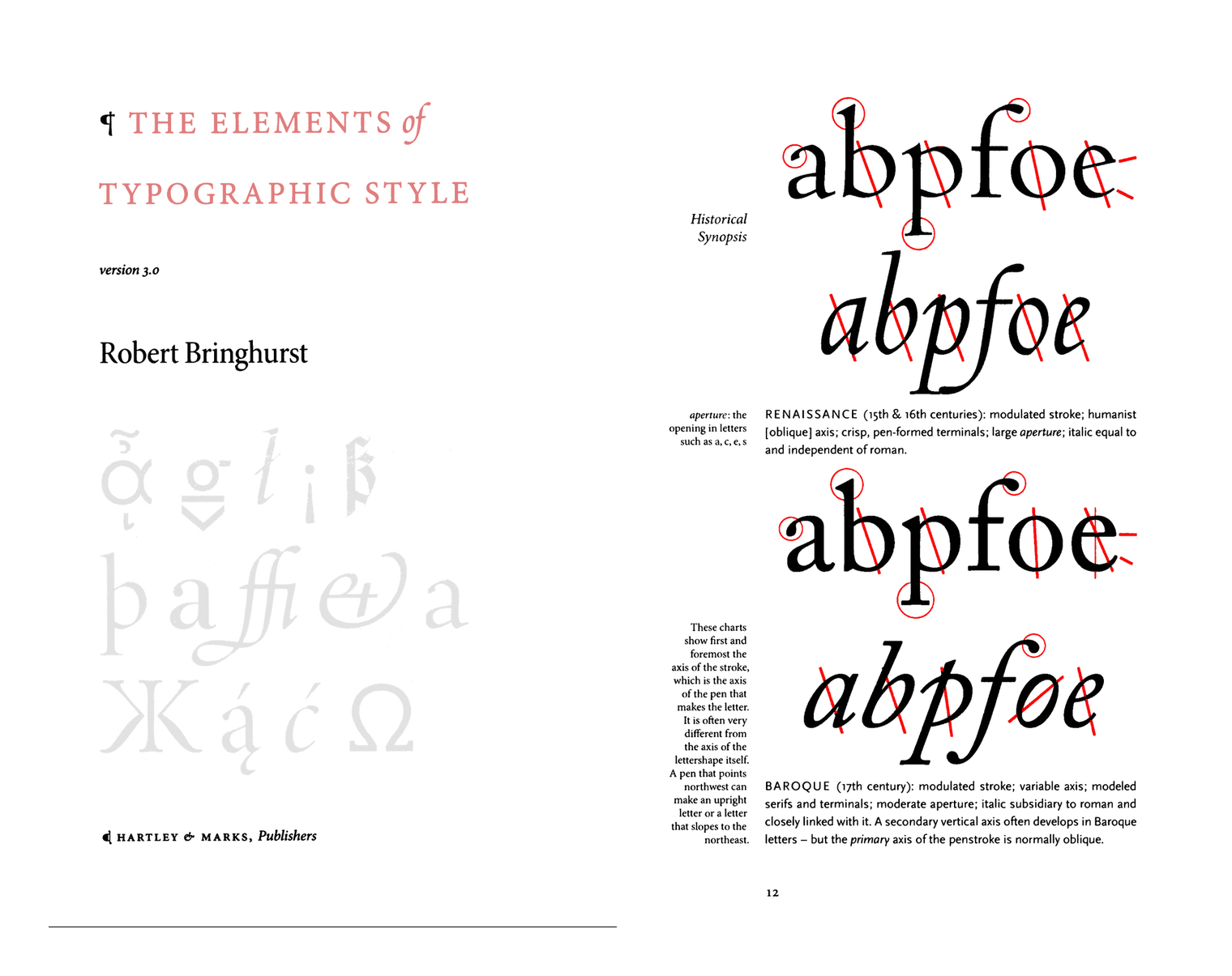
Bringhurst 200422ya (The Elements of Typographic Style) uses primarily grayscale but—true to his comments on red—turns to it for the occasional inside-cover text or for diagrams of letters (starting pg12).
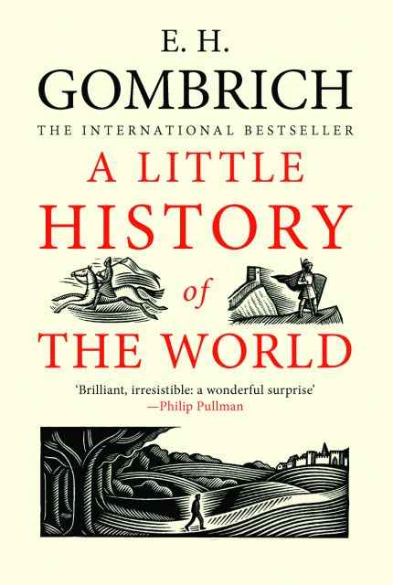
Cover, A Little History of the World, Ernst Gombrich 200521ya (English publication)
![German design studio Catalogtree’s “VINEC 001-009” project: “March 200521ya—A series of nine screen-printed posters commenting on the growth of Arnhem and nearby Nijmegen. The series focuses on the A325 highway which connects the two cities. … A325-005 [#6 out of 9 posters]: All accidents on A325—location, speed, time of day and day of week—between December 16, 199828ya and January 1, 200323ya.” Like the IBM photocopier diagram, this uses rubricated lines to call out details on a schematic, but the rubrication is deliberately overdone, blotting out the original road in favor of painting a bloody spine out of the implied injuries/mortalities.](/doc/design/typography/rubrication/2005-03-catalogtree-vinec-poster-06.jpg)
German design studio Catalogtree’s “VINEC 001-009” project: “March 200521ya—A series of nine screen-printed posters commenting on the growth of Arnhem and nearby Nijmegen. The series focuses on the A325 highway which connects the two cities. … A325-005 [#6 out of 9 posters]: All accidents on A325—location, speed, time of day and day of week—between December 16, 199828ya and January 1, 200323ya.” Like the IBM photocopier diagram, this uses rubricated lines to call out details on a schematic, but the rubrication is deliberately overdone, blotting out the original road in favor of painting a bloody spine out of the implied injuries/mortalities.
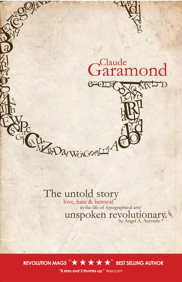
Angela Acevedo, 200719ya school assignment: mock book cover about Claude Garamond
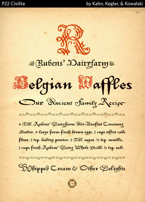
Specimen by Joe Newton for P22’s Civilite (full specimen) historic font revival of Dutch versions of Granjon’s “Civilité”
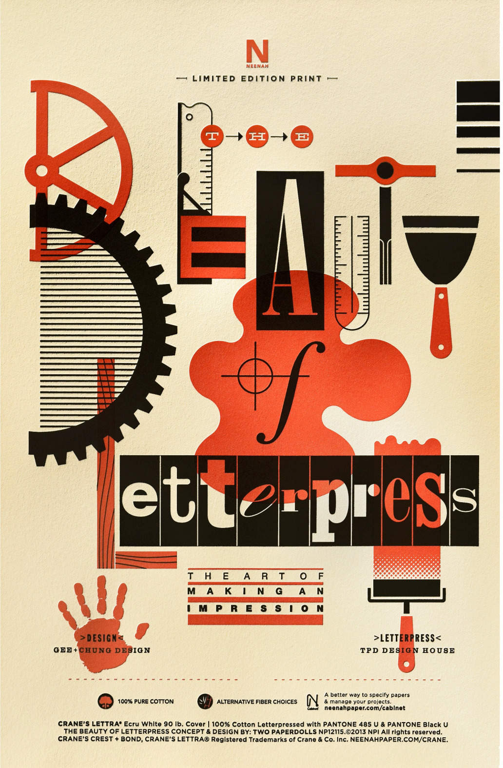
Edition #13 of “The Beauty of Letterpress: The Art of Making an Impression”, Earl Gee 200620ya (background; image via Type Worship)
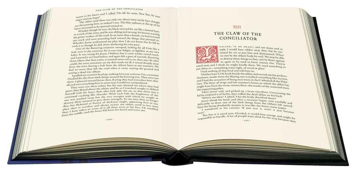
Rubricated dropcap (custom variant by Sam Weber likely based on Petit Fleur) on pg101, chapter 13 of The Claw of the Conciliator, Gene Wolfe, 2019 Folio Society limited edition
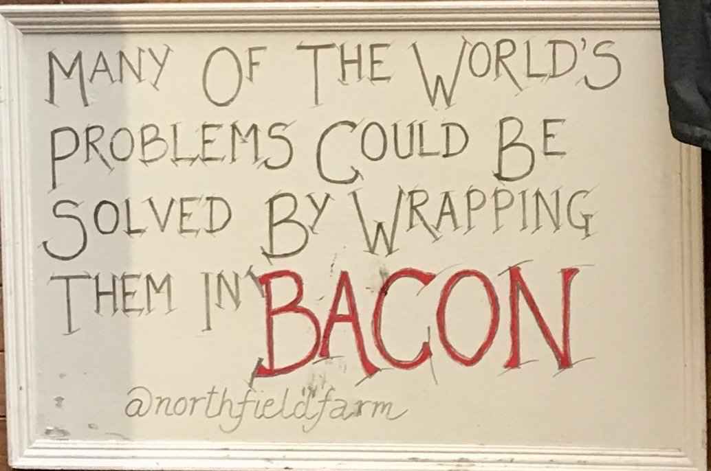
Hand-drawn sign advertising Northfield Farm’s bacon, photo Twitter 2019
Digital
![]()
The anime series Neon Genesis Evangelion is iconic for its graphic design, featuring striking use of color, distorted fonts , title cards, and character design. Red/black is associated with the main character Asuka Langley Soryu, but two other examples employ red-on-black to iconic effect: the NERV logo, and the SEELE “monoliths” (video conferencing UI design).
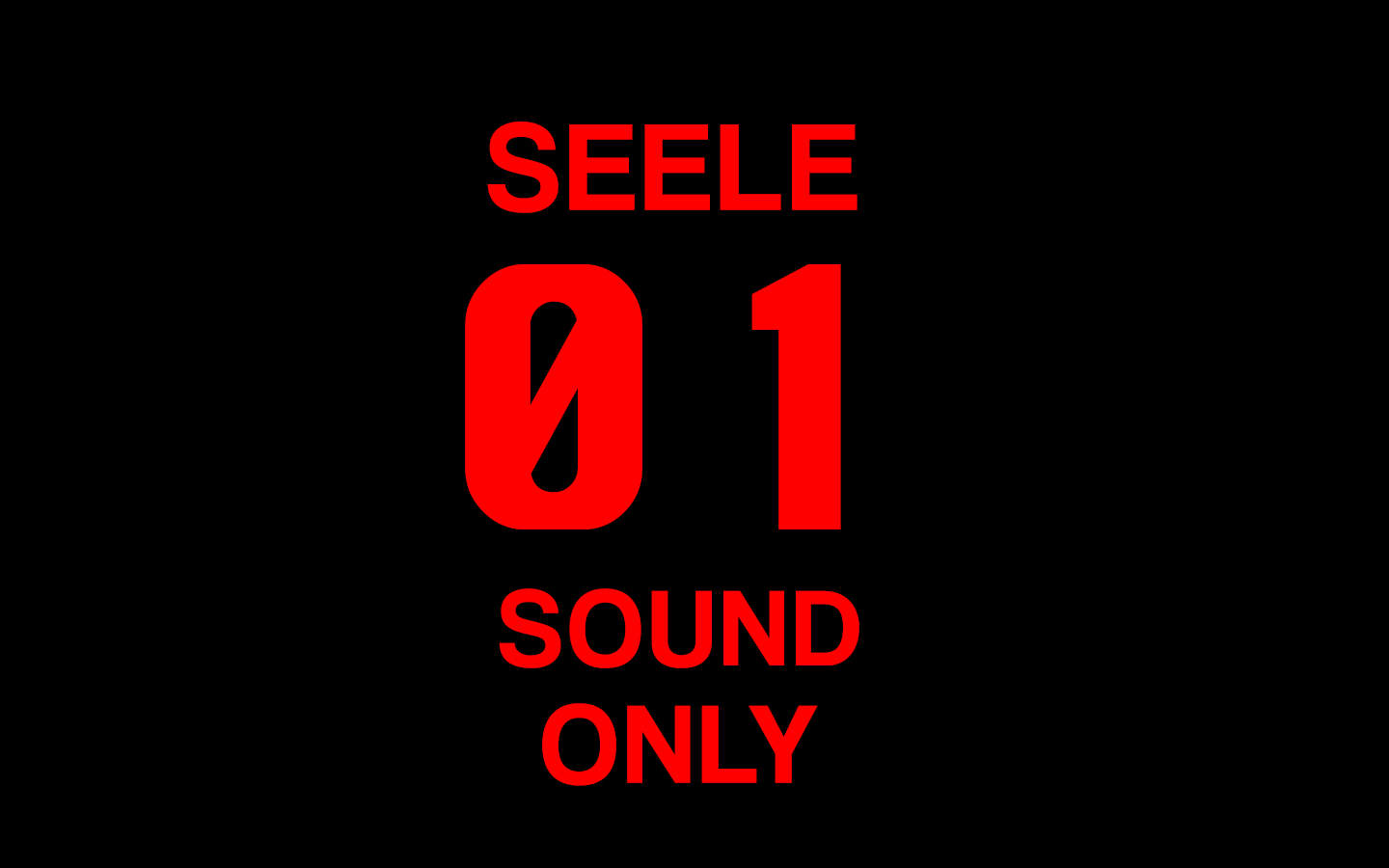
Fan-made rendering of a SEELE monolith
![The common red-black tree data structure invites rubrication in diagrams explaining its function; ironically, the name is typographic in origin: “The color ‘red’ was chosen because it was the best-looking color produced by the color laser printer available to the authors while working at Xerox PARC.[8] Another response from Guibas states that it was because of the red and black pens available to them to draw the trees.[9]” Example by Madz in TikZ 201214ya.](/doc/design/typography/rubrication/2012-11-25-madz-tikz-redblacktree.jpg)
The common red-black tree data structure invites rubrication in diagrams explaining its function; ironically, the name is typographic in origin: “The color ‘red’ was chosen because it was the best-looking color produced by the color laser printer available to the authors while working at Xerox PARC.[8] Another response from Guibas states that it was because of the red and black pens available to them to draw the trees.[9]” Example by Madz in TikZ 201214ya.
Rubrication used in labeled equations, akin to Byrne; “TikZ & PGF: Manual for Version 3.1.5b”, Till Tantau 201312; more examples
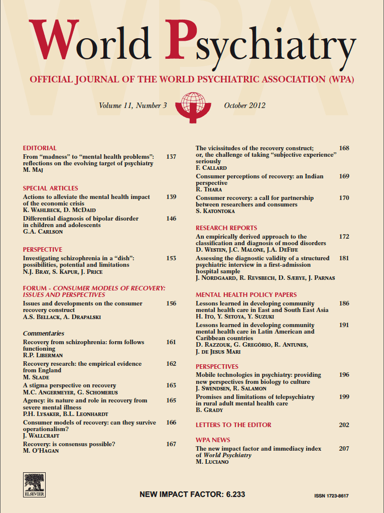
The World Psychiatry journal of the World Psychiatric Association uses rubrication for its logo, and section headers in its table of contents (example: October 201214ya issue)
Tufte 199729ya (Visual Explanations pg110–111) introduces sparklines (Tufte website compilation), and uses red to emphasize various things: the final datapoint, the numerical form of a graph, or a specific time-series in an overlapping set, among others. One representative example comes from Johnson et al 2015 (“SUPPLEMENT FIGURE F1 (all pairs, part 1 of 11)”), graphing heart data.
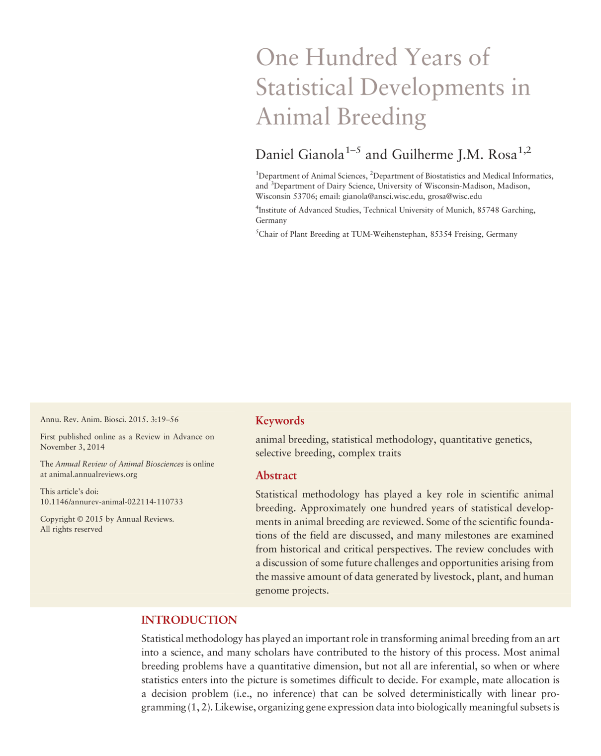
The Annual Reviews journals/publications, such as Gianola & Rosa 2015, use rubrication for sections (as does Cell & New England Journal of Medicine to a limited extent, eg. Peterson et al 2019 or Xu et al 2019).
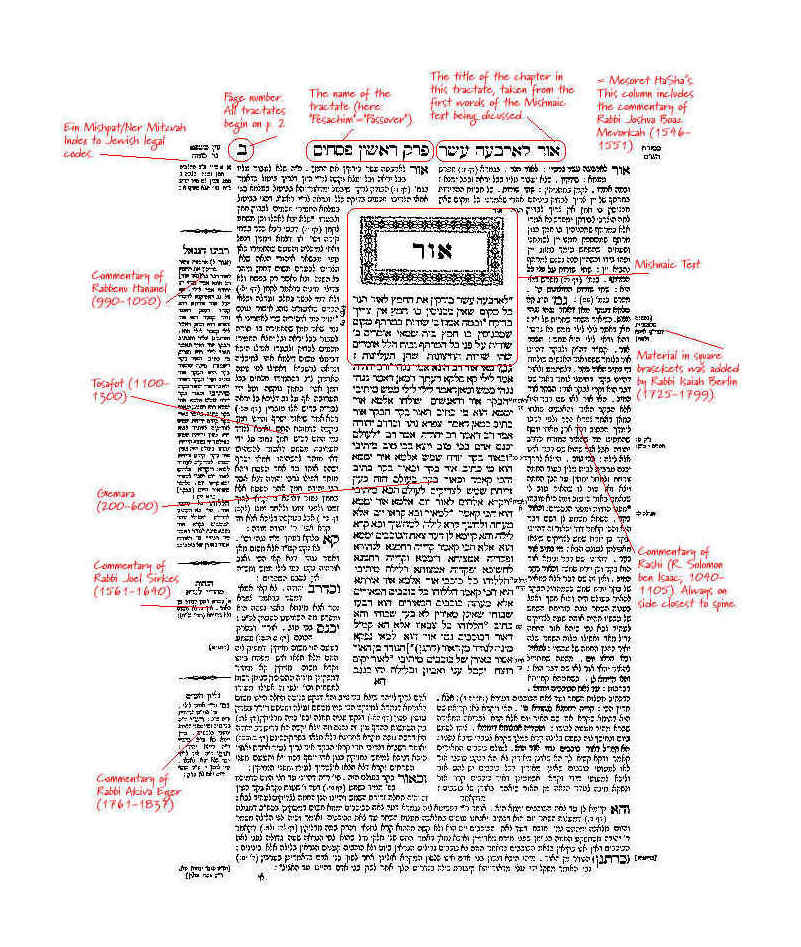
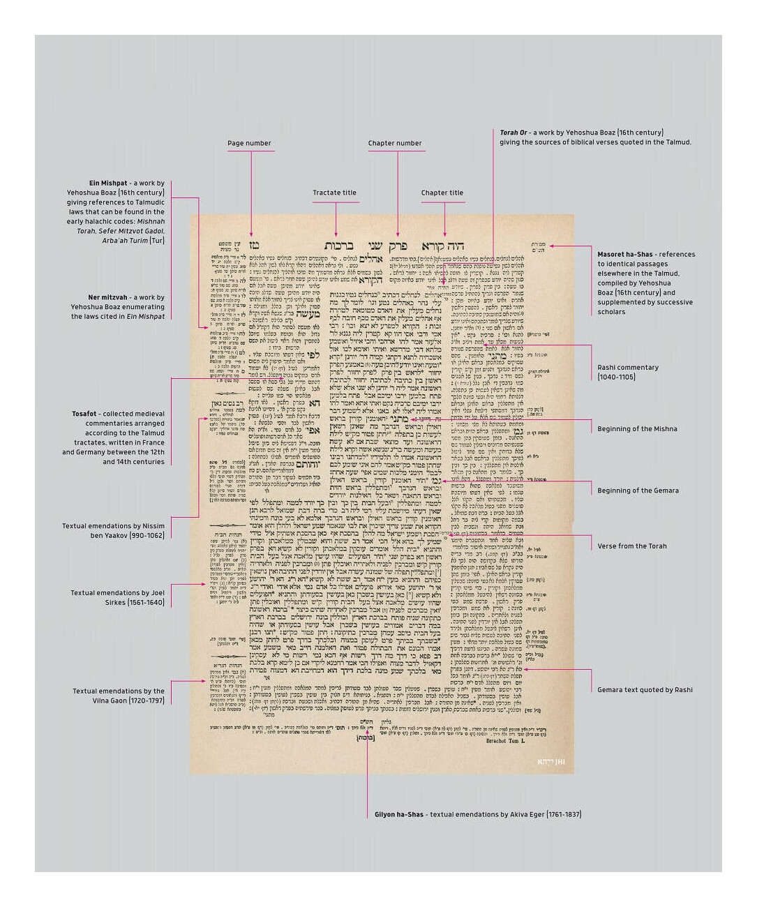
First page of Tractate Pesahim from the Babylonian Talmud; rubrication annotations by Thomas Shoemaker (201511ya?); a similar annotation appears on Tufte’s website (redrawn by Tufte?); non-rubricated annotated example
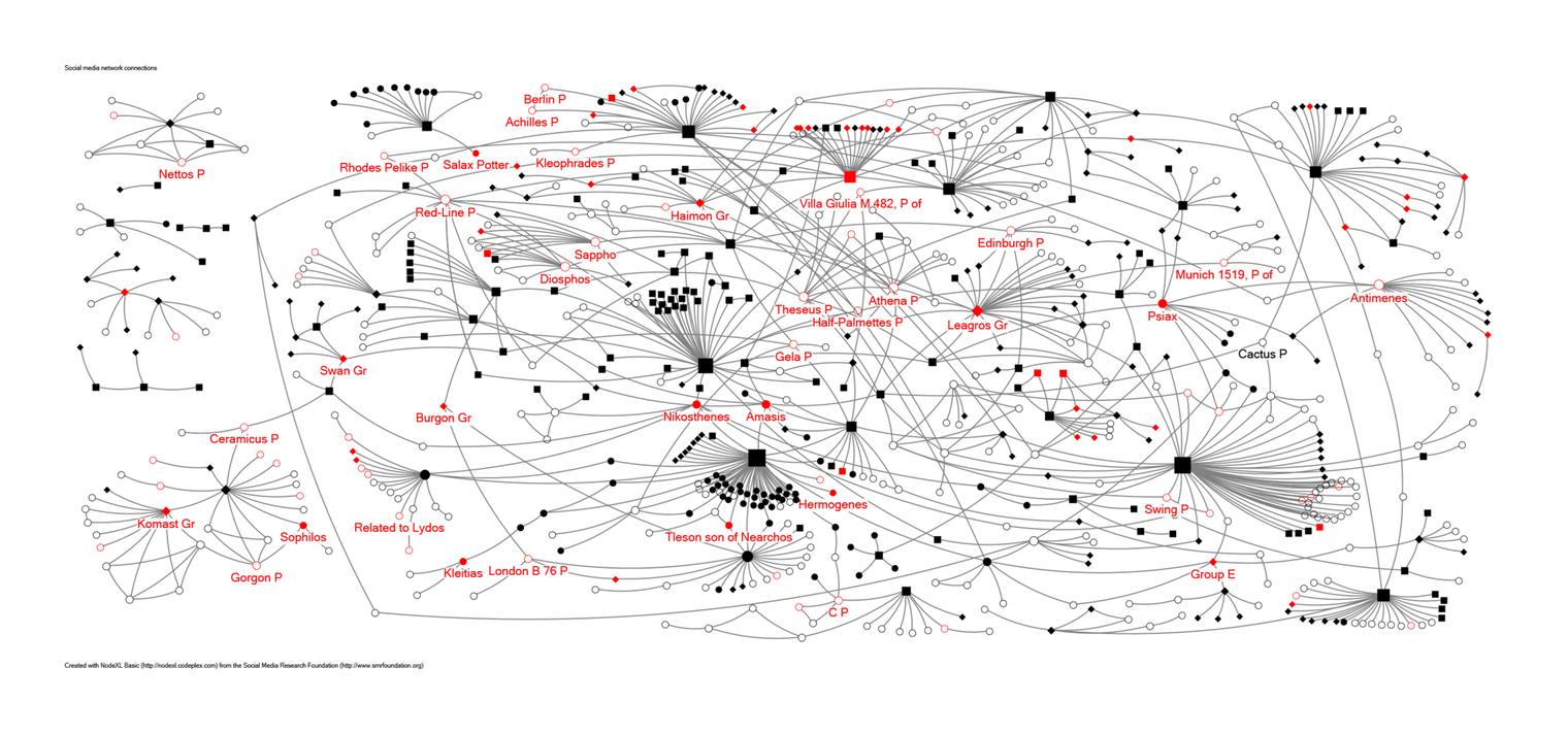
“Figure 9: Highlighted in red are black-figure artists (solid circles for signed artists; open circles for attributed artists) whose pots were excavated in the Athenian Agora. A selection of them are labeled.” Harris & Hasaki 2019
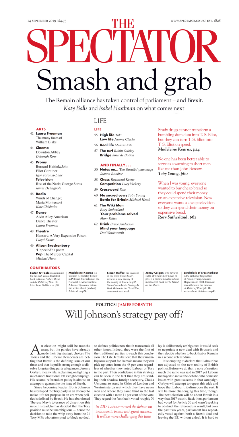
The Spectator, crops of 3 pages from the 2019-09-14 issue; use of rubrication for pull quotes, The Spectator name & favicon (a rubricated ‘S’), and a somewhat confusing use in some but not all titles/sections/authors.
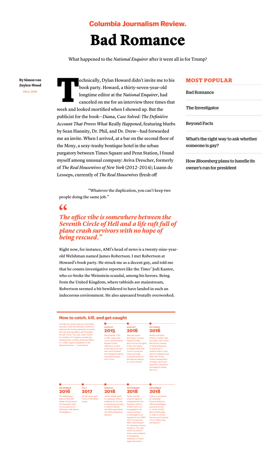
Columbia Journalism Review, November 2019 article, “Bad Romance: What happened to the National Enquirer after it went all in for Trump?”, demonstrating elements of their design using rubrication for emphasis.
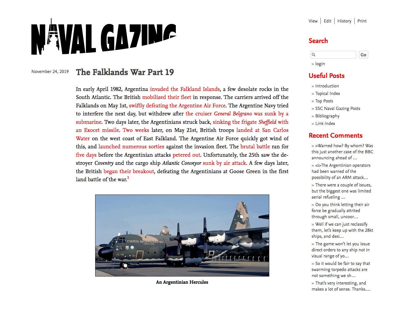
Naval Gazing (military navy group blog), “The Falklands War Part 19”, 2019-11-24; demonstrates side design’s rubrication for links & sidebar sectioning
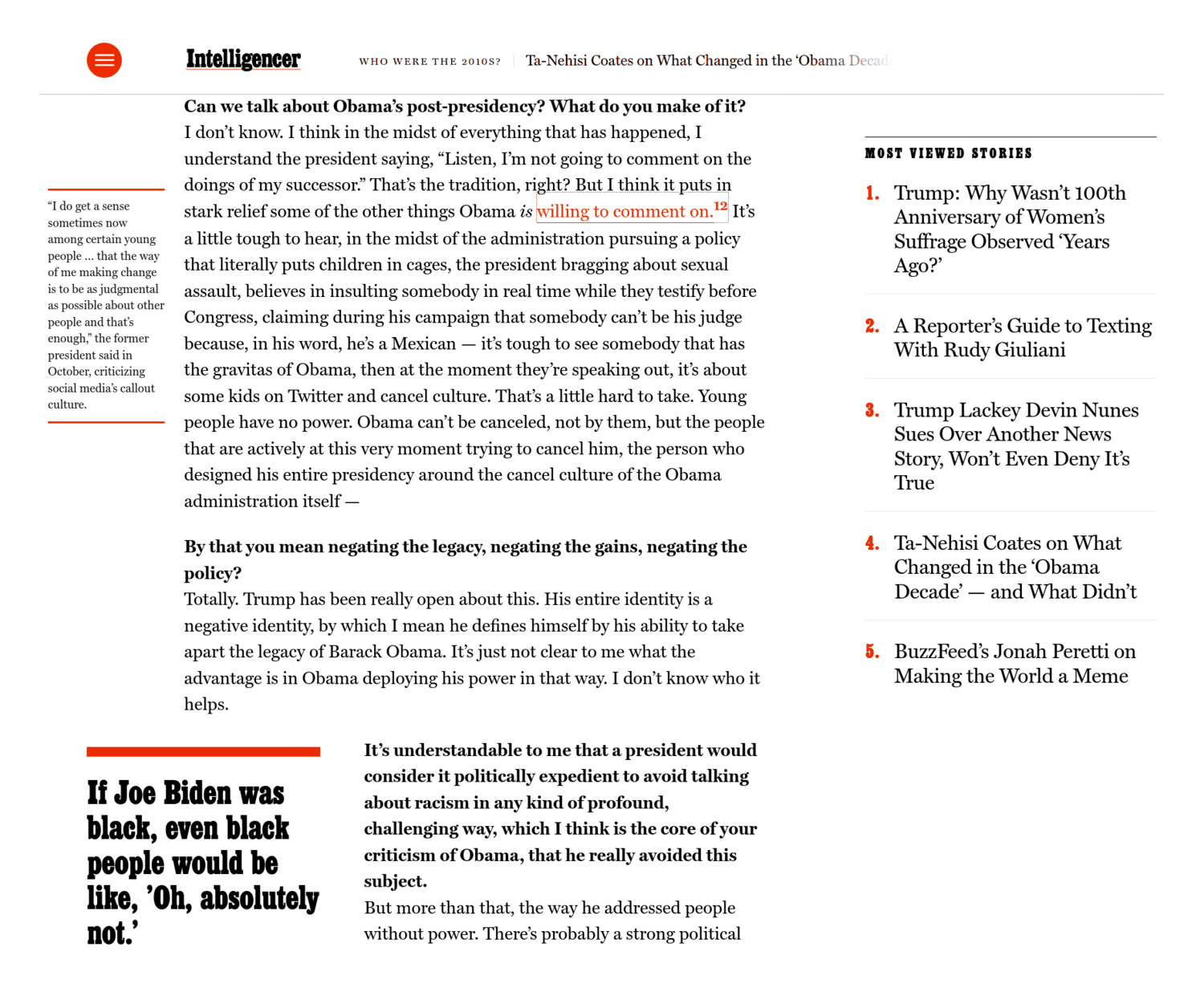
New York Magazine, “In the 2010s, White America Was Finally Shown Itself: Ta-Nehisi Coates on”Obama’s decade,” reparations, and Kaepernick”: similar to CJR or Spectator but offering a nifty use of rubrication in implementing the rarely-seen sidenote

Gwern.net mockup for a rubricated site design.
Visualization of a neural net transcription (red) of old Japanese text written in “Kuzushiji” cursive script (black); NN & visualization by Tarin Clanuwat, 2020-01-14.
Non-screenshotable:
Randomly-selected dropcaps and pointing hands in Emily Short’s 201511ya computer-generated fantasy travel guide, The Annals of the Parrigues, are rubricated.13
The 2019 redesign of The Atlantic introduced a rubricated initial A as the favicon.
Trends: rubrication of a sorts seems to have become a media web design trend, perhaps ~2021—by 2023, I had begun noticing a single small bright red button (or blue, then a miscellany of colors depending on website design) on most media websites for their various kinds of subscription/donation/newsletter/sharing spam, and had to begin creating adblock rules just for them.
Their annoying intrusiveness is a testimony to the effectiveness of rubrication.
Modern
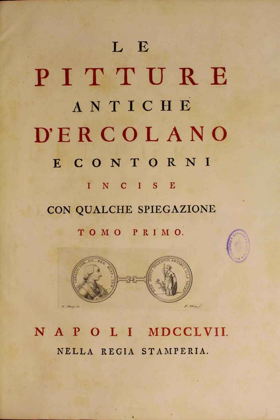
Cover of Le pitture antiche d’Ercolano e contorni incise con qualche spiegazione. Tomo primo, 1757, documenting the Herculaneum Villa of the Papyri excavations; alternating rubrication of title lines for emphasis.
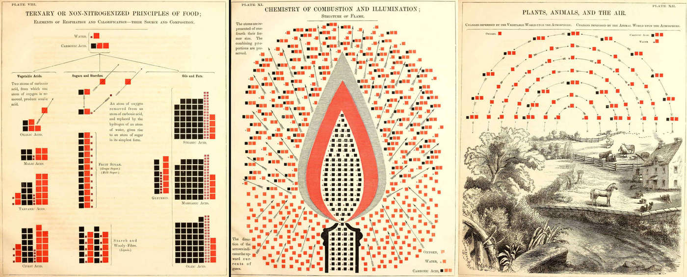
pg65/81/87 of Chemical Atlas, Or, The Chemistry Of Familiar Objects, demonstrating consistent use of rubrication for denoting oxygen/water/carbonic acid; from an 1856170ya chemistry textbook by American science popularizer (& co-founder of Popular Science magazine) Edward L. Youmans who took pains to defend his systematic use of illustration14.
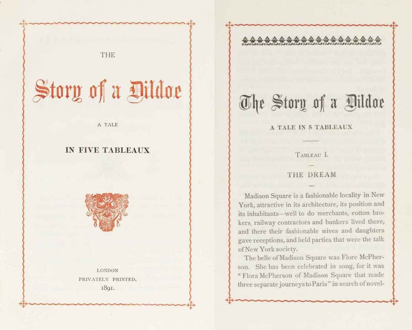
The Story Of A Dildoe: A Tale In Five Tableaux, 1891135ya (from a discussion of Victorian erotica)
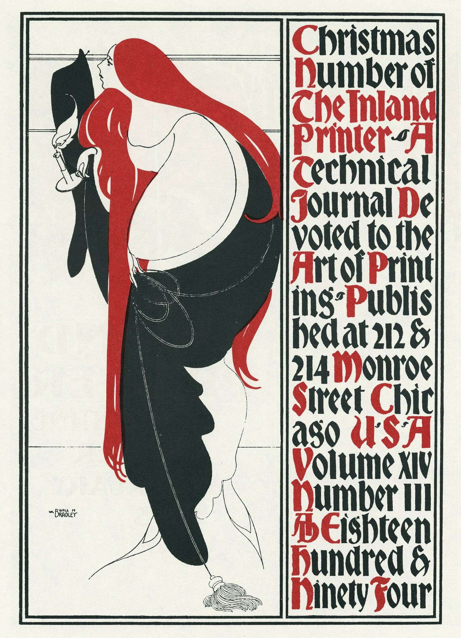
Will H. Bradley Art Nouveau cover of the noted printing magazine & showcase, The Inland Printer (v14, #3, 1894132ya; scan from Will Bradley: His Graphic Art via David Jonathan Ross apropos of making a Bradley revival font).
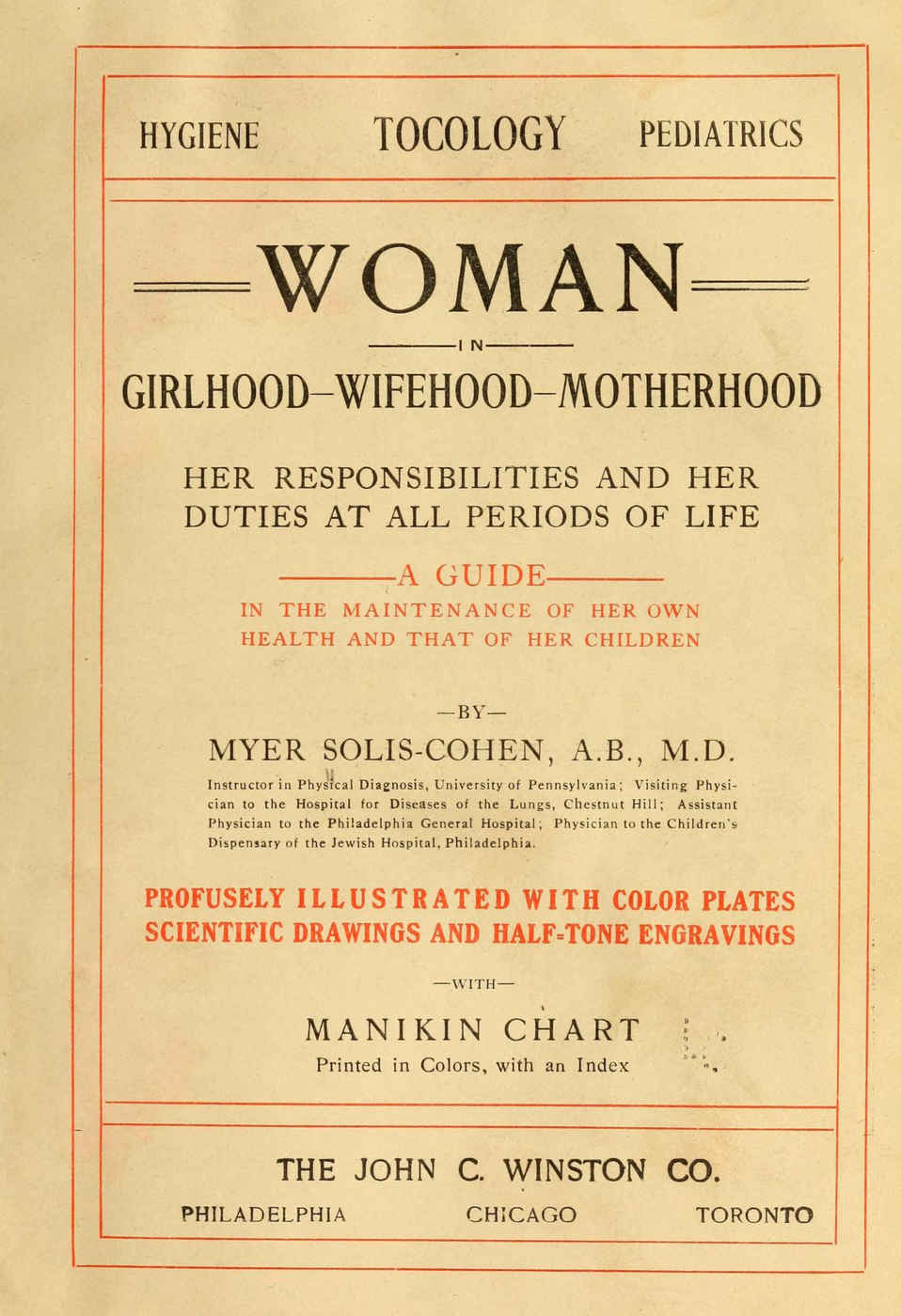
Rubricated title page of the “profusely illustrated” menstruation/pregnancy/married-life manual, Woman in girlhood, wifehood, motherhood; her responsibilities and her duties at all periods of life; a guide in the maintenance of her health and that of her children, Solis-Cohen 1906
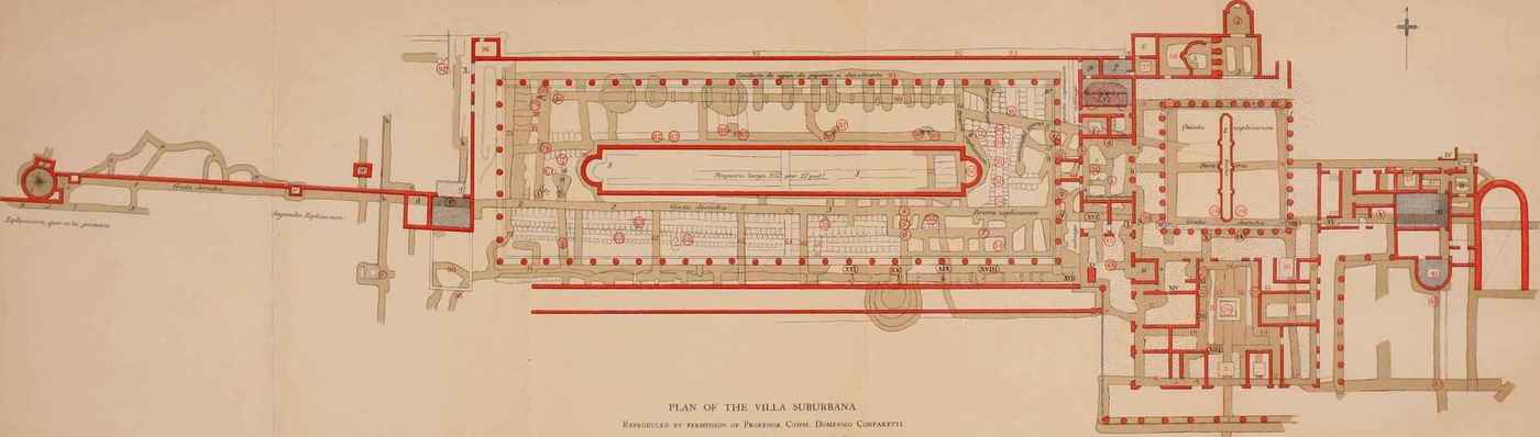
Plate 48, pg441 of Herculaneum, Past, Present & Future, Waldstein & Shoobridge 1908: Villa of the Papyri ground plan; rubrication denotes wall/pillars (lines/dots) and artifact locations (numbered circles).
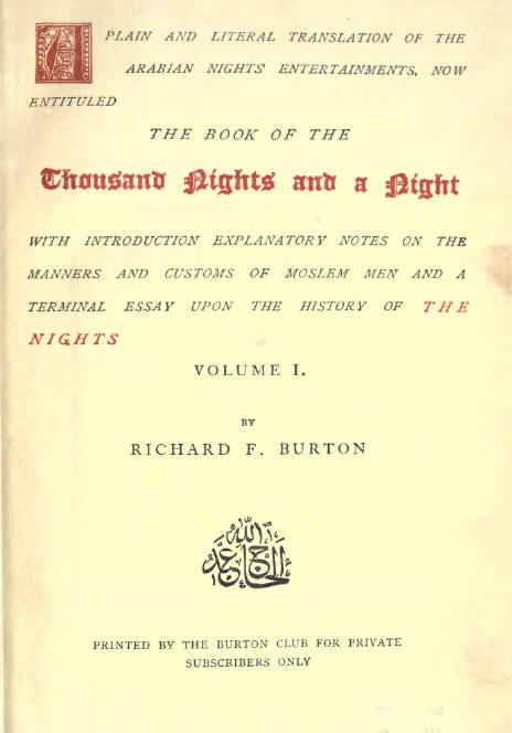
Cover of the first edition of Richard Francis Burton’s infamous 1885141ya translation of The Thousand And One Arabian Nights15 (cf. Lady Burton’s Edition).
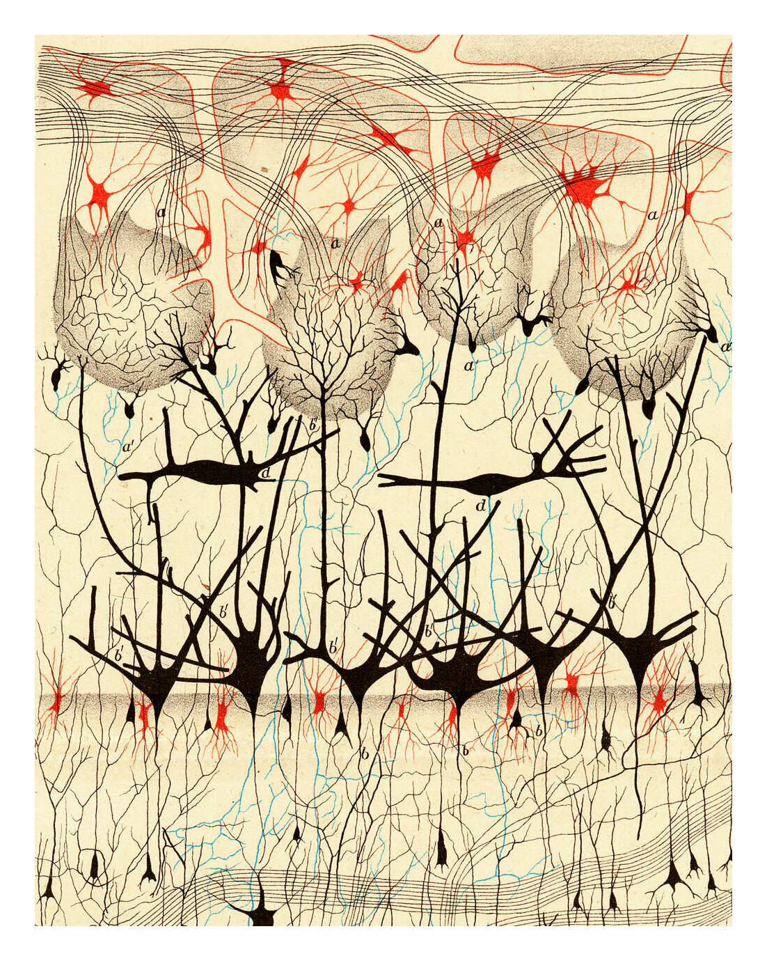
Dog olfactory bulb, neuron stain by Camillo Golgi (Sulla fina anatomia degli organi centrali del sistema nervoso 1885)
1911: Elite French publisher Éditions Gallimard begins publishing its standardized “white” book covers: rectangular outline, Didot font, monograph, rubricated text.
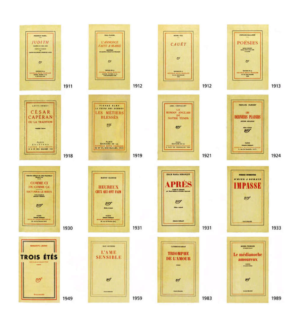
Gallimard covers 1911–78198937ya (4×4), from Graphéine
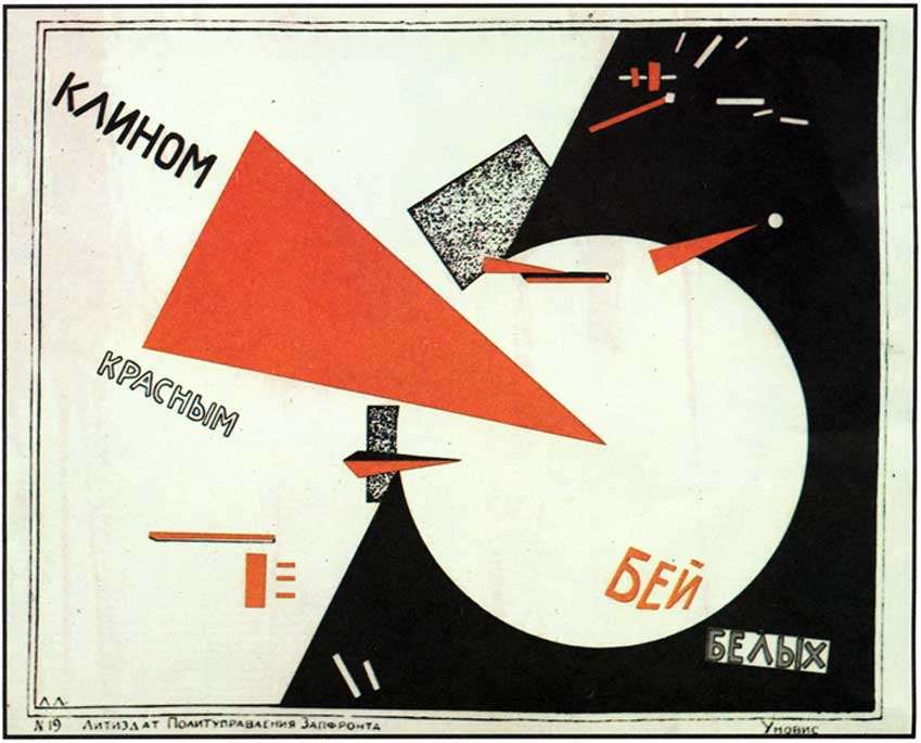
“Beat the Whites with the Red Wedge”, 1919107ya Communist propaganda poster by Lazar Markovich Lissitzky (see also Henryk Berlewi’s 1924102ya Mechano-faktura bialo-czerwono-czarna (“White, red and black mechano-factura”))
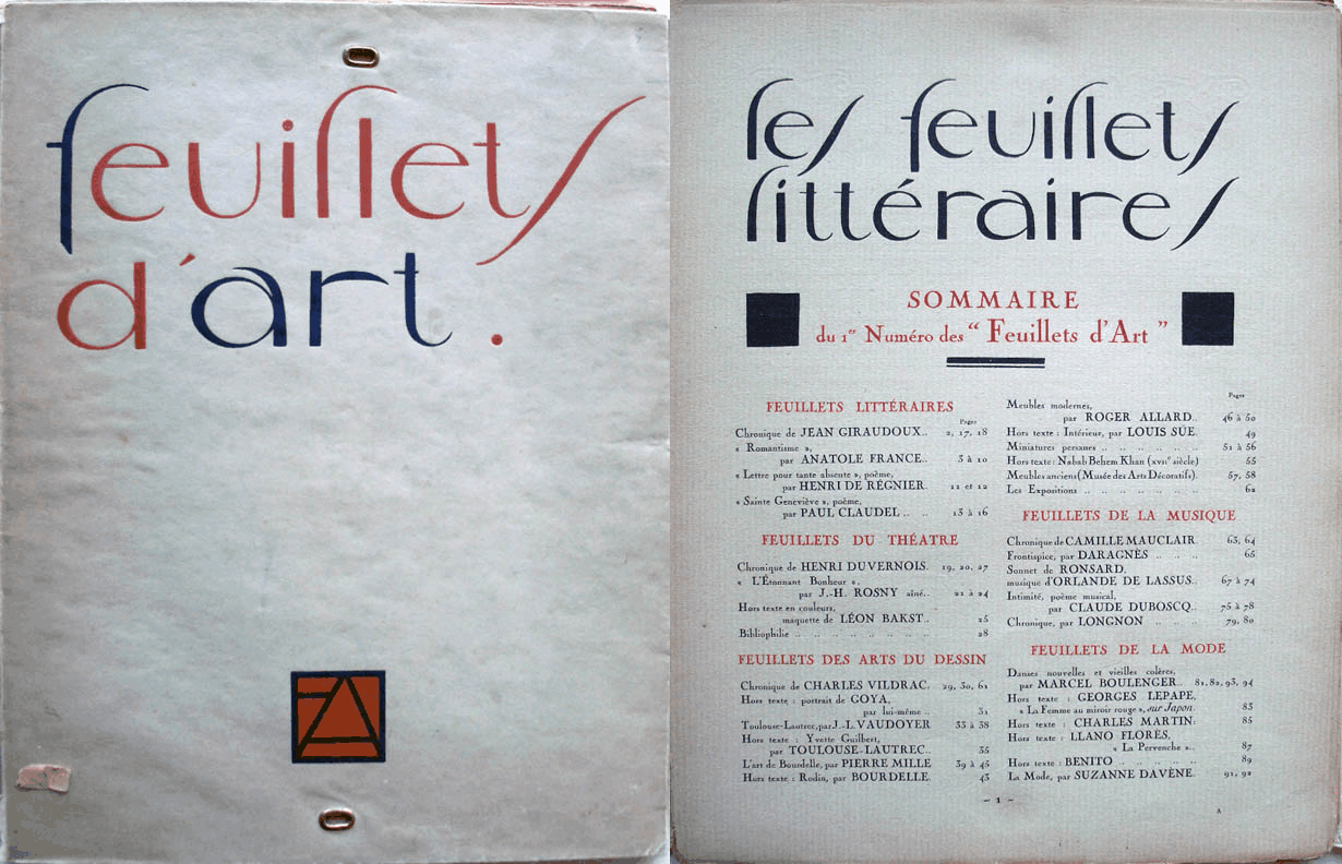
Title & table of contents of issue #1 (1919107ya) of Les Feuillets d’Art (The Pages of Art), a prominent Parisian fashion magazine (1919–1922104ya); scanned by Princeton University Library
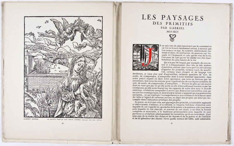
Dropcaps in a Gabriel Mourey essay; pg31, issue #1 (1919107ya) of Les Feuillets d’Art
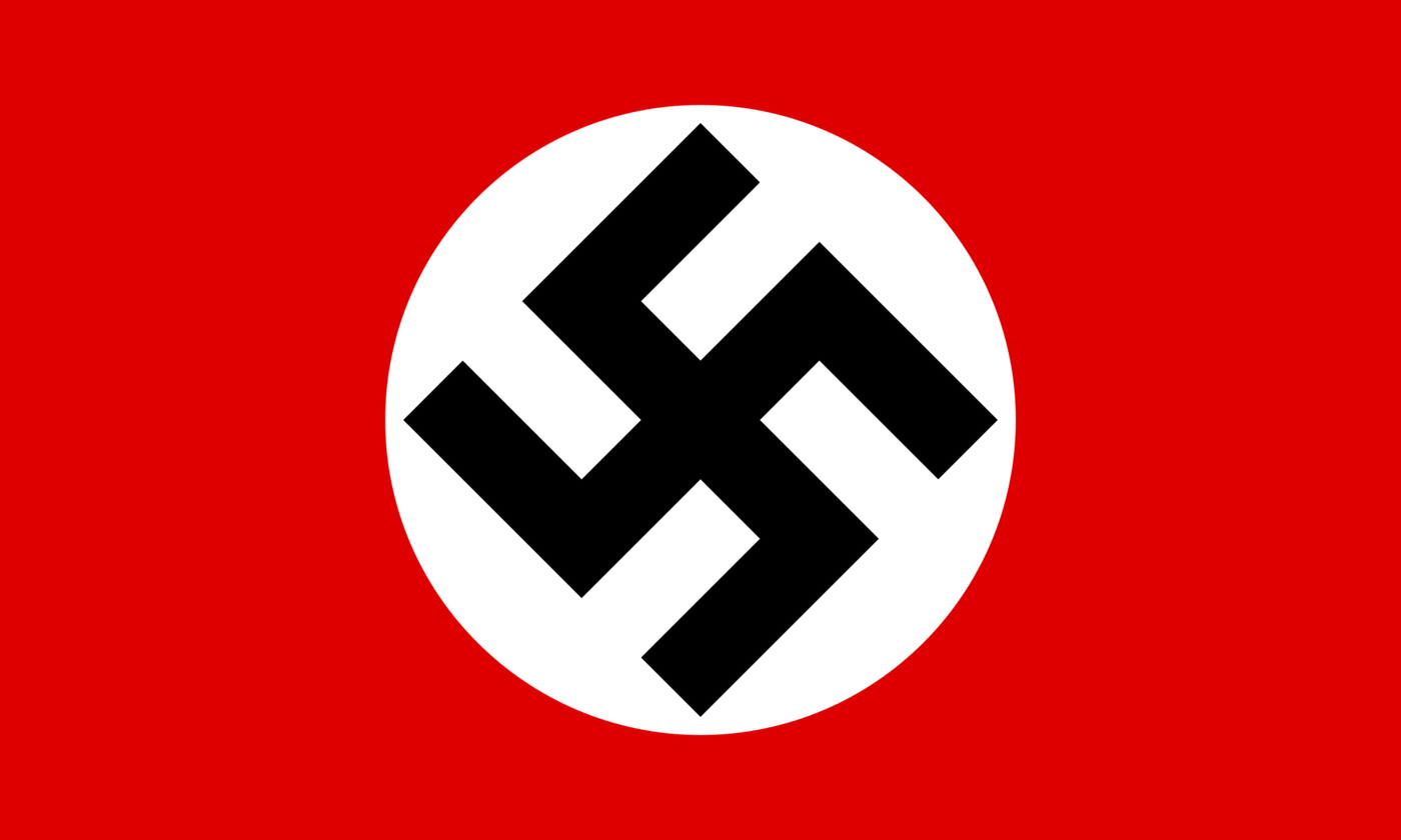
The Nazi swastika (NSDAP flag), 192016 (see also: Nazi symbolism17, Occultism in Nazism, Art of the Third Reich, Triumph of the Will)
.svg)
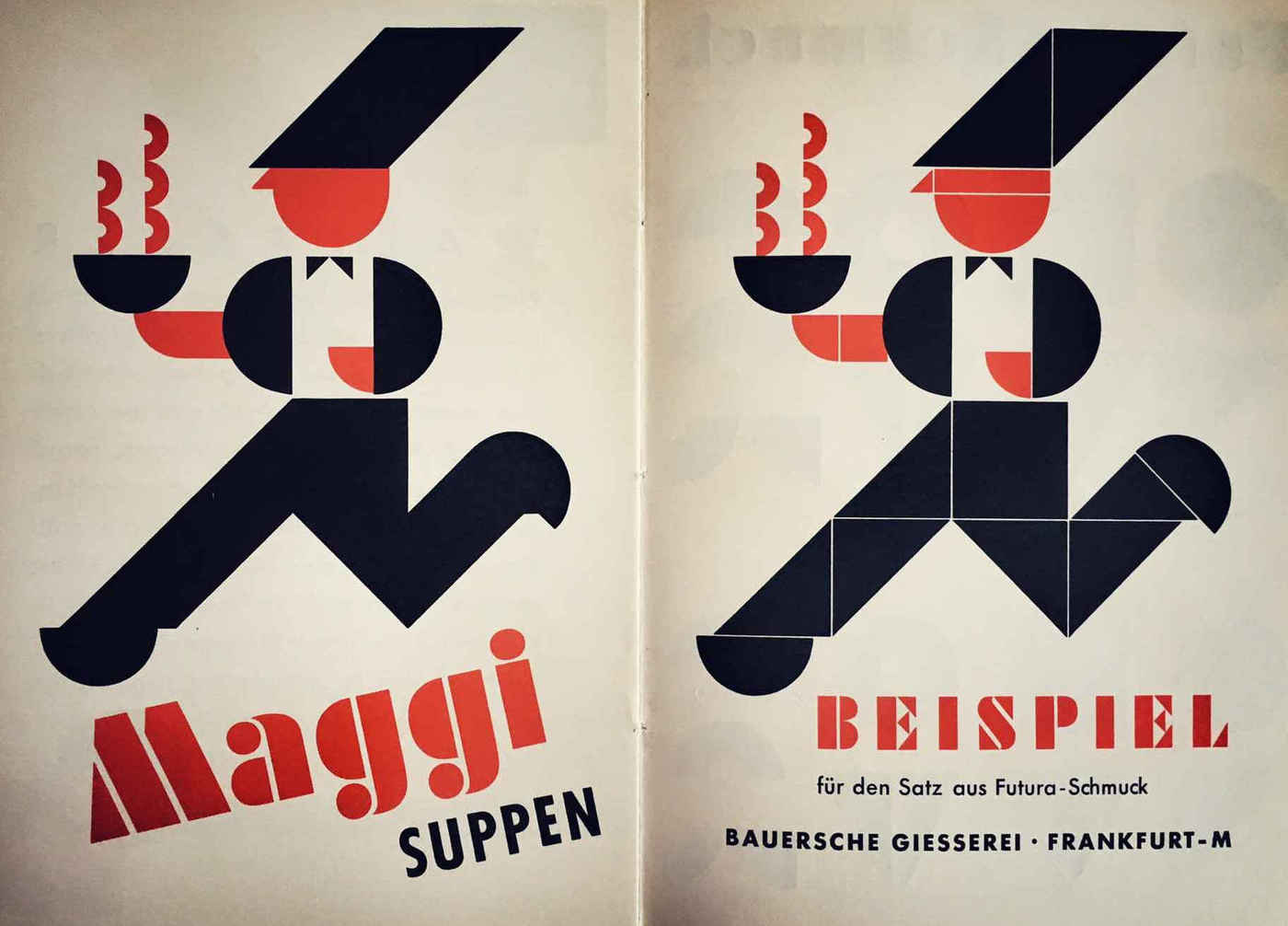
Futura typographic samples often showed it off using rubrication; in this sample from the Bauer Type Foundry, newly-for-sale geometric ornaments are used to make amusing advertisements.
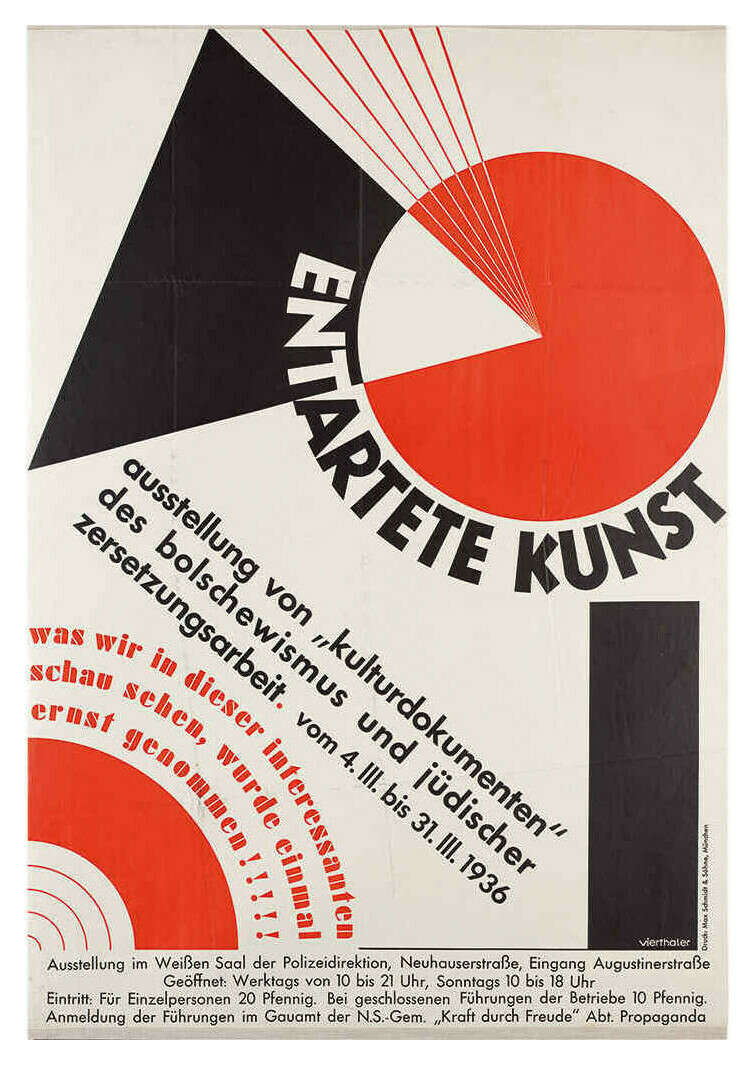
A parody of “cultural documents of Bolshevism” (ie. “Beat the Whites with the Red Wedge”) by Nazi designer Hans Vitus Vierthaler (1910–32194284ya); poster apparently designed in 193690ya for the Nazi’s 193789ya “Degenerate Art Exhibition” condemning Entartete Kunst/“degenerate art”
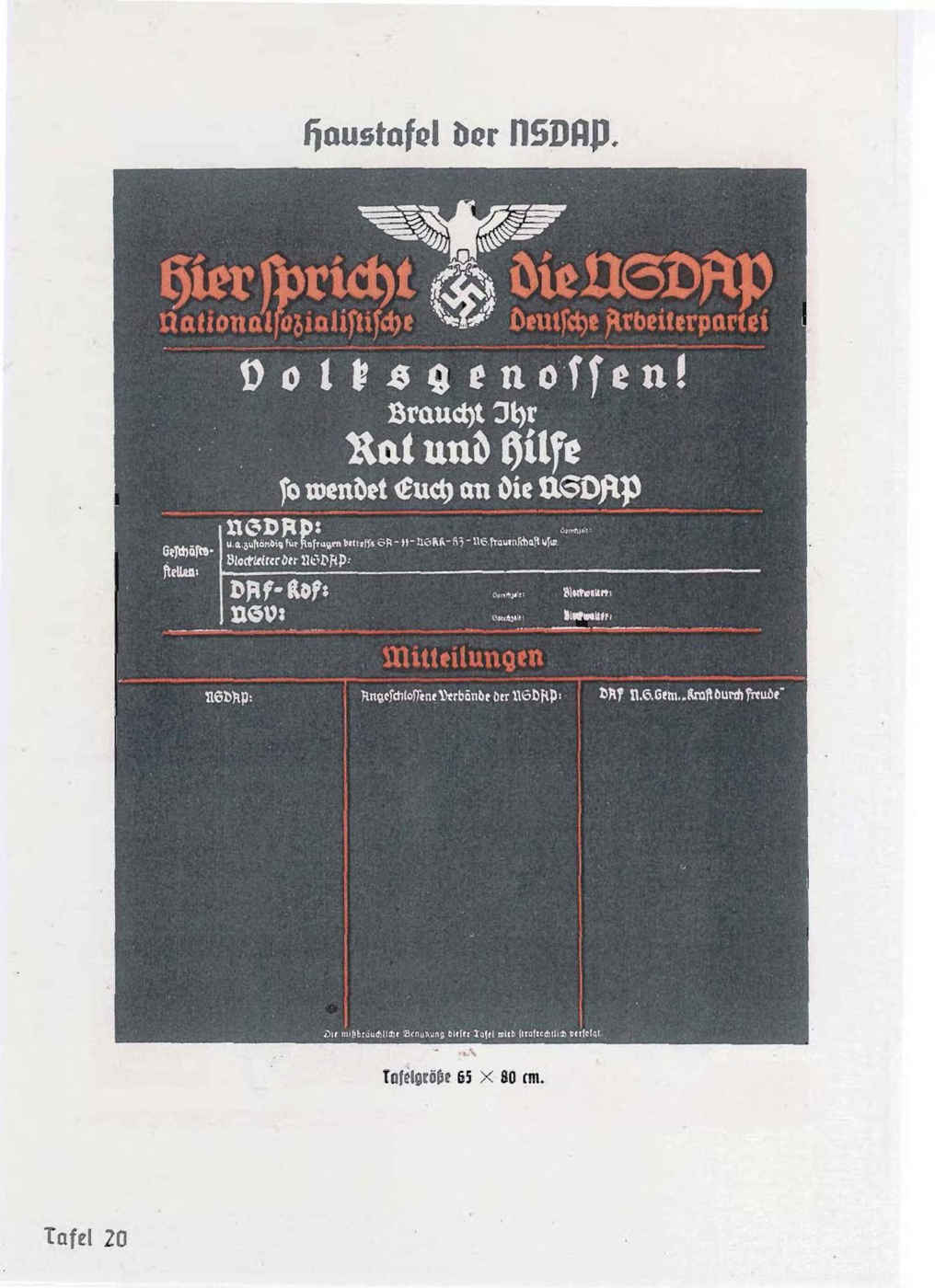
An unfortunately-faded Nazi form using rubrication to maintain legibility of blackletter text18 on a black background; pg99 of the 1937 Organisationsbuch der NSDAP yearbook, ed Robert Ley
“Four Billy Goats”, Lissitzky 1922
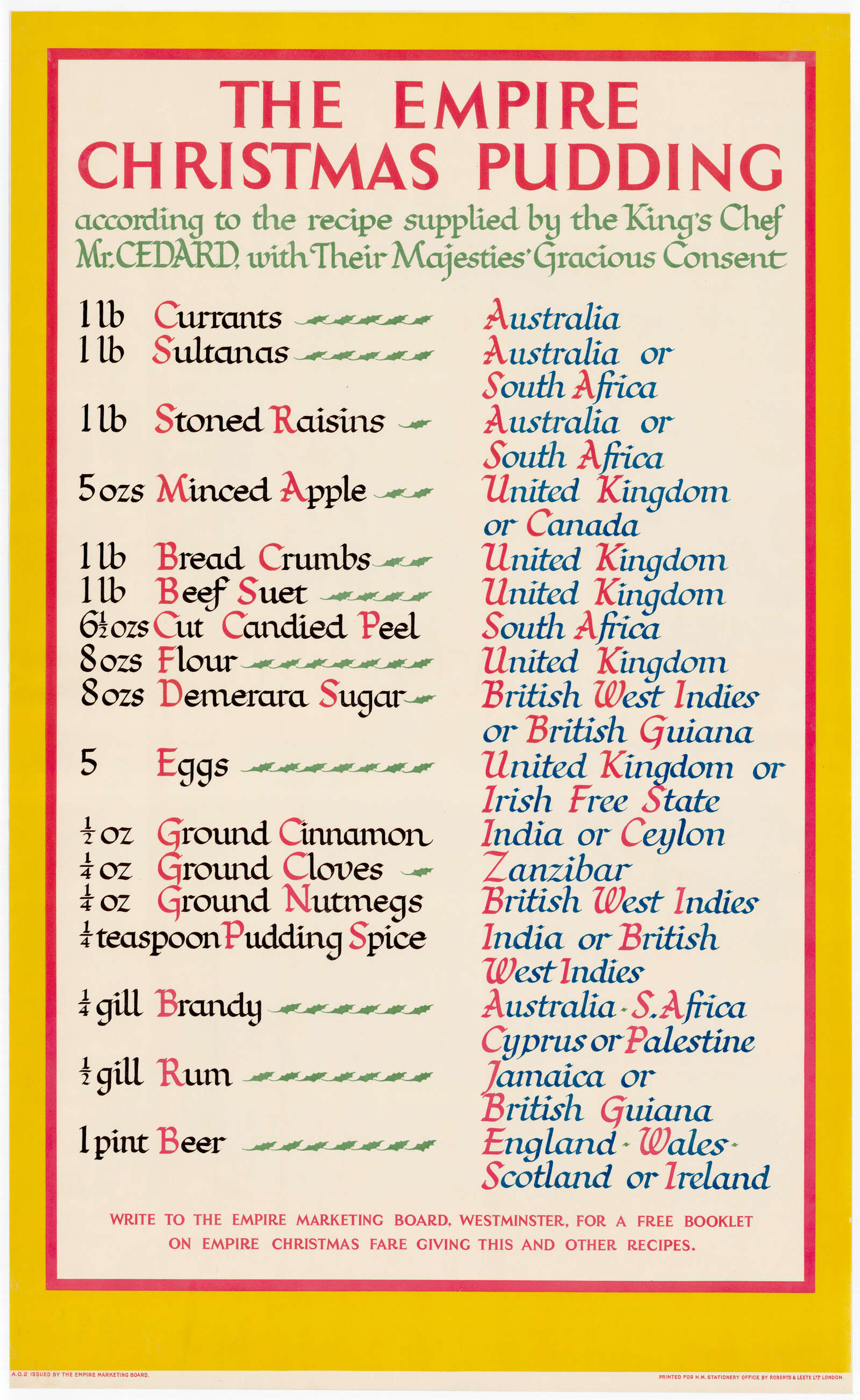
“‘The Empire Christmas Pudding’, artwork by F. C. Harrison produced for the Empire Marketing Board”, 1923103ya; part of an extensive patriotic marketing campaign
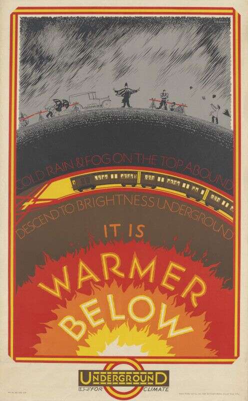
“It is Warmer Below”, London Underground subway poster by Frederick Charles Herrick (1926100ya)
Rubricated blackletter font; in “Stempel foundry catalog from the 1920s”, photo by Matthew Butterick, slide from “Rebuilding the Typographic Society” 2012
More rubrication examples from Stempel foundry catalogue, Butterick 2012
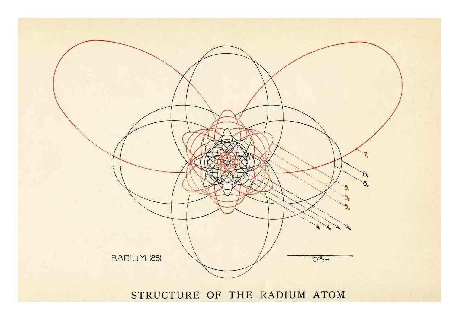
Rubrication denotes odd vs even electron orbitals in this schematic atom diagram, “Principal Features of Atomic Structure in Some of the Elements—Atomic Structure of Radium”; color plate #2, pg217, The atom and the Bohr theory of its structure: an elementary presentation, Holst & Kramers 192220
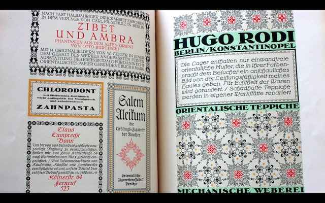
Rubricated ‘Edomoji’ (“calligraphic letterforms used for advertising”), pg51, volume 15, The Complete Commercial Artist, Hamada et al 1929
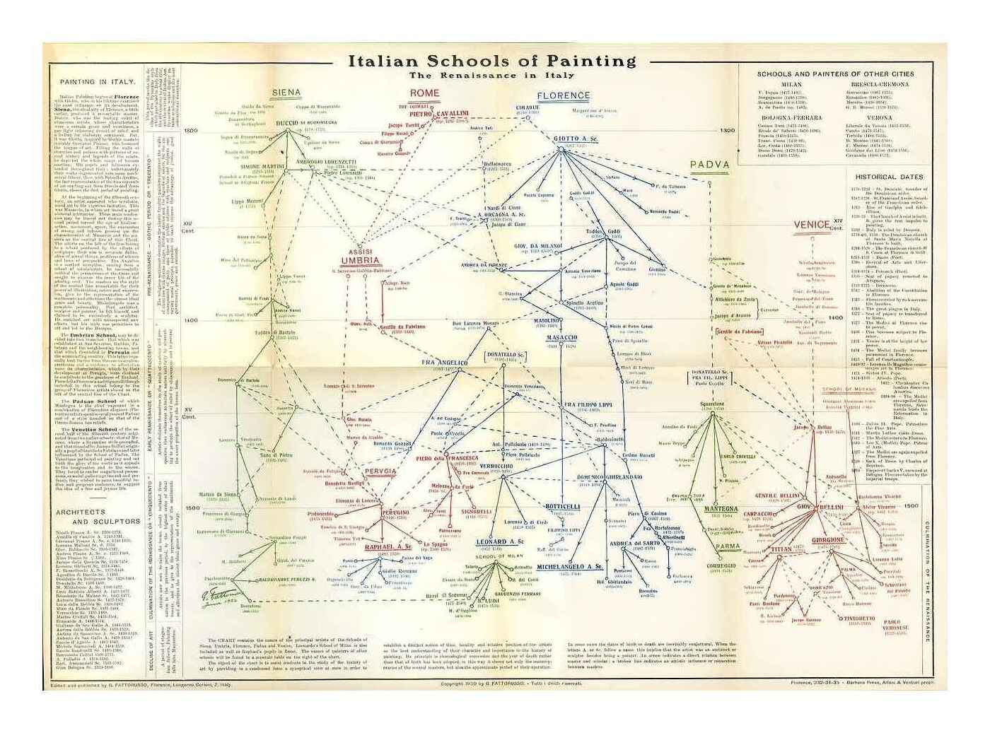
“Italian Schools of Painting: The Renaissance in Italy” phylogenetic timeline, printed in the brochure Italian Schools of Painting: History of Art Charts for the Uffizi-Pitti Gallery in 193096ya (Museum of Modern Art scan)
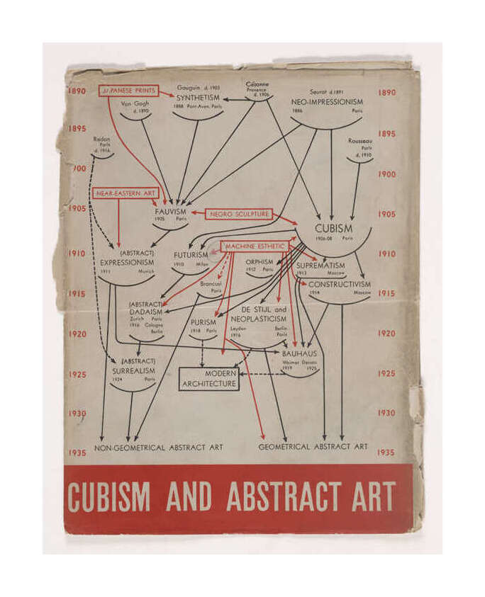
Cover of catalogue for the 1936 MoMA exhibition Cubism and Abstract Art designed by Alfred H. Barr Junior (source). Edward Tufte has a redrawn version based on a 194185ya Barr manuscript. Red distinguishes internal from external influences on art movements.
2 examples of Isotype, Otto Neurath, International picture language, 193690ya (source21)
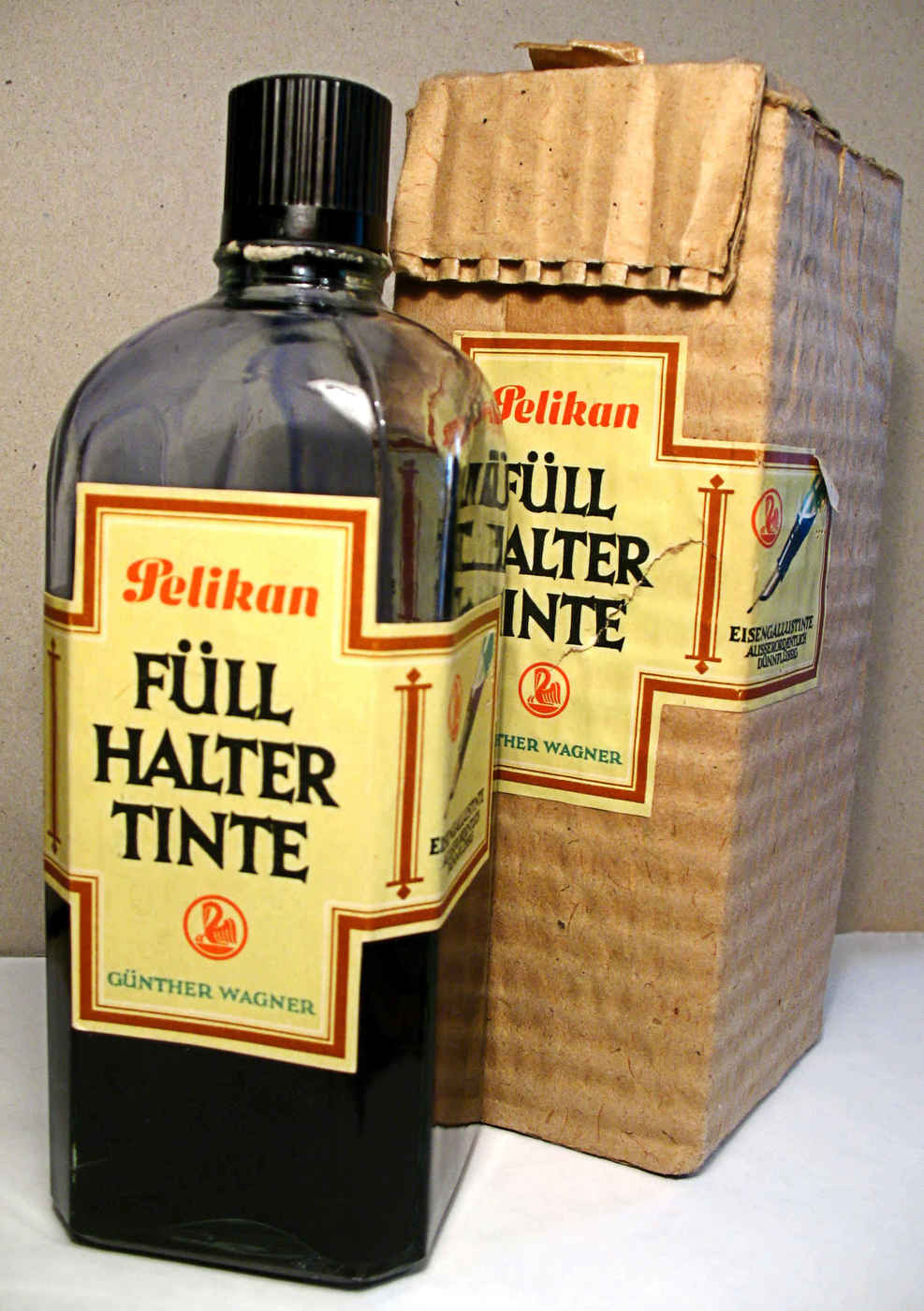
“Iron gall ink for fountain pens, refill bottle, 0.5 liter (500 ml), Pelikan, Günther Wagner, ca 1950s with storage container”; 200818ya photo, Richard Huber
.JPG)
Medieval
As expensive and restricted as materials were, and labor-intensive the process of manuscript copying, medieval and later scribes nevertheless accomplished great things, including effective use of rubrication, dropcaps, and diagrams (some of which put most contemporary web designers to shame):
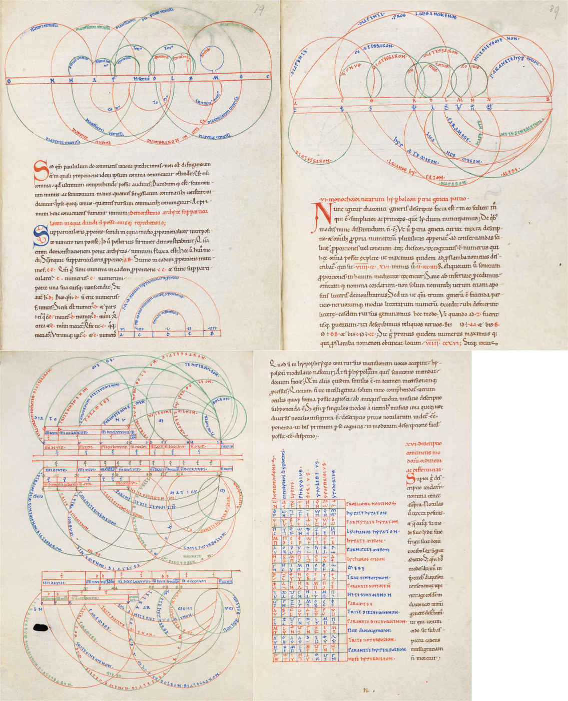
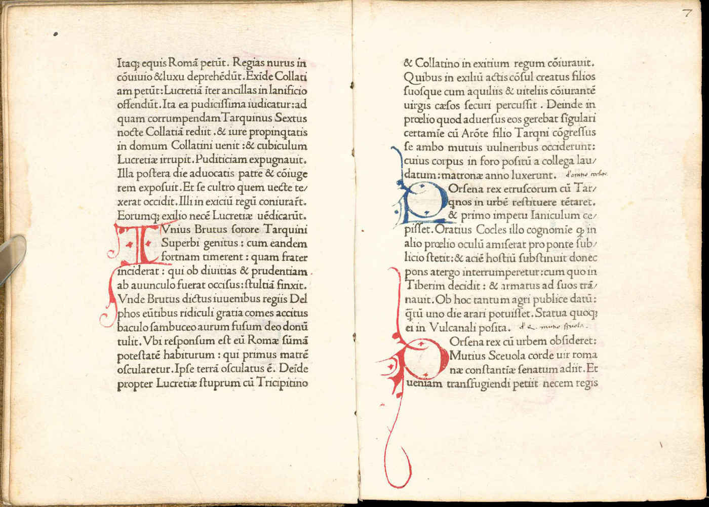
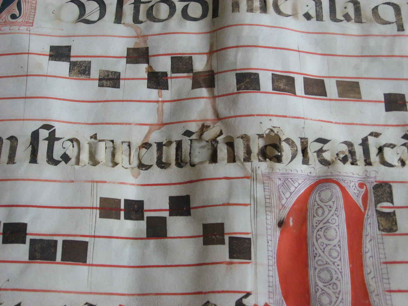
VadSlg Ms. 296 (1100s manuscript of Boethius’s De arithmetica/_De institutione musica): “The polychrome schematic illustrations in this 12th century manuscript are particularly carefully made.” Indeed. This image combines pages 79/89/93/99, which show off the diagrams, tables, dropcaps, and rubricated text employed in the discussion of music theory & multiplication.
Pg13 of Mellon MS 1 manuscript of Ars notoria, sive Flores aurei (“The Art of Magic or Golden Flowers”), alchemical text ascribed to Apollonius of Tyana
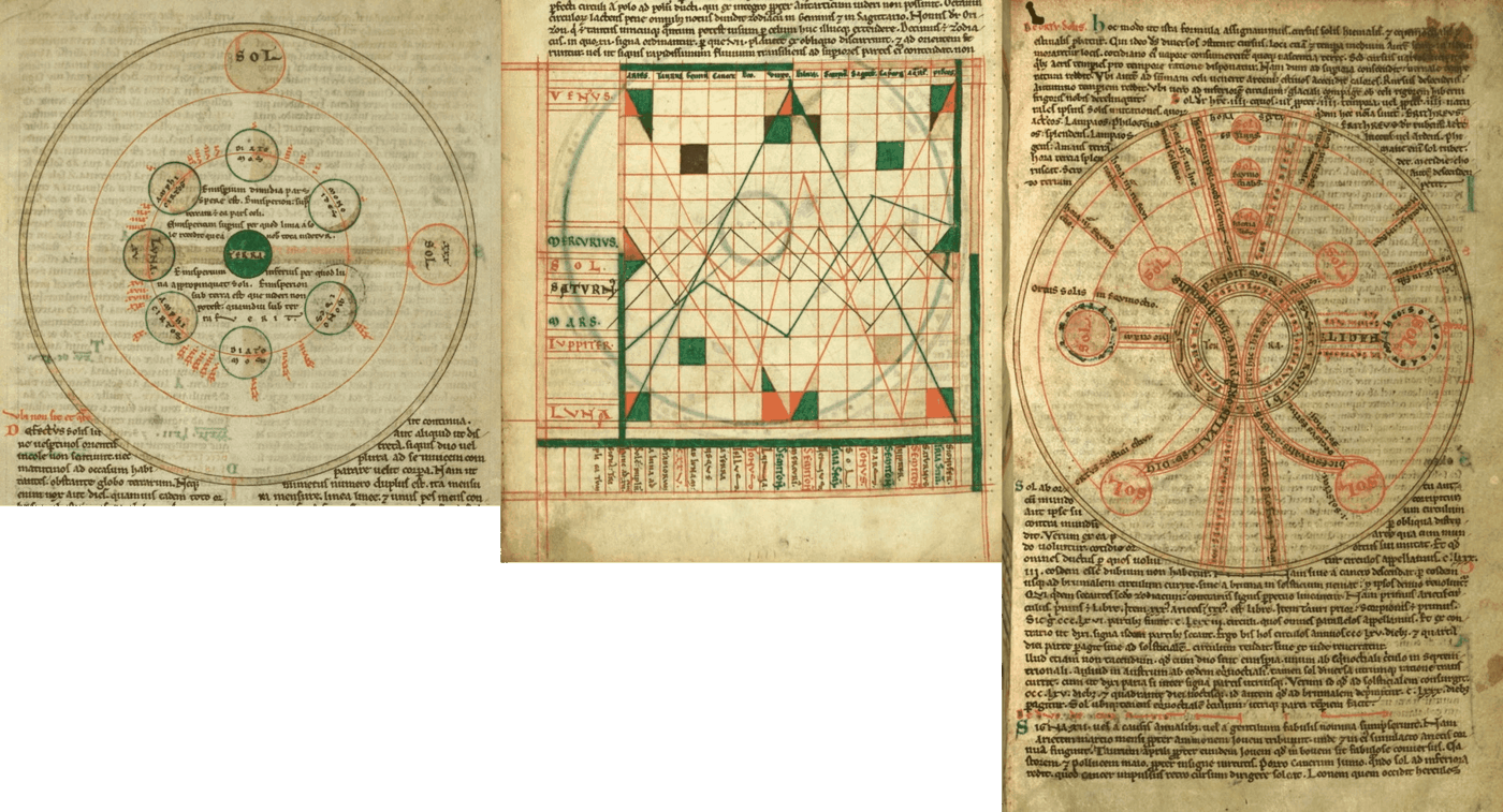
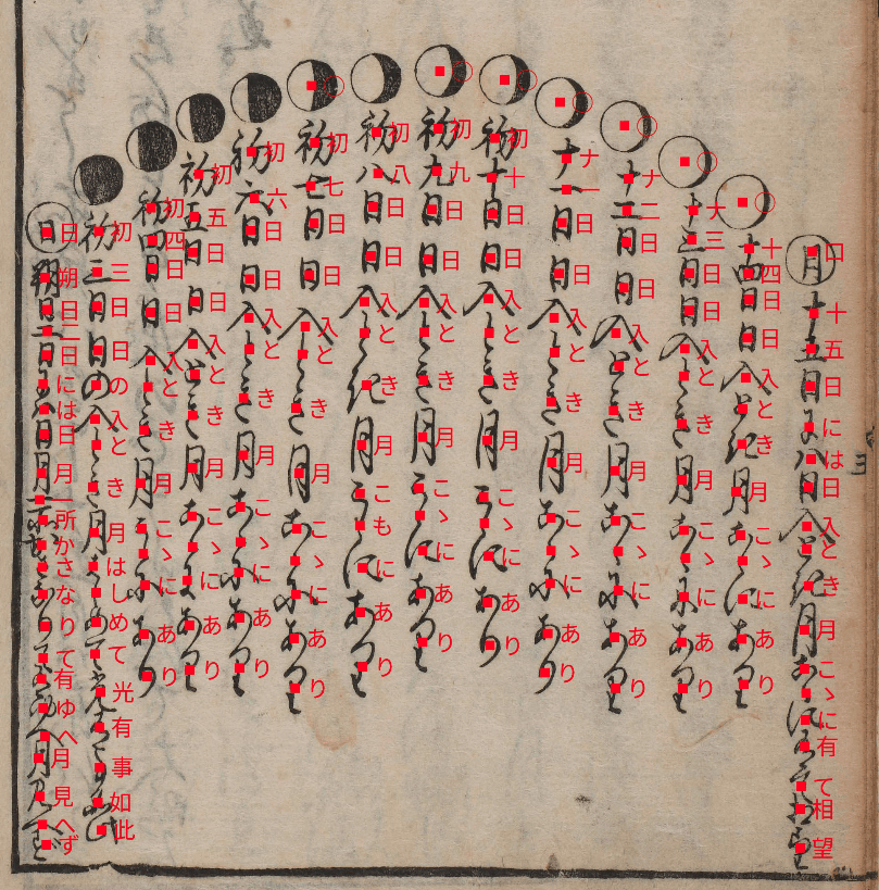
W.73 Cosmography manuscript (Walters Library), late 1200s (via The Public Domain Review); from left to right: the phases of the moon, planetary paths through the Zodiac, and solstices & equinoxes.
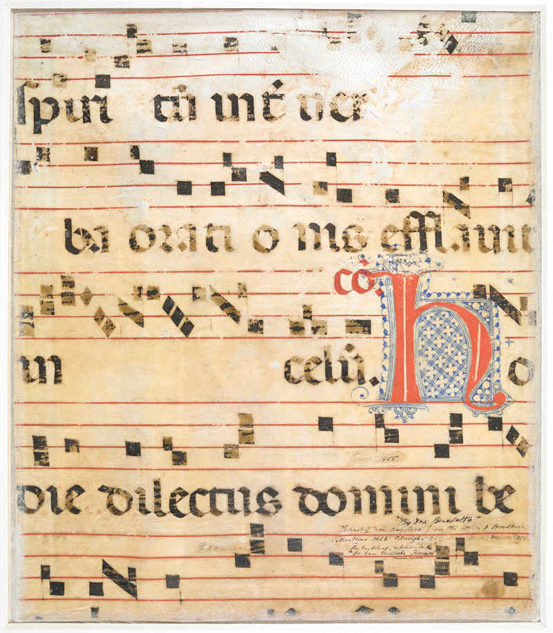
“Add MS 35254: the hymn Ave Maria Gratia Plena incorporating a large red initial with contrasting blue penwork.”22, Freeman 2014; from cuttings of a 1375 gradual choirbook, illustrated by Don Silvestro dei Gherarducci of the Camaldolese monastery of Santa Maria degli Angeli in Florence.
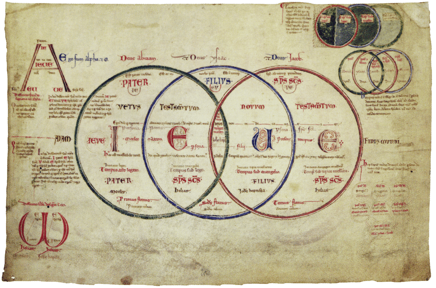
“Trinitarian Circles enclosing the Tetragrammaton (from the Liber Figurarum). Corpus Christi College, Oxford MS. 255A, f.7v” (Ziolo 2001), illustrating beliefs of the Joachimites (unknown date; 1100s–1200s?)
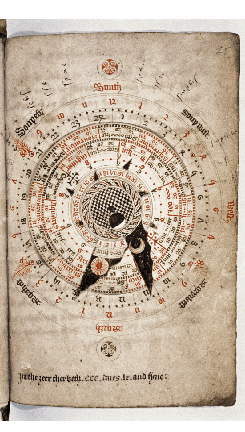
MS. Ashmole 370, c.1424: a lunar volvelle for calculating phases of the moon, folios 24v–25r. Nicholas of Lynn, Kalendarium, composed 1386; copied 1425, courtesy Bodleian Libraries, University of Oxford
The first edition of the Gutenberg Bible (~1454) used two printing passes, with the second for rubrication, but switched to a single pass & hand rubrication. (Rubrication was often used on ‘caput’/pilcrow symbols to denote paragraphs and other separations inline; a fun homage is Dowling & Duncan’s exhibit on the Charter of the Forest.)
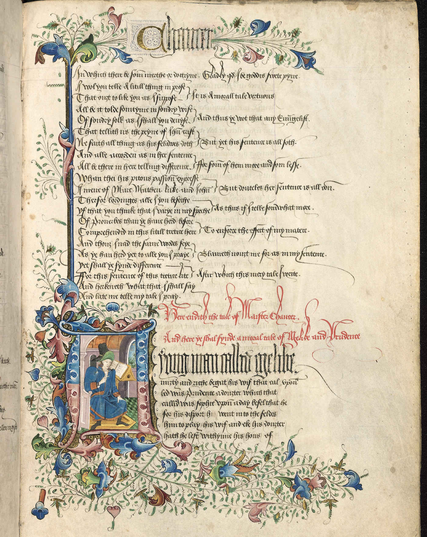
“‘A copy made around the third quarter of the 15th century of Geoffrey Chaucer’s The Canterbury Tales (1390s); at the division between’The Tale of Sir Thopas’ and ‘The Tale of Melibee’, the initial, border, running head and title help the reader to navigate the text.’ (MS. Rawlinson poet. 223, fol. 183r., courtesy Bodleian Libraries, University of Oxford)”; rubrication marks ‘the end’.
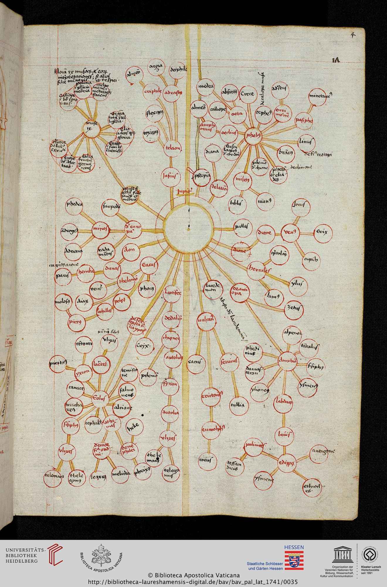
Genealogy of the god Jupiter, 1400s? (Vatican manuscript)
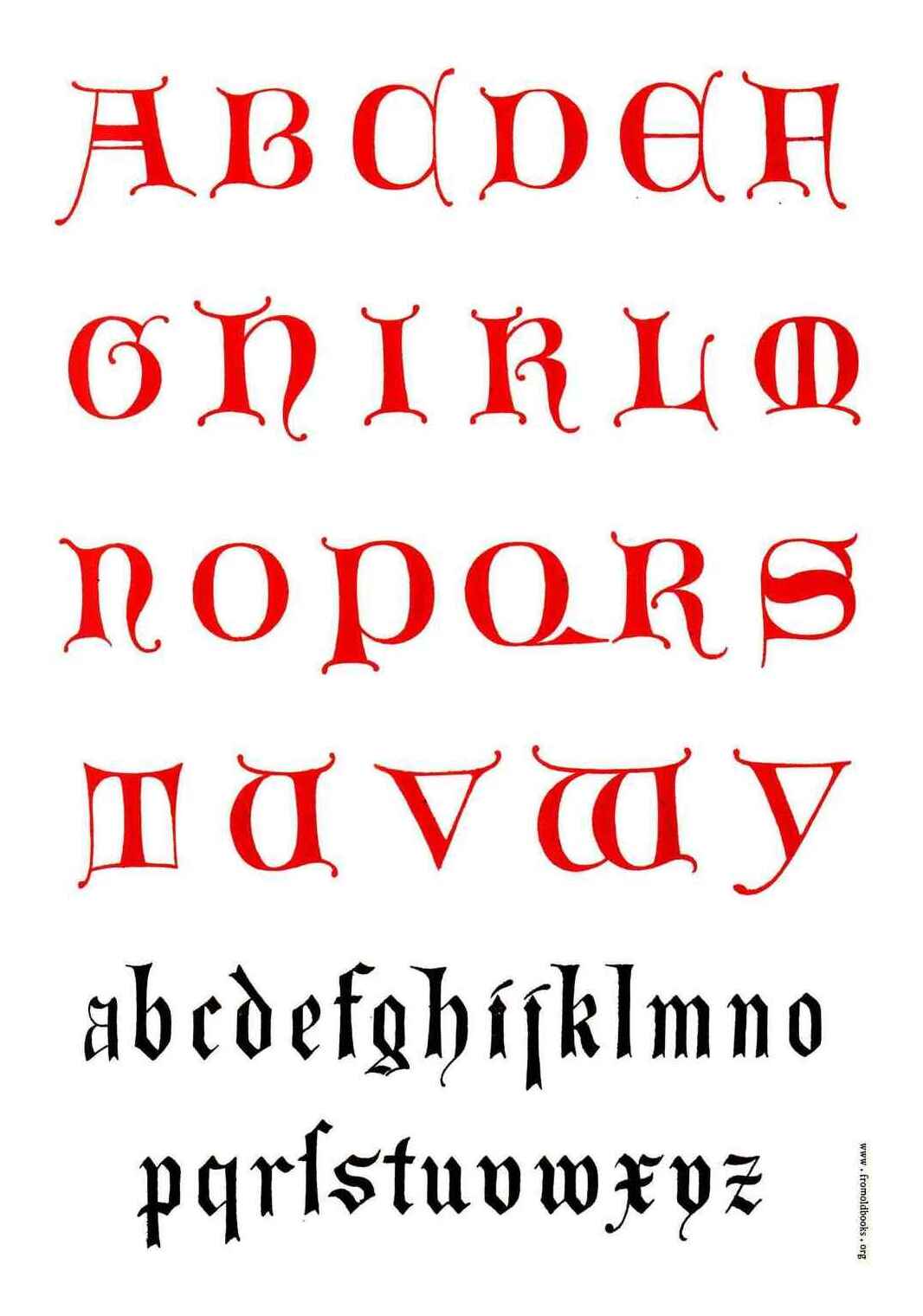
Plate 43, 14th century Lombardic alphabet, The Art of Illuminating As Practised in Europe from the Earliest Times, Tymms 186023, modeled after earlier Lombardic capitals
Plate 67, Tymms 1860
De viris illustribus page, printed 1474 by Nicolas Jenson; rubricated Lombardic capitals (initials), both red & blue
“Fig. 1—Munich, Bayerische Staatsbibliothek, Cgm 331, f.172r.”, 1480; on the Landshut Wedding
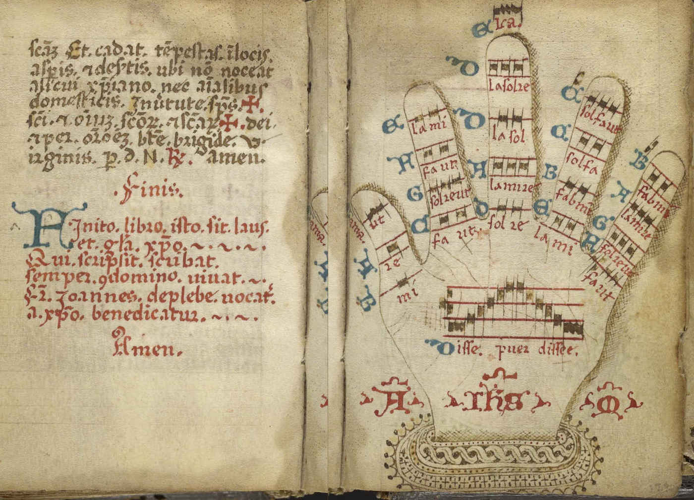
Italian monastic music manuscript explaining the Guidonian hand musical mnemonic, using rubrication for emphasis against the musical scales, falling back to blue for additional material; pg121–122 of Liturgical Manuscript (Ms. Codex 1248) dated 1450–1500AD.
1500s Spanish prayer book in Cambridge University Library, provided to Atlas Obscura for article on dirty books (note wax drippings on page).
Ambraser Heldenbuch (fol. 75v), c.1516; rubricated Lombardic capitals, both red & blue
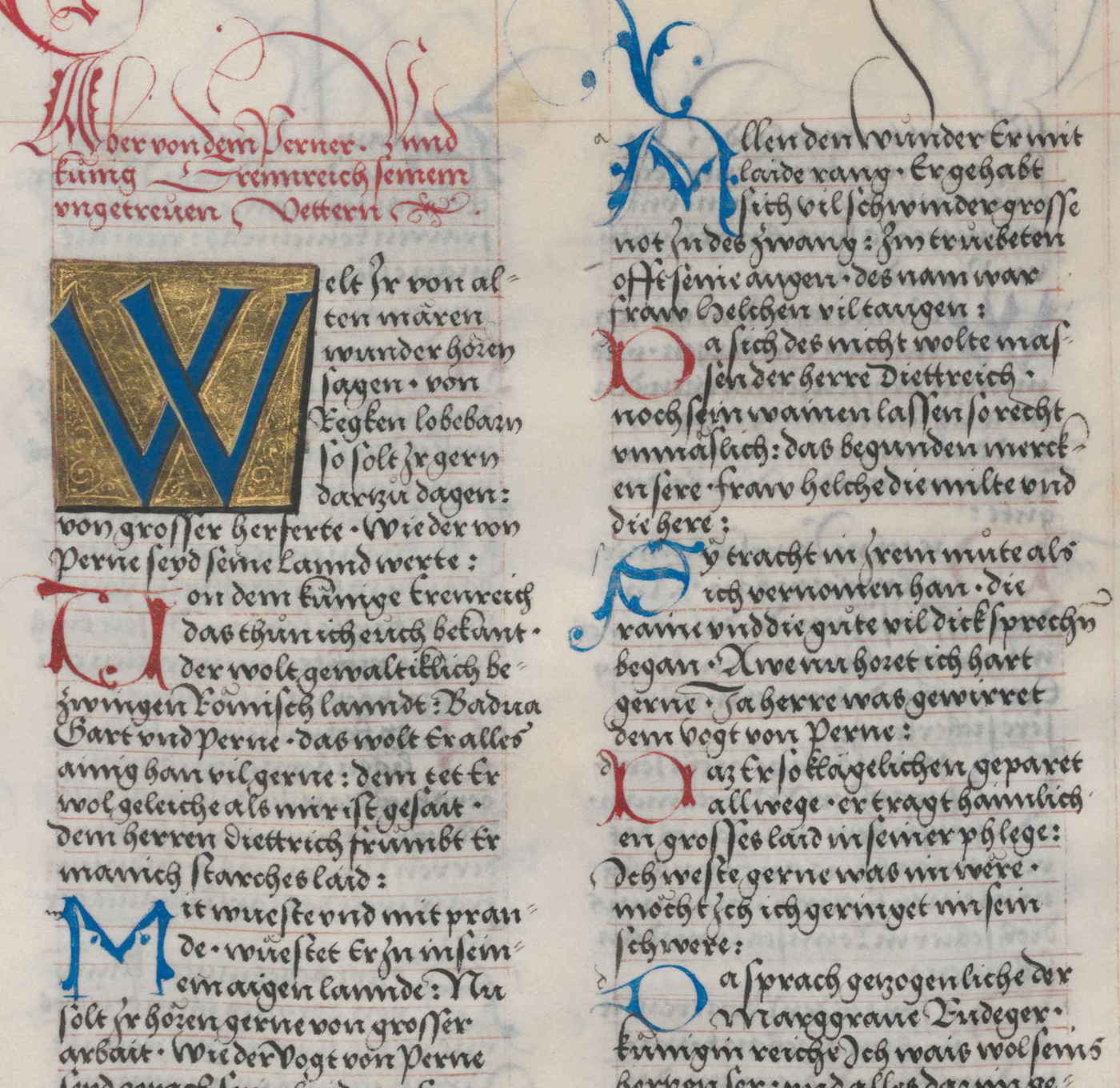
4 pages (pg49, 131, 151, & 188) from MSS Folger V.b.26, the anonymous Book of Magic, with Instructions for Invoking Spirits (1577–61583443ya?; transcription/translation)
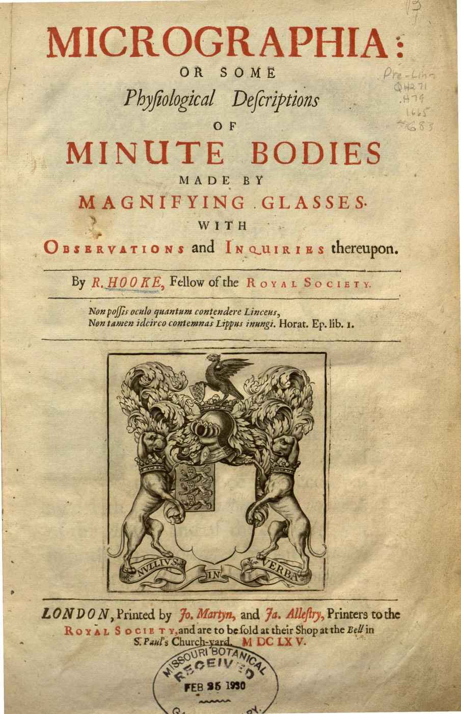
Cover of Robert Hooke’s Micrographia (1666360ya); fairly conventional book example, but interesting for its relatively systematic use of rubrication on cover to emphasize key nouns.
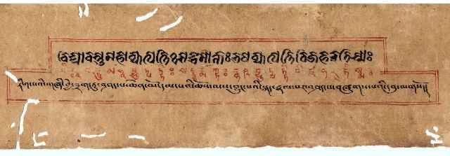
Title page of Tibetan manuscript of the Mahāvyutpatti (bilingual Buddhist dictionary), unknown date, scanned 200125ya by Chris Fynn
“Ink corrosion: iron gall ink has oxidized the cellulose, causing the paper to disintegrate. The manuscript is exhibited behind glass in a church in Evora, Portugal.” Photo taken 200719ya by Ceinturion, unknown manuscript date (possibly a gradual?)
External Links
“Calligraphy Letterform Album” (Johann Hering’s Kalligraphische Schriftvorlagen)
“Red, Black, White: Only drawings with red and black pens on white paper”/“Rubrication”, Daniel Friedman (art gallery)
“Filling in the Blanks: A Prehistory of the Adult Coloring Craze”, Morris & Carmichael 2019
“Red Ones Go Faster”, TVTropes
“Pixels and their neighbors: Finite volume”, Cockett et al 2016 (color-coding equations)
“The First Roman Fonts”, John Boardley
“A Pocket Cathedral”, Jaap Harskamp
“Type Matters: A Review”, James Puckett
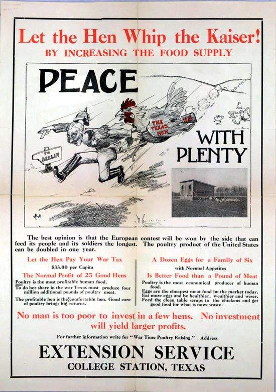
“Eat more cottage cheese: you’ll need less meat”, WWI food poster; Chicken poster (Smithsonian)
“Walbaum Type Specimen in high resolution” (on Justus Erich Walbaum’s Didone font)
“Reem Kufi Ink” (color Google Fonts)
Shall We Slay To Eat?, Kellogg 1899127ya (early vegetarian shock tactics)
Alfred Tennyson’s May Queen rubricated & illuminated by Alberto Sangorski
“Meander is a procedural system for generating historical maps of rivers that never existed”, Robert Hodgin (based on “Ancient Courses: Harold Fisk’s Meander Maps of the Mississippi River (194482ya)”)
“What Could Be Better? Pairing and Comparing the Scheide and Kane Copies of Fifteenth-Century Books”
“How Tiny Red Dots Took Over Your Life” (on smartphone notifications)
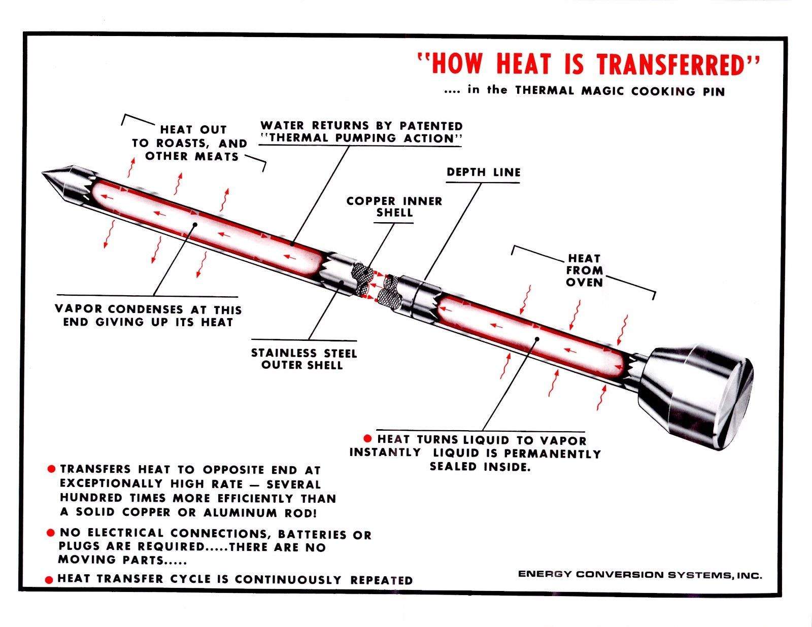
“How Heat Is Transferred” (1960s heat pipe for cooking)
“Rubrication Typora blog theme”, sohalsdr
“World’s First Classical Chinese Programming Language: Programs written in the language include one for fortune-telling from the I Ching” (homepage)
pg63, The Elements of Typographic Style (third edition), Bringhurst 200422ya:
↩︎…if the text, or a new section of text, begins at the top of a page with no heading to mark it, a little fanfare will probably be required. The same is true if the opening page is busy. If there is a chapter title, an epigraph, a sidenote, and a photograph and caption, the opening of the text will need a banner, a ten-gallon hat or a bright red dress to draw the eye.
Fleurons (typographic ornaments) are often used to flag text openings, and are often printed in red, the typographer’s habitual second color. The opening phrase, or entire first line, can also be set in small caps or in bold u&lc. Another excellent method of marking the start of the text, inherited from ancient scribal practice, is a large initial capital: a versal or lettrine. Versals can be treated in many ways. Indented or centered, they can stick up from the text. Flush left, they can be nested into the text (typographers call these dropcaps, as opposed to elevated or stick-up caps). If there is room, they can hang in the left margin. They can be set in the same face as the text or in something outlandishly different. In scribal and typographic tradition alike, where the budget permits, versals too are generally red or another color in preference to black.
When using white-on-black, what is the functional equivalent of red? A green? A blue? For all the traditional popularity among programmers of the classic monochrome monitor computer terminal green-on-black phosphor color scheme exemplified by the VT100—what I myself use—most dark mode designs I see currently seem to opt for a blue…↩︎
Tufte routinely uses rubrication in his graphs & sparklines to emphasize key numbers or points: his 200620ya Beautiful Evidence, for example, uses red on practically every other page, and his 2020 Seeing With Fresh Eyes appears to use even more. The use of proprietary Bembo fonts and rubrication mean that even Tufte ads are recognizably by Tufte. (This does pose some challenges for the family of Tufte CSS packages for various formats: there are now open-source Bembo fonts, but do red links really work online? Some Tufte CSS implementations like Eric J. Wang’s go for it, and others do not. The HyperTIES hypertext system apparently found red links “easier to spot [but] user comprehension & recollection declined”.) The sheer number of Tufte uses makes it difficult to select any examples for this gallery.↩︎
Byrne’s edition is beautiful and unusual enough that there are at least two attempts at recreating it worth looking at: Slyusarev Sergey’s “Fancy Euclid’s Elements in TeX” for PDFs; and Nicholas Rougeux’s “Making of Byrne’s Euclid” on how he created a beautiful interactive HTML version.↩︎
Is saying that rubrication works because it ‘maximizes contrast’ question-begging?↩︎
Use of primary colors like Byrne (yellow/red/blue) highlights an additional advantage of rubrication for emphasis: it avoids problems with the most common forms of color blindness—pretty much everyone can see red or at least see the contrast with red.↩︎
While exceptions have been found to this flowchart and the Berlin & Kay results questioned, the red results (that it follows black/white darkness terms, and precedes all other colors, and red is consistently red cross-culture) appear to be supported by the subsequent data.↩︎
“Why Red Means Red in Almost Every Language: The confounding consistency of color categories”, Nautilus:
↩︎It’s unclear, though, why our infant brains chunk colors at all. In a 201115ya study, a team led by researchers at Mount Sinai School of Medicine, in New York, found a mathematical formula that describes how inputs from the retina could result in the separation of colors into warm (white) and cool (black) tones, suggesting that the physical properties of our vision system may create natural “fault lines” in color space.10 Other researchers speculate that colors in our environments may cluster around certain shades, such as the bright red of blood and berries, or the solid green of fields and foliage. As babies, we may be primed to pick up on these statistical regularities.
Given how wasteful that seems, one might wonder about alternatives; there might have been earlier ones, leading to the Purple Earth hypothesis. Are there better chlorophylls which could absorb more light?
Possibly, the bacteriochlorophyll absorb light that plants cannot, and are one of many suggested ways to improve photosynthesis efficiency. But there may be some good reason for green being blocked, like being too energetic for biological cells to handle safely.↩︎
Curiously, although Apple did make heavy use of rubrication at some times, like its 199531ya Apple Macintosh Performa 600 Series User Manual, post-1997 Apple appears devoid of that technique. Did Steve Jobs not like red?↩︎
This is likely from Mark Lombardi: Global Networks, ed Hobbs 200323ya, which demonstrates rubrication on its cover, and in an homage to the artist, uses rubrication in the accompanying textual biography/discussion of Lombardi; it also uses sidenotes. Lombardi, incidentally, read Tufte’s Envisioning Information, and Richards et al 200323ya speculates he was influenced by the Uboku Nishitani calligraphy example (also reproduced on this page)—personally, I suspect the typewriter & other rubricated diagrams were more influential. His use of yellow backgrounds is also Tufte-like.↩︎
The TikZ community uses rubrication heavily, as can be seen in the TikZ example gallery. Examples which use red:
simple examples: “Rainbows—Sun ray entering a rain drop”/“The 3dplot package”/“GNUPLOT basics”/“Annotated manipulator”/“Andler optimal lot-size”/“Polarization state of light”
Another computer-generated work, Liza Daly’s Seraphs Voynich Manuscript parody, makes elegant use of a faded red font on sepia background with (usually) black illustrations, but because it uses it for all text rather than emphasis, I exclude it.↩︎
Tufte notes (pg142, Visual Explanations 199729ya) that Youmans’s diagrams are “accompanied by a hesitant and apologetic text that carries on about the possibility of unduly literal readings, as if diagrams are chronically threatened by misinterpretations”.
However, Youmans’s textbook was aimed at schoolchildren, and appears to have been something of an innovation: he defends his “novel” “system of illustrating Chemistry” in his preface “To Students and Teachers”, and takes pains to include 2 pages of “Opinions of Distinguished Chemists and Educators”, testimonials that his “new Chemical Diagrams” are clear, correct, and conducive to childrens’ chemical education. When we consider the contemporary hostility of many educators to any kind of acceleration like SMPY or towards ‘young adult literature’, which might strain or damage fragile young minds, and reflect on how much greater such hostility may’ve been in 1856170ya, we cannot fault Youmans for attempting to preempt such criticism.↩︎
For a good discussion of the various translations’ virtues & vices and what Burton was trying to achieve, see “The Translators of The One Thousand and One Nights”, Borges 1936.↩︎
Like most technologies, rubrication can be used for evil (Nazi/Communist propaganda) as well as for good… Speaking of famous flags, why not The Red Cross? Because the Red Cross organizations’ emblem is based on figure-ground inversions of the flag of Switzerland, which uses only red/white, with no black ever employed, and this inversion approach has carried through to its alternatives like the Red Crescent symbol.
Similarly for the Japanese Rising Sun Flag or current flag of Japan—there do not appear to be any notable official flags employing black, aside from, unsurprisingly, the emperor mourning protocol (there are also obscure unofficial variants involving South Korea or the 193690ya February 26 Incident).↩︎
Hitler, in Mein Kampf, discusses the design of flags in detail, and notes of the Nazi flag:
↩︎And so, up to 1920106ya, Marxism was actually confronted by no flag which philosophically would have represented its polar opposite. For even if the best parties of the German bourgeoisie after 1918108ya would no longer consent to take over the suddenly discovered black, red, and gold flag as their own symbol, they themselves had no program of their own for the future to oppose to the new development; at best they had the idea of a reconstruction of the past Reich. And it is to this idea that black, white, and red banner of the old Reich owes its resurrection as the flag of our so-called national bourgeois parties…The present-day Reich, which sells itself and its citizens, must never be permitted to fly the black, white, and red flag of honor and heroes. As long as the November disgrace endures, let it bear its own outer covering and not try to steal this like everything else from a more honorable past. Let our bourgeois politicians remind their conscience that anyone who desires the black, white, and red flag for this state is burglarizing our past….The question of the new flag—that is, its appearance—occupied us intensely in those days…
…For this reason we had to reject all suggestions of identifying our movement through a white flag with the old state, or, more correctly, with those feeble parties whose sole political aim was the restoration of past conditions, as was proposed by many quarters. Besides, white is not a stirring color. It is suitable for chaste virgins’ clubs, but not for world-changing movements in a revolutionary epoch. Black was also suggested: in itself suitable for the present period, it contained nothing, however, that could in any way be interpreted as a picture of the will of our movement. Finally, this color has not a stirring enough effect either. White and blue were out of the question despite their wonderful esthetic effect, for these were the colors of an individual German state, and of an orientation toward particularistic narrow-mindedness which unfortunately did not enjoy the best reputation. Here, too, moreover, it would have been hard to find any reference to our movement. The same applied to black and white. Black, red, and gold were in themselves out of the question. So were black, white, and red, for reasons already mentioned, at least in their previous composition. In effect, to be sure, this color combination stands high above all others. It is the most brilliant harmony in existence.
…I myself, meanwhile, after innumerable attempts, had laid down a final form; a flag with a red background, a white disk, and a black swastika in the middle. After long trials I also found a definite proportion between the size of the flag and the size of the white disk, as well as the shape and thickness of the swastika. And this remained final.
…In midsummer of 1920106ya the new flag came before the public for the first time. It was excellently suited to our new movement. It was young and new, like the movement itself. No one had seen it before; it had the effect of a burning torch. We ourselves experienced an almost childlike joy when a faithful woman party comrade for the first time executed the design and delivered the flag. Only a few months later we had half a dozen of them in Munich, and the monitor troop, which was growing bigger and bigger, especially contributed to spreading the new symbol of the movement. And a symbol it really is! Not only that the unique colors, which all of us so passionately love and which once won so much honor for the German people, attest our veneration for the past; they were also the best embodiment of the movement’s will. As National Socialists, we see our program in our flag. In red we see the social idea of the movement, in white the nationalistic idea, in the swastika the mission of the struggle for the victory of the Aryan man, and, by the same token, the victory of the idea of creative work, which as such always has been and always will be anti-Semitic.
Nazi art & typography are associated with both blackletter & also with Paul Renner’s sans Futura. This is because the Nazis themselves were divided about what to use, although the “Antiqua-Fraktur dispute” ultimately came down on the side of more conventional Latin/Roman scripts & the Nazis banned blackletter from government use.↩︎
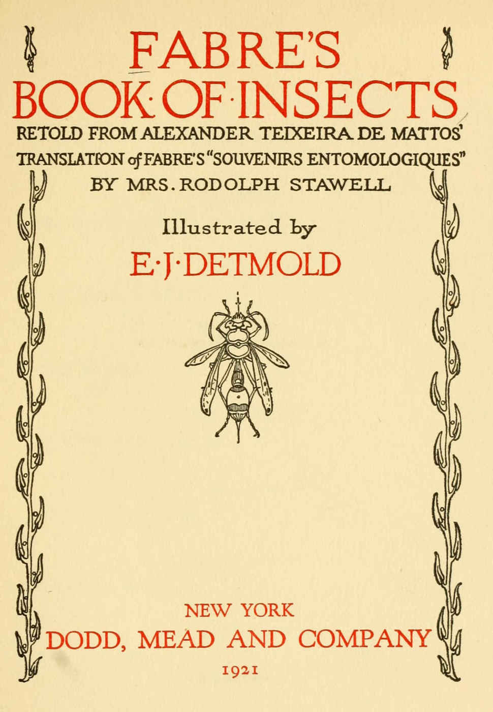
I was amused to discover Fabre’s cover while skimming Public Domain Review essays, as the name Fabre rang a bell—not long before, I had read “The Sphex story: How the cognitive sciences kept repeating an old and questionable anecdote”, Keijzer 201313ya, criticizing the Sphex anecdote which Hofstadter & Dennett so enjoy.
And imagine what phrase I ran into within the first screens of reading Fabre’s cat essay, but “red-letter day”! The Baader-Meinhof effect‽↩︎
1923 translation of Bohrs Atomteori, al-menfatteligt fremstillet by Lindsay & Lindsay, color plates apparently in original; note that several of the scans/e-books are incomplete & omit diagrams. The Bohr theory was unsuccessful; for background on the creation of this radium diagram, see Kragh 2013.↩︎
Isotype made heavy use of red as its default second color; see pg41–50, where the justification is primarily that many printers may only do black & red. Incidentally, I use the WP photo here instead of the online scans because they are low-resolution and the original copies may have been faded, so they do not convey the sharpness of the printing & the brightness of the red ink.↩︎
MS 35254 also offers some extraordinarily elaborate historiated initials—so much so I didn’t realize until reading the captions!↩︎
Tymms 1860166ya includes many interesting color plates which use red starting on pg104, but most I wouldn’t consider as examples of rubrication, specifically.↩︎