My third post about typography in sci-fi has been gestating for a while now. Indeed, it’s been slowly taking shape – you might say it’s been forming itself inside of me – for really quite some time.
I’m delighted to say that it is now ready to burst forth from my allegorical chest, and to spatter allegorical typographic blood all over your allegorical faces. Welcome to Typeset In The Future: The Alien Edition.
The opening credits for Alien are nothing short of a typographic masterpiece. You can watch them in their entirety on the Art Of The Title web site, but here’s the general gist: a slow, progressive disclosure of a disjointed, customized Futura reveals the movie’s central theme over 90 seconds of beautifully-spaced angular lettering.
UPDATE: Susan Bradley (and others) have pointed out that this is much more like Helvetica Black than Futura. I’d based my original claim on Art Of The Title’s interview with the creators, despite a mismatch when I checked it against Futura myself. However, after a detailed comparison with Helvetica Black, I tend to agree with Susan. Thank you for the correction!
(Before I show you how it looks, I should provide a sizable caveat: I got a lot of grief following my Moon article for spoiling that movie’s central twist. So, if you don’t want to know the extra-terrestrial nature of the central antagonist in Alien, close your eyes now.)
Here we go.

Can you tell what it is yet?

It’s looking pretty angular.

And beautifully mirrored, at least along the y-axis.

Well, that was unexpected. I’m still none the wiser, mind.

WAIT A MINUTE. I might have an idea where this is going.

Oh, no, I was wrong. Still, that new line is almost certainly completing the middle part of a W, yes? (It certainly looks like two strokes and a crotch, at least from where I’m standing.)
WAIT ANOTHER MINUTE. Crop. Zoom. Enhance.

I hate to say it, but a little bit of the bar on this capital A (for it is he) has been allowed to bleed out into the unfolding titles. Talk about typographic spoilers. Look really closely and you’ll see what I mean:

That’s totally going to become a capital A, isn’t it? God, that’s ruined everything. In fact, I wouldn’t be at all surprised to discover that this entire credits sequence is going to end up spelling the word ALIEN:

Right you are, then. Let’s get on with it. (For those of you with your eyes closed to avoid spoilers: you can open them again now.)
After all that Futura-ish beauty, it’s a little disappointing to see a follow-up card introduce commercial towing vehicle The Nostromo with some slightly fuzzy Helvetica:

This title card from Alien is an example – possibly the Ur Example – of a popular sci-fi trope, the Foreshadowing Inventory. Seven crew, you say? Hmm. Seven. Let’s hope nothing disastrous happens to them, one by one. And their course is set for a return to Earth, eh? Well, I’m sure that’s the likely outcome for this particular story.
The Foreshadowing Inventory crops up in other movies too, such as the opening card from Moon:

A crew of one, you say? And there for only three years? Interesting. I wonder if these facts will turn out to be significant to the plot?
A final point on Alien’s Foreshadowing Inventory: hmm. That’s a nice twenty million tons of mineral ore you’ve got there. It would be a shame if something were to… happen to it. (We do like a good bit of typographic foreshadowing here at TITF.)
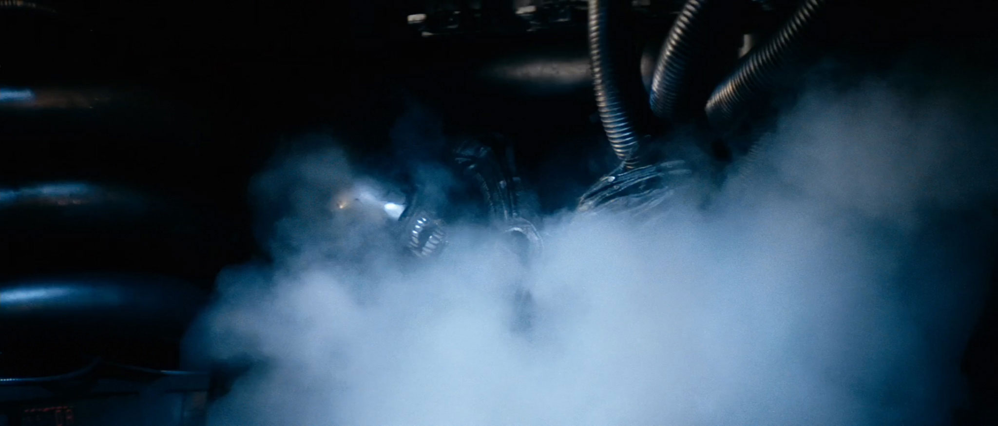
Let’s take a look on board the Nostromo. The opening shots of the craft give some tantalizing glimpses of its wall-based iconography:


These icons are the work of cinematic design legend Ron Cobb. He named them the Semiotic Standard For All Commercial Trans-Stellar Utility Lifter And Heavy Element Transport Spacecraft. The production sketches below are from Cobb’s 1981 collected works, Colorvision:
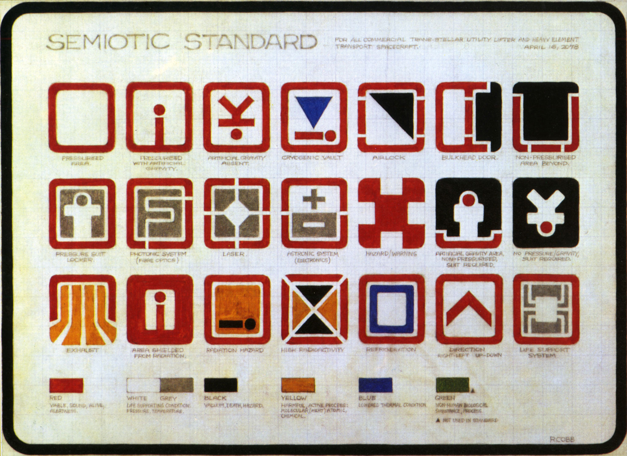

My favorite is #23 – “COFFEE”:

“Semiotics”, of course, is “the study of signs and symbols, and their use or interpretation”. (I could just as easily have called this blog Semiotic-matic.)
You might have noticed that these icons bear a striking resemblance to the rounded rectangles used for modern app iconography. Indeed, design company The Iconfactory has recreated the Semiotic Standard as a beautiful set of iOS app icons. It could be argued that Cobb provided the inspiration for rounded-rectangle iconography some 28 years before Apple made it the standard on the iPhone. (Although tegestologists may well argue their case too.)
A quick glance back over the iconography of Moon shows that (like many sci-fi movies) it owes a large debt to the Semiotic Standard:

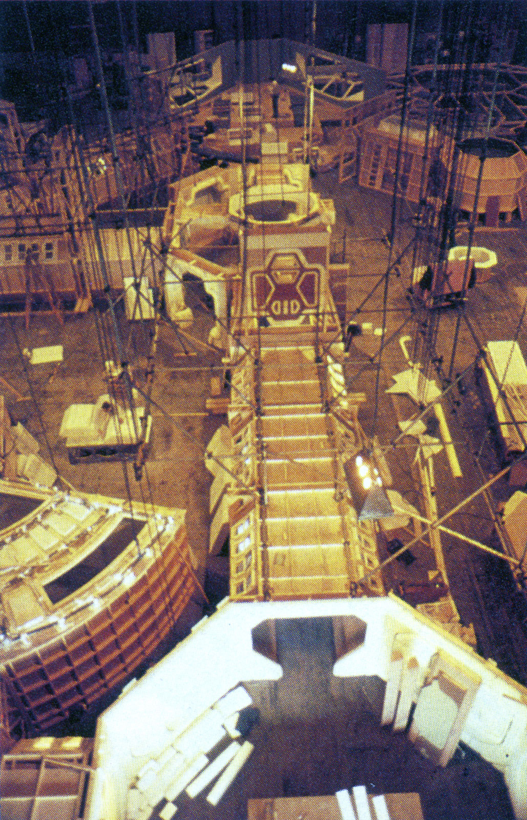
On the subject of iconography: the set of Alien was actually built as a single sprawling series of interconnected rooms, just like the set of Moon. Here we have the Nostromo‘s Control Room at the top of the photo, connected to the Central Corridor below:
I like to think that the Semiotic Standard served a practical purpose for the cast, helping them to navigate around the Nostromo as they made their way through filming.
In addition to the Semiotic Standard, Cobb was also responsible for the final design of the Nostromo itself. Let’s continue on our tour of his creation.
The crew are noticeable by their absence at the start of the movie, as reinforced by this Helvetica-monikered EMERGENCY HELMET:
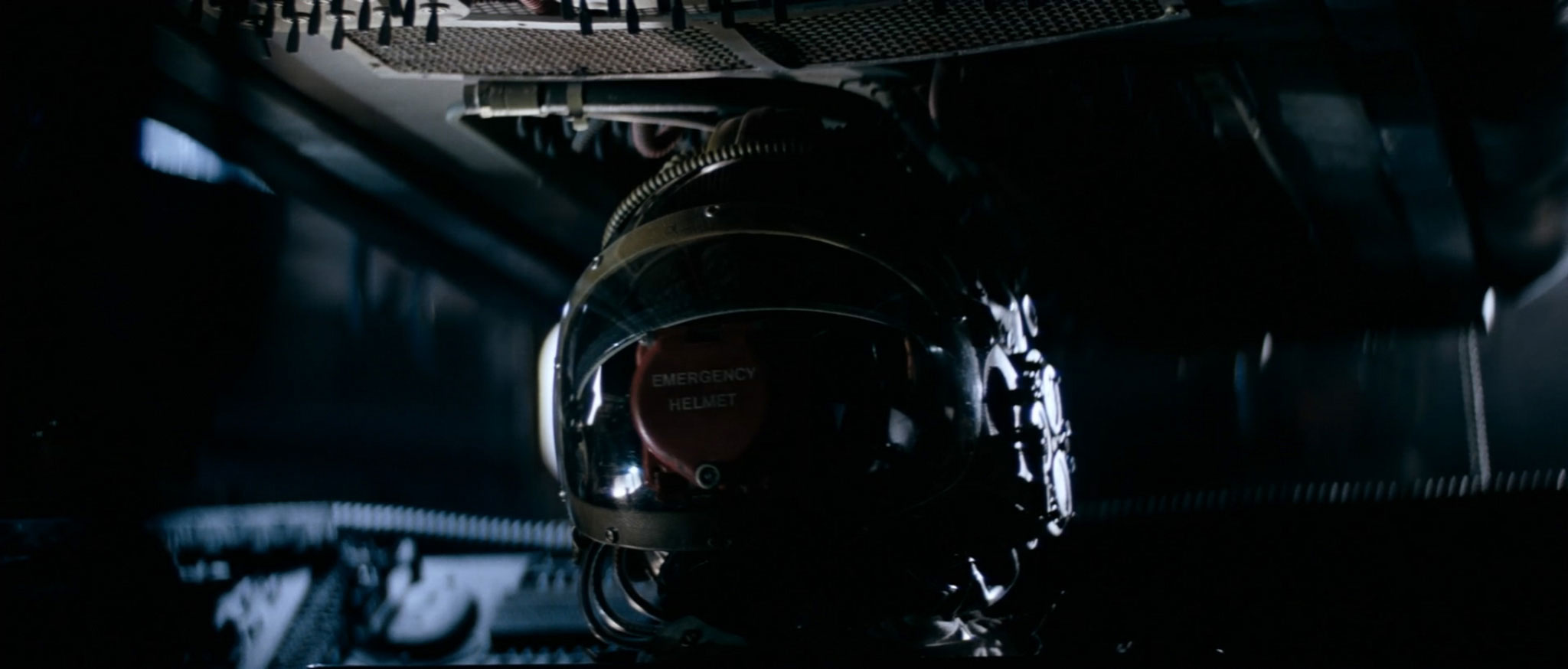
(At least, I say it’s Helvetica – the G is dead cert, but the second M looks more like Futura. Either way, let’s hope there’ll be no need for emergency helmets.)
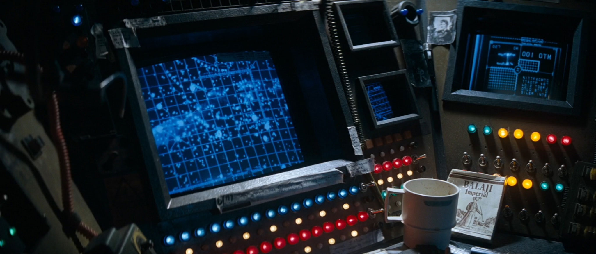
The Nostromo‘s computers blip into life unexpectedly. You can tell they are the Nostromo‘s computers, because they say Nostromo 180924609 on their boot screen. On this occasion, I don’t recognize the font:
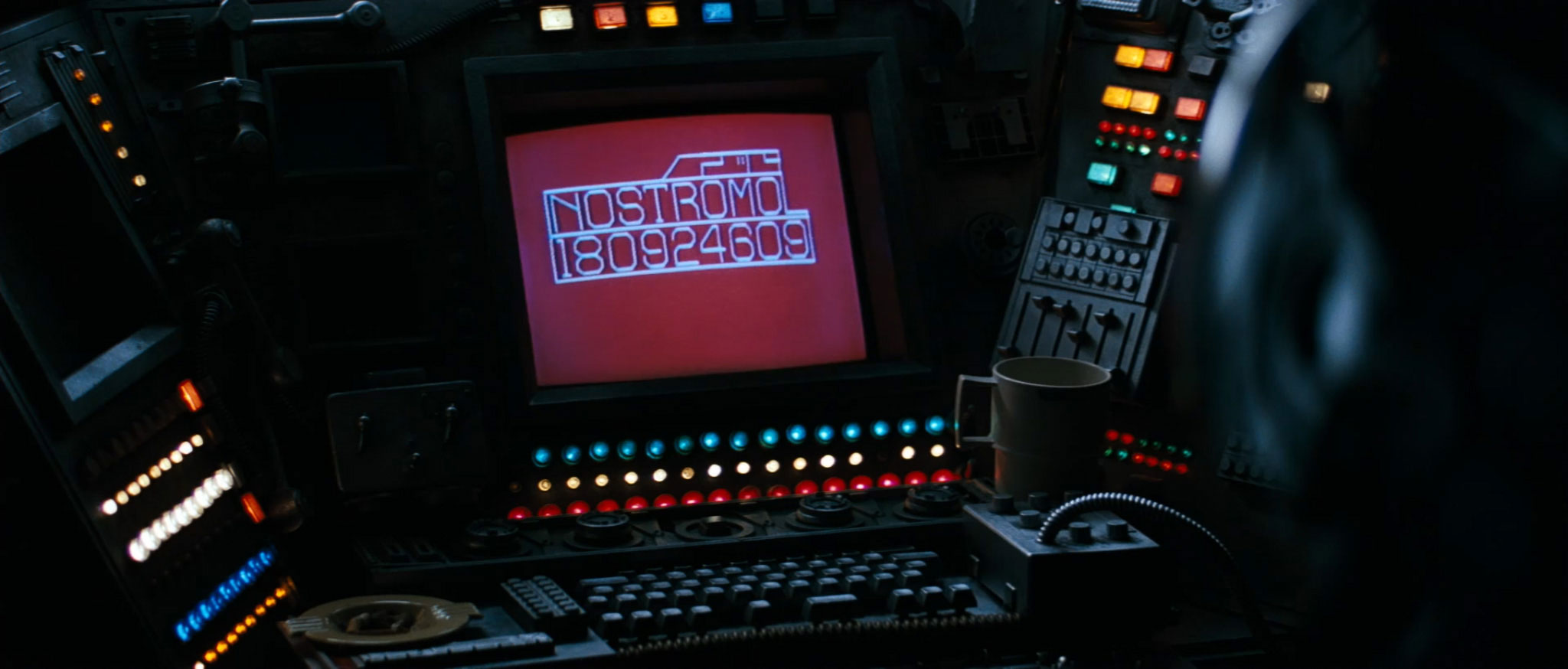
The ship’s registration number is contracted on the next on-screen display:

This screen lists the ship as the Weylan Yutani Nostromo 180246. (Eagle-eyed viewers will have spotted that subsequent Alien films name the company Weyland Yutani, not Weylan Yutani.)
Furthermore, this screenshot shows that the Nostromo has a refinement capacity of “200,000,000 tonnes”, and not the “20,000,000 tons” mentioned in the Foreshadowing Inventory. That’s not just a factor of ten out – it’s also an entirely different unit of measurement.
UPDATE: Several commenters have noted that potential cargo capacity isn’t the same as current cargo, and that the refinery might just be mostly empty. A confession: I realized that myself when writing the article, and was rather hoping that no-one would pull me up for it. Given the audience for this blog, I really should have known better. There’s still the more fundamental problem of tons vs tonnes, however, as I go on to explain…
If you’re familiar with units of weight, you’ll know that a ton is 2,000 pounds if you’re American (known as a “short ton”), or 2,240 pounds if you’re British (known as a “long ton”). Conversely, a tonne (also known as a “metric ton”) is precisely 1,000 kilograms, which is roughly 2,205 pounds.
At this point, you might be thinking: “Wait – why are we talking about units of measurement? Why should I, Joe or Jane Blog-Reader, care about a typographic anomaly in the measurement units of a space-based computer?”
You really should know the answer to that by now. Typography is always important.
Here’s a map of all of the countries in the world that still use pounds as their primary unit of weight:

And here’s a map of all of the countries that don’t:

That’s right – pounds are used by Liberia, Myanmar, and popular space-faring nation The United States of America. And by no-one else AT ALL.
And here’s why you should care. In September 1999, NASA lost its Mars Climate Orbiter craft, ruining a mission that cost over 655 million dollars. The reason for this loss? One part of the Orbiter calculated propulsion in the Imperial system of pound-seconds of thrust, whereas another part used the international standard metric system of newton-seconds of thrust. This caused the Orbiter to gradually deviate from its intended trajectory, and disintegrate in the Mars atmosphere. (And the bit that worked in pound-seconds wasn’t made in Liberia or Myanmar.)
An aside for future-thinking Alien fans: should you ever need to nuke a planet from orbit – it’s the only way to be sure, after all – then don’t worry yourself about the number of megatonnes that your nuke’s detonation will create. Megatonnes aren’t based on any of the units mentioned above.
But enough about massive nuclear explosions – we won’t be needing any of those. Let’s get back to the Nostromo.
The ship’s crew awake from hypersleep, only to discover that they’re not on course for Earth after all. (Damn you, Foreshadowing Inventory!) Star charts are consulted, as they try to work out what’s going on:
This screenshot contains not one but four details of note. The first is some random text on the right-hand monitor screen:
Well, I say random… it may be significant that the text includes the phrase D GILER. (That name might sound familiar.)
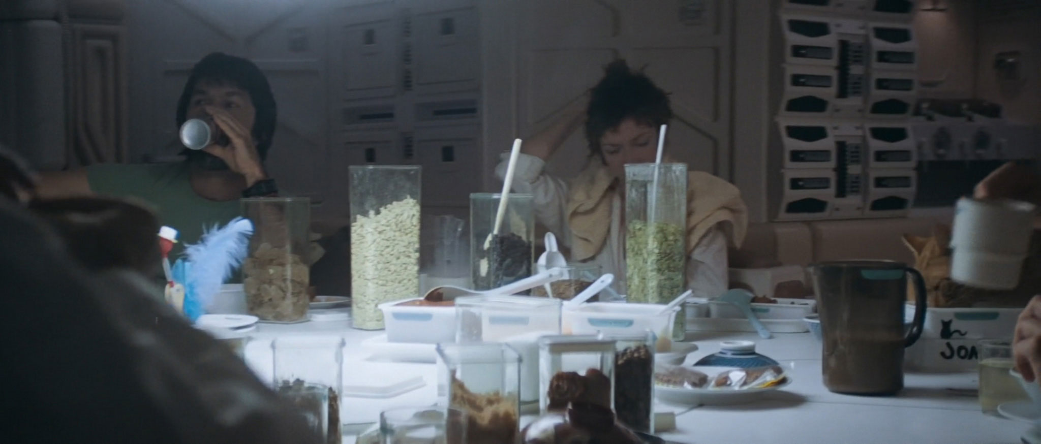
The second item of interest is that packet of cigarettes:
Although it’s less clear-cut than D GILER, it’s significant that the actor who played the alien in Alien was none other than 6′10″ Nigerian design student Bolaji Badejo. The similarity of name may just be coincidence, however.
The third item of note is a coffee mug bearing the Weylan-Yutani winged logo:
This logo appears everywhere onboard the ship. Indeed, the Balaji Imperial cigarettes are about the only items that are not corporately branded. Clothing, containers, mugs, even cat dishes all display the corporate logo…
…as do bowls, storage drawers, and water dispensers:

Hell, even the beer is branded:

That’s a 440ml can of Original And Genuine Extra Strong Weylan Yutani Aspen Beer. One thing’s for sure – the Weylan-Yutani Corporation has employee wellbeing as their primary concern. (Yes, just like Lunar Industries.)
The fourth item of note in that screenshot from earlier is the monitor screen itself. A perennial challenge for any sci-fi film is to find a visual style that remains futuristic as technology marches on. The Nostromo‘s production design is a perfect example of used future chic, but shows the challenge of using physical display technology from the 1970s alongside film-based special effects.
Early in the film, we cut from a blurry, low-res shot of an Elite-like descent trajectory:

…to a hi-res animated display of the same descent:

Similarly, when Dallas (the ship’s captain) visits the Nostromo’s master computer (known as “MU/TH/UR”) to find out what’s going on, we cut from a low-res 4:3 CRT display:
…to a hi-res 16:9 text animation more reminiscent of The Matrix:

However, I’ve come to the conclusion that it’s not the disconnect between these displays that’s at fault. Rather, it’s the presence of those cathode ray tube displays at all:

That curved screen shape immediately shouts “legacy technology”. In 2014, seeing a curved CRT display in a futuristic spacecraft, rather than the ubiquitous flat LCD screens of today, feels somewhat archaic. This was a deliberate choice by the movie’s design team at the time – they chose everyday CRT screens rather than high-tech flat screen displays, to match the rest of the Nostromo’s beaten-up kit – but it dates the movie with hindsight.
Ironically, Stanley Kubrick’s 2001: A Space Odyssey was made 11 years before Alien, and yet has screen technology that looks substantially more futuristic. In the late 1960s, when A Space Odyssey was made, computer graphics simply weren’t good enough to generate the on-screen imagery needed for the Jupiter mission. As a result, all of the screen imagery was hand-animated, and projected onto flat surfaces:

The presence of flat screen displays throughout the Jupiter craft fits 2001‘s polished aesthetic perfectly, and makes the HAL 9000 displays feel futuristic even today.
(Interestingly, the makers of 2014’s Alien: Isolation video game actually reverted to 1970’s video technology to make the game feel more like the original movie. The game’s menu screens were first rendered in software, then recorded on to VHS video tapes, played on a CRT display, filmed, and imported back into the game.)
One final typographic point of note: the on-screen display font for MU/TH/UR appears to be an optically stretched version of City Light:


This is most unusual, if only for being a serif (rather than sans-serif) on-screen computer font in a sci-fi movie.
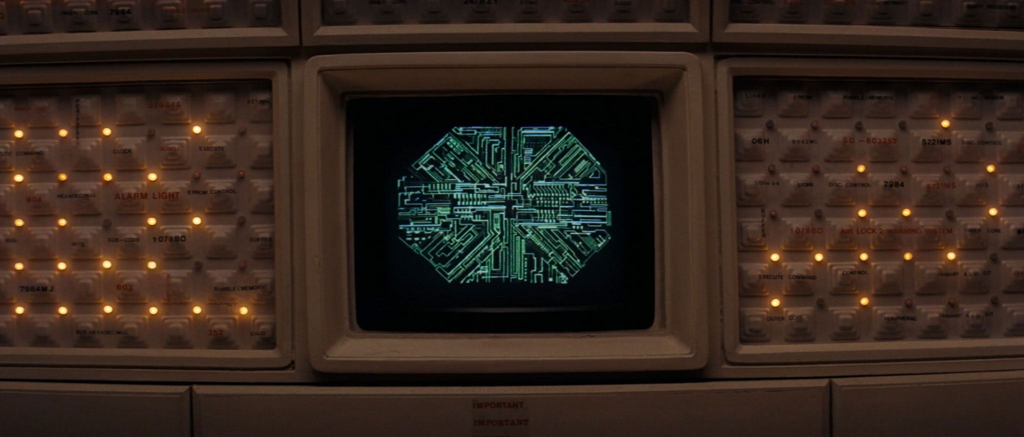
As the movie unfolds, MU/TH/UR’s behavior reinforces the TITF trend for untrustworthy space-based computers. We discover that MU/TH/UR is a Series 6000:
I’m sure that the 6000 Series has a perfect operational record – at least, going by the Gerty 3000 in Moon and the 9000 Series in 2001. I’d trust both of those computers until the end of my life.
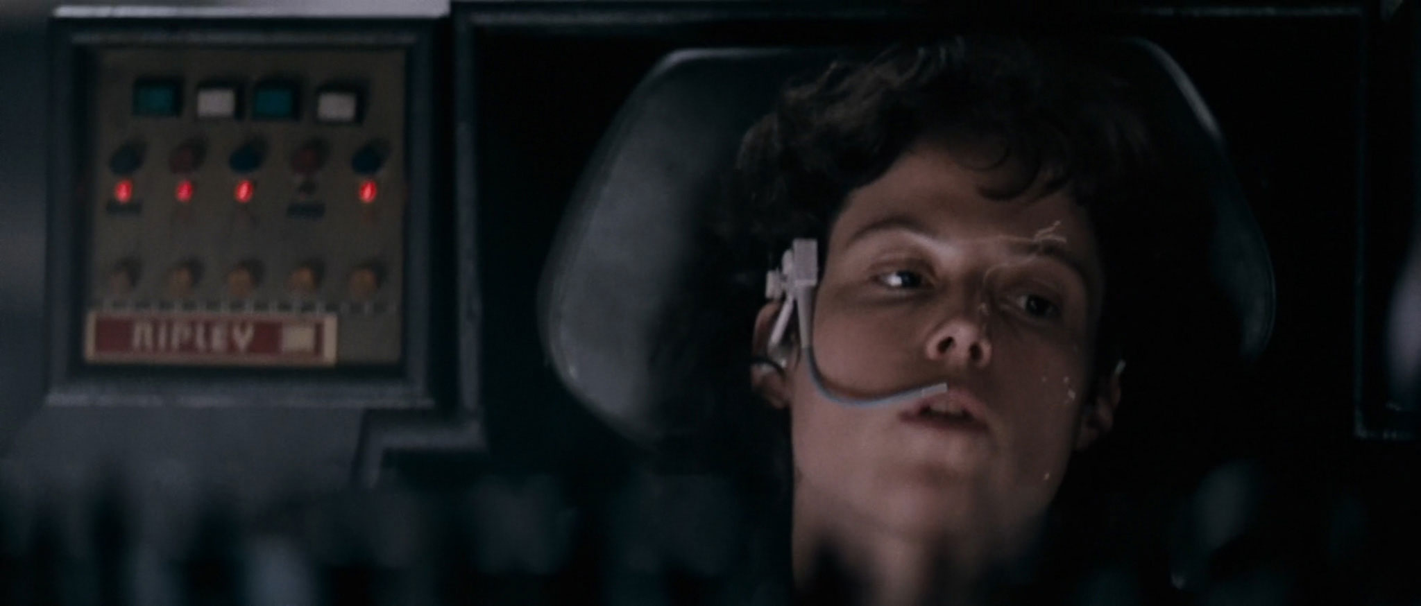
Later in the movie, Ripley interrogates MU/TH/UR to find out the truth about the alien. MU/TH/UR’s response is predictably chilling:

Damn you, untrustworthy space-based computers!
(A final bit of MU/TH/UR trivia: following my Moon post, conceptual designer Gavin Rothery told me that Moon‘s master computer was named “Old Man” – British slang for “father” – as a sneaky tribute to Alien. Nicely done, sir.)
In addition to the CRT displays, there’s a second aspect of Alien’s design that clearly dates the movie to the 70s. For the most part, the movie’s costume design displays a timeless aesthetic for a working interstellar haulage crew:

The exception is Captain Dallas’s jacket, which has the word “NOSTROMO” written on the back in Pump Demi:


Pump Demi was recently voted “Most 70s Font Of All Time” by the International Font Council. That’s not actually true, but it might as well be. It goes to show that it’s very hard to know which aspects of a design will still look futuristic in the future.
Pump Demi is also seen on the crew’s nameplates in the main Nostromo cabin. You can recognize it from its freaky capital Y, even when blurry:
But enough about Pump. We saw earlier how an international mishap with measurement units cost NASA $655m. Alien goes one step further, with possibly the most expensive on-screen localisation error in the history of science fiction.
You’d think that the Weylan(d)-Yutani Corporation, as a large British / Japanese conglomerate, would be familiar with the need for precise translation and localization. However, you would be wrong, sir or madam. Very wrong indeed.
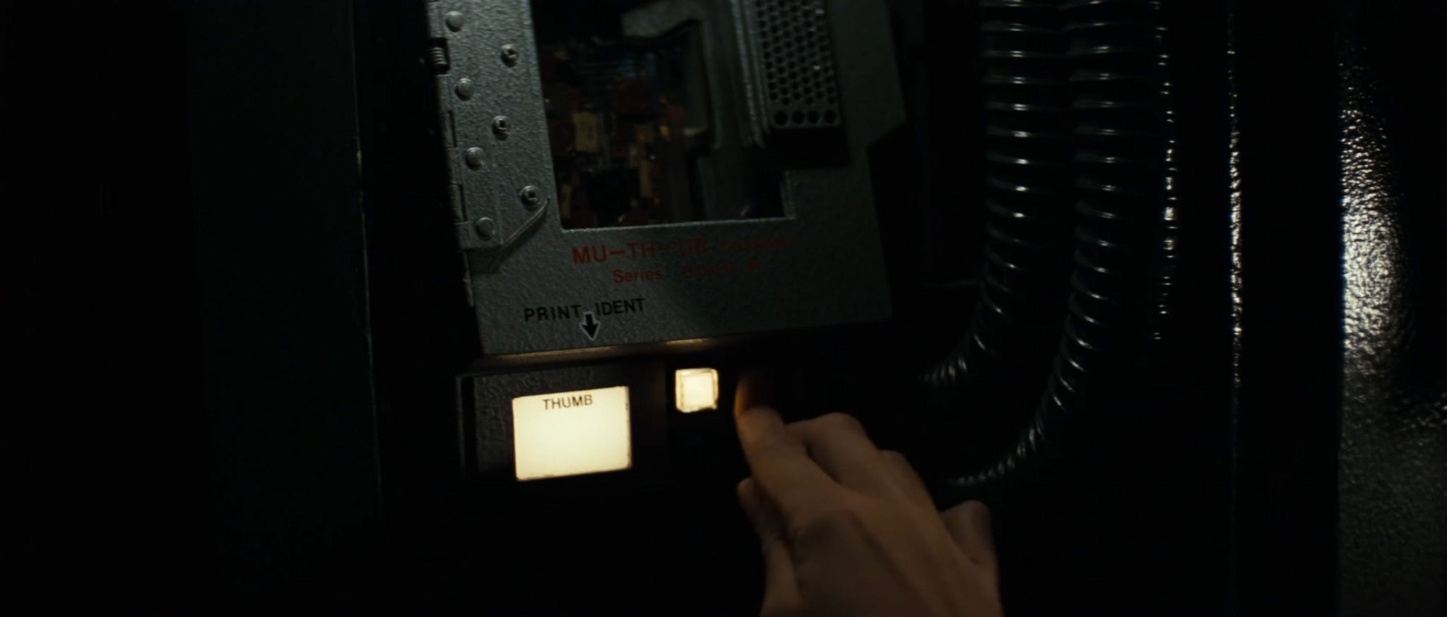
Let’s rejoin Ripley onboard the Nostromo. As the last of her crew-mates are slain by the lurking xenomorph, Ripley realizes that the only option is an Emergency Systems Override to self-destruct the ship. She presses the EMERGENCY button marked PUSH…

…pulls the EMERGENCY lever marked PULL…

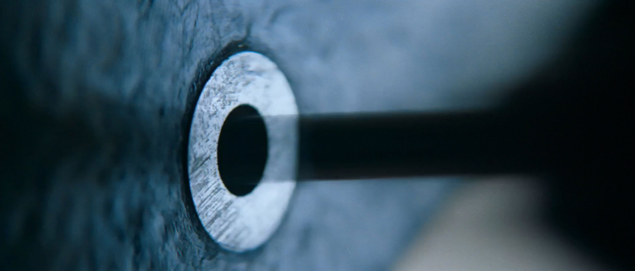
…unscrews the EMERGENCY screw…

…unscrews the other EMERGENCY screw…
…pulls two EMERGENCY levers, usefully marked ONE and TWO…
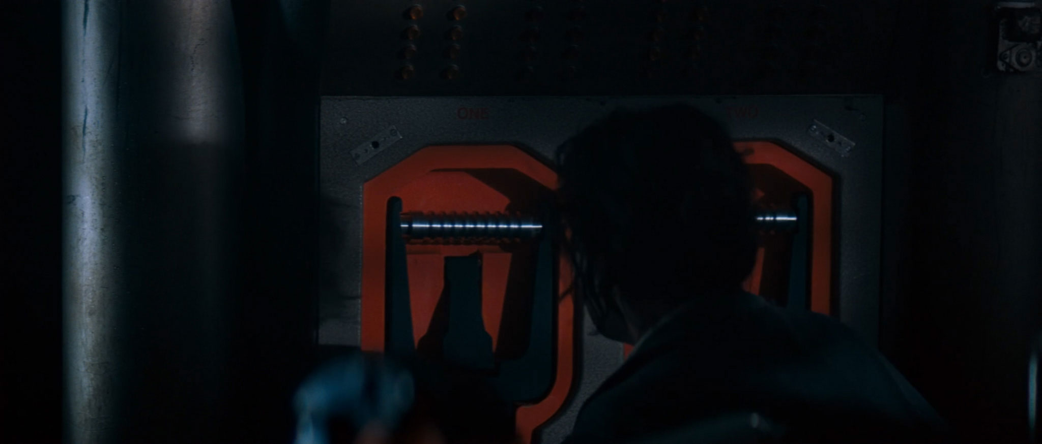
…and finally open the EMERGENCY hatch. (I’m not sure why there are four pulled levers in the background of this shot; Ripley only actually pulls two of them.)
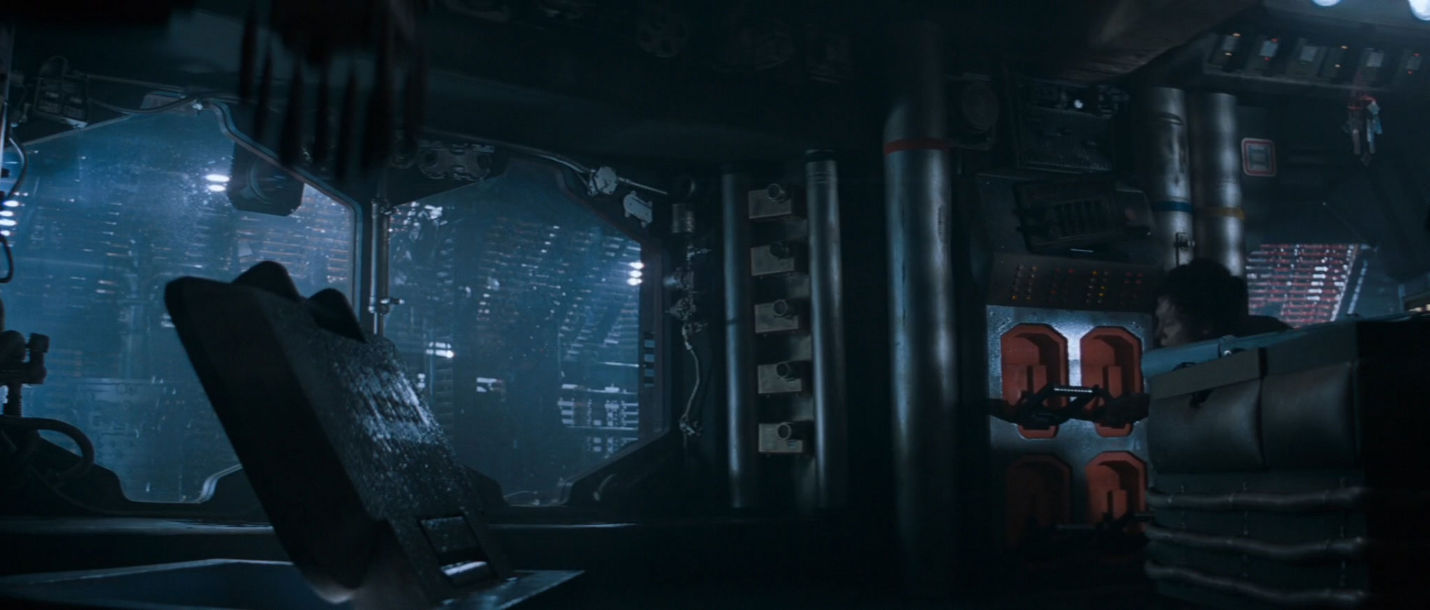
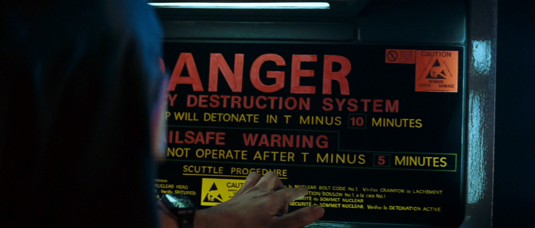
This hatch gives access to the Emergency Destruction System:
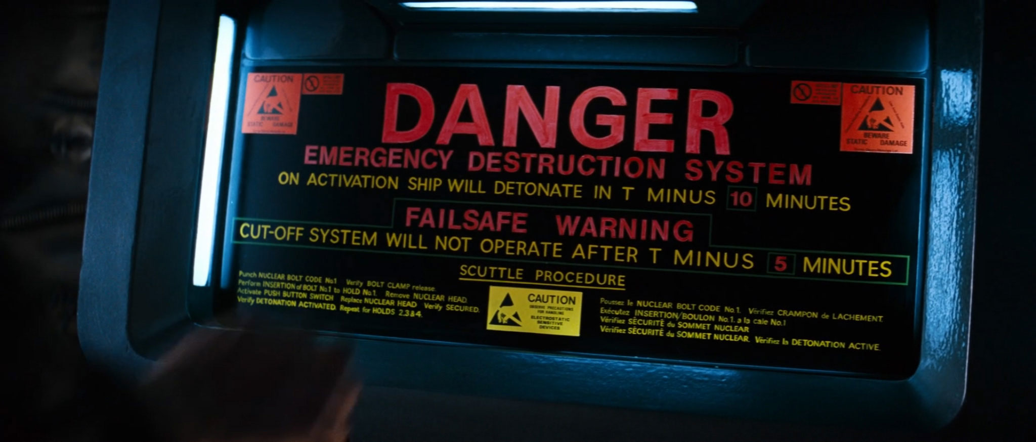
Let’s straighten up the screen to make it a bit more readable:
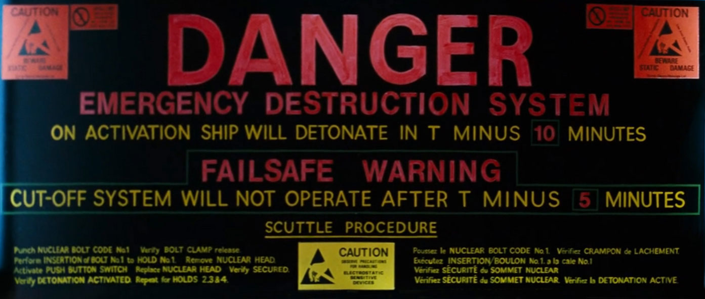
This beautiful (and by the looks of things, hand-painted) display contains yet more typographic foreshadowing. We learn that on activation, the ship will detonate in T minus 10 minutes. Moreover, the Failsafe Cut-Off System will not operate after T minus 5 minutes.
With those surely insignificant facts typographically established, let’s take a look at the scuttle procedure itself. (For the uninitiated, “scuttling” is the nautical procedure of deliberately sinking one’s own ship.)
Perhaps unexpectedly, the Scuttle Procedure instructions are presented in both English and French versions. Being American, Ripley naturally follows the English version. Here we see her tracing the English instructions with her finger:

Let’s take a look at those English instructions in detail:

- Punch NUCLEAR BOLT CODE No 1
- Verify BOLT CLAMP release
- Perform INSERTION of BOLT No 1 to HOLD No 1
- Remove NUCLEAR HEAD
- Activate PUSH BUTTON SWITCH
- Replace NUCLEAR HEAD
- Verify SECURED
- Verify DETONATION ACTIVATED
- Repeat for HOLDS 2, 3 & 4
Ripley wastes no time in punching NUCLEAR BOLT CODE No 1:

…and INSERTing each NUCLEAR BOLT into its corresponding HOLD:

(Okay, so she skips the “verify” steps. But, y’know: lurking xenomorph.)
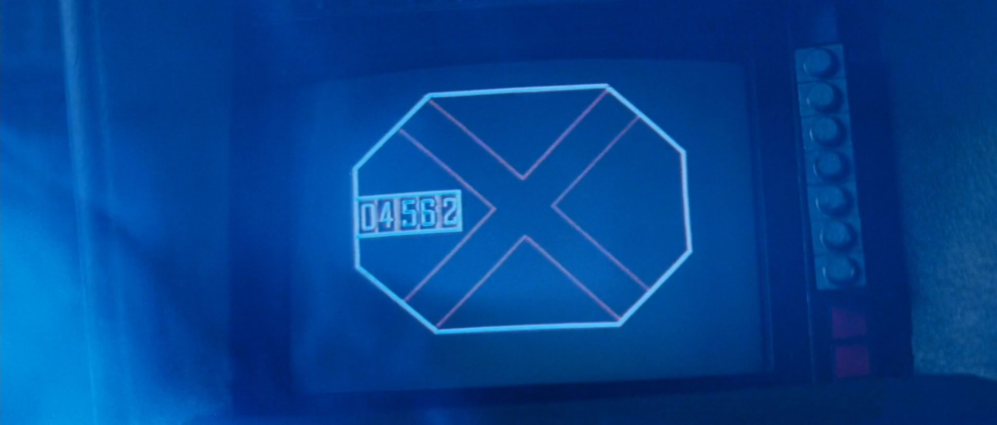
After the fourth NUCLEAR BOLT enters the fourth HOLD, an Ominous Clock starts counting down to T minus ten minutes:
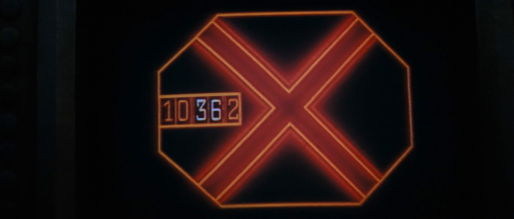
The Ominous Clock is accompanied by an Ominous Voice, which reminds us that “the option to override automatic detonation expires in T minus five minutes.” Let’s see how that one plays out.
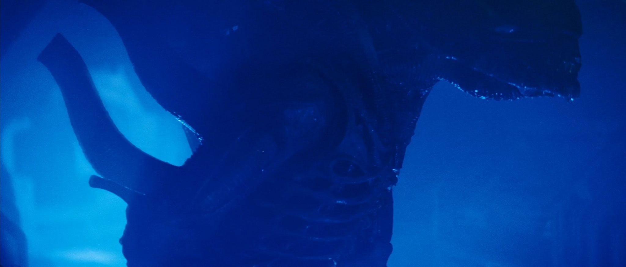
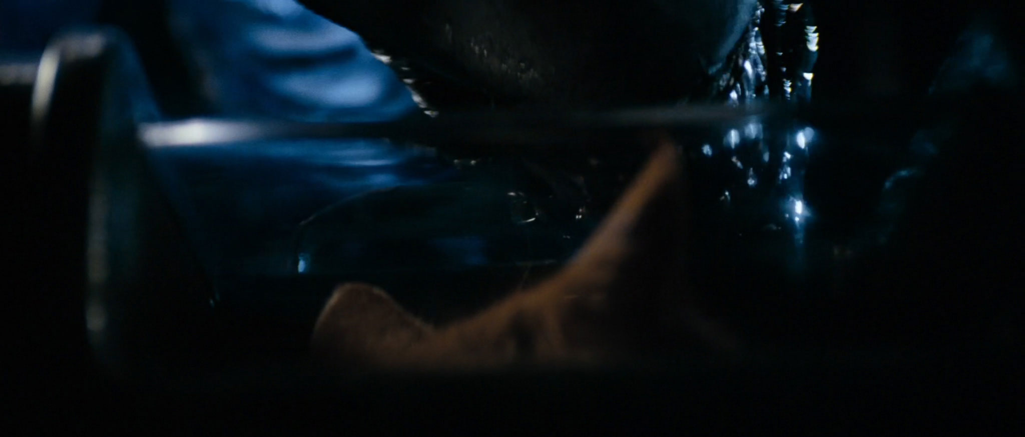
During the next five minutes or so, Ripley heads towards the Nostromo’s shuttle to make her escape, with her cat, Jonesy, in a handy industrial cat box. Somewhere along the way, Ripley encounters the alien, directly between her and the escape shuttle she’s trying to reach:
There’s clearly no way through, and the ship is about to detonate. In her panic, she drops Jonesy, leaving him to his alien fate:
Ripley dashes back to the Emergency Destruction Room, desperately trying to stop the self-destruct process and give herself chance to escape. As she arrives at the Emergency Destruction Room, the Ominous Voice counts down the final seconds to inevitable failsafe cutoff.
29…
28…
27…

Let’s pause that countdown temporarily, and take a moment to put ourselves in Ripley’s situation. There’s an alien xenomorph with acid for blood running around a dimly-lit spacecraft, picking off your co-workers one by one. You’re the sole remaining survivor. Your only form of defense is a single-canister flamethrower. You have thirty seconds to halt the self-destruct sequence for your spacecraft – and you’ve just gone and lost your cat.
I think it’s fair to say that this is a stressful scenario.

Perhaps this is why, on arriving back at the ship-scuttling instructions, Ripley follows the French instructions with her finger, not the English ones from before:
And this is where it all goes horribly wrong.
Let’s take a look at those French instructions in more detail:

- Poussez le NUCLEAR BOLT CODE No 1
- Vérifier CRAMPON de L’ACHEMENT
- Exécutez INSERTION/BOULON No 1 a la cale No 1
- Vérifier SÉCURITÉ du SOMMET NUCLEAR
- Vérifier SÉCURITÉ du SOMMET NUCLEAR
- Vérifier la DETONATION ACTIVE
Hmm… something something “NUCLEAR BOLT”… something something “SÉCURITÉ”… it certainly sounds plausible. But how do these compare to the English instructions we verified the efficacy of earlier?
For the first three steps, all is bon. But from instruction four onwards, things take a definite turn for the worse. The French instructions don’t mention anything about removing the NUCLEAR HEAD, activating the PUSH BUTTON SWITCH, or replacing the NUCLEAR HEAD. All three of which seemed pretty damn important when Ripley was doing them earlier.
The French instructions do at least remind us to check that things are secured. Indeed, just for good measure, they remind us to check them twice. This is commendable belt-and-braces stuff on an average day, but it’s not really what you want when you’ve got thirty seconds left before inexorable destruction.
In a further example of the famous French passion for safety, the instructions also ask us to verify that the detonation is active (which it won’t be, because we forgot to activate the push button switch). However, they completely neglect to mention that the process needs to be repeated for the other three holds.
In short: this is a localization disaster. I mean, it would be bad at the best of times – but we’ve just lost our cat to a xenomorph. We’re in no fit state to cope with dodgy French.
Thanks to this truly awful piece of translation, Ripley fails to abort the detonation process in time, and the five-minute countdown to total detonation continues:
Although we do cut briefly to a screen that still shows a countdown of over ten minutes:

The five minutes to destruction are typographically uninteresting. Ripley makes it to the escape shuttle with no sign of the alien. She even finds her not-dead cat along the way. With seconds remaining, her shuttle detaches from the Nostromo, blasting away just before either 20 (or 200) million tons (or tonnes) of mineral ore explode into tiny fragments:

Just before the explosion, we see a brief ENVIRON CTR PURGE display onboard the shuttle:

This screen might be familiar to fans of Ridley Scott’s other classic sci-fi movie, Blade Runner, which has a remarkably similar screen onboard a flying police vehicle:

There’s one more typographic anomaly to be found during the self-destruct sequence. Remember when Ripley was punching NUCLEAR BOLT CODE No 1 into that funny-looking keyboard? Well, it turns out to be a very strange keyboard indeed. Here’s the central panel for your closer inspection. I’ve Photoshopped a composite image from several frames, to make it easier to see all of the keys without Ripley getting her hand in the way:
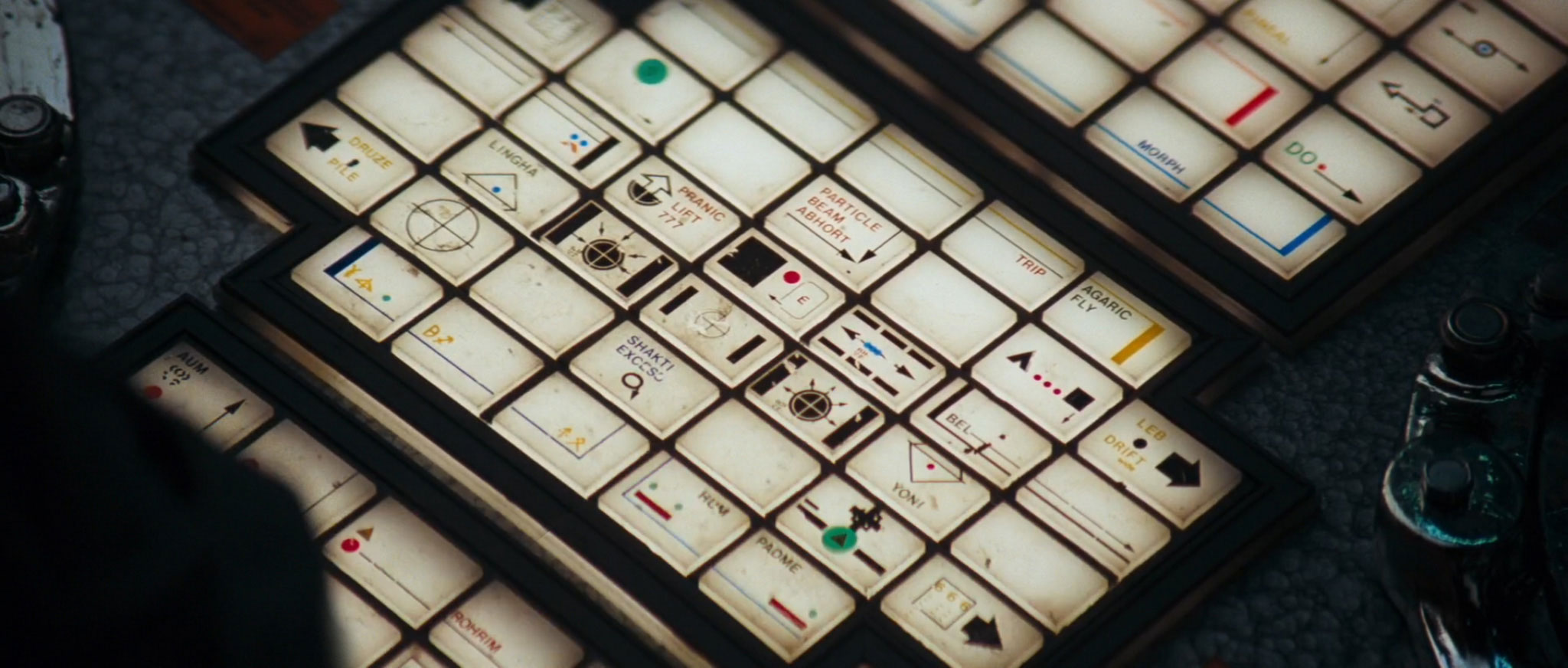
The first key of note is “PRANIC LIFT 777”:

Prana is the Sanskrit word for “life force”. It’s a cosmic energy believed to come from the sun, and to connect the elements of the universe.
We also have “PADME”, a possible variant of Padma, Sanskrit for “lotus flower”:

…and “LINGHA” (or Lingam), a representation of the Hindu deity Shiva:

Lingha is balanced by “YONI”, Sanskrit for “womb”:

Yoni is a symbol for the Hindu Divine Mother, an embodiment of Shakti, the concept of divine feminine creative power. This might explain why we also have a “SHAKTI EXCESS” button on the keyboard:

But perhaps the oddest key on the keyboard is this one in the top right hand corner – “AGARIC FLY”:

Now, Agaric Fly – or Fly Agaric, as it’s more commonly known – is a mushroom and psychoactive fungus known for triggering a hallucinogenic experience:

You might think this is an odd thing to be written on the keyboard of an emergency destruction system. You would be correct.
This might also explain why the key to the left of “AGARIC FLY” is labelled, simply, “TRIP”:

So why are all of these strange references on the Nostromo’s emergency destruct keyboard? Well, according to the Alien Explorations blog, designer Simon Deering needed some complex-sounding labels for the keyboard at short notice. He was reading The Secret Doctrine by Helena Blavatsky, a Russian philosopher and occultist, at the time of filming. Blavatsky’s book attempts to explain the origin and evolution of the universe in terms derived from the Hindu concept of cyclical development. Deering found his inspiration in its pages, and the Nostromo‘s odd keyboard was born.
Back to the action. Ripley is safely on board the shuttle, with no sign of the alien. But wait – just when we think all is rosy, it turns out that the damned thing has also stowed away on the shuttle. Gah!
Thankfully, this shuttle comes equipped with a system that pipes highly toxic and flammable SPECIAL GASES into the main cockpit at the press of a button:

It’s not immediately clear why this is a particularly useful or safe feature to have in a shuttle. Nonetheless, it certainly comes in handy when there’s an alien hiding in the wall.
Ripley starts by venting some Iodine Pentafluoride and Methyl Chloride. This doesn’t seem to have much effect. It’s a whole different matter when she tries the Nitrosyl Chloride, however:

According to Wikipedia, Nitrosyl Chloride is “very toxic and irritating to the lungs, eyes, and skin”. I don’t know whether the alien actually has any of these organs, but he definitely doesn’t like Nitrosyl Chloride one bit, and starts squealing like a frog in a roomful of cats:
(I’m going to ignore the fact that Nitrosyl Chloride gas is actually yellow. It’s working, and that’s all that matters.)
The gas finally forces the alien out into the open. A forward-thinking Ripley (who’s already strapped herself into a chair) opens the shuttle’s exterior door, and blasts the alien into space. Go Ripley!
In her final recorded message before hypersleep, Ripley notes that she is the sole survivor of the Nostromo. What she forgets to mention is that she has not once in the past two hours encountered any Eurostile Bold Extended.
We shouldn’t let this worry us as she settles down to sleep, however. There’s a ton of Eurostile in Aliens, so all will be made right. But that, my friends, is a story for another day.
For now: goodnight!
FUN FACT: An expanded version of this article appears in the Typeset in the Future book, available on December 11 2018. You can pre-order it now on Amazon.


Awesome! Thank you!
LikeLike
This is a masterpiece. Thank you!
LikeLike
you made my day. Love it to pieces. Looking forward to part two!
LikeLike
Brilliant blog post. Your intro had me laughing out loud on the city bus. I subscribed to your RSS feed.
LikeLiked by 1 person
This was wonderful to read! Thank you.
LikeLike
Thank you so much for this.
LikeLike
This is a fantastic analysis. One minor point, though: Sigourney Weaver is fluent in French…maybe that’s why she was able to follow those instructions to disengage the self-destruct?
LikeLike
No dude, the French instructions make no sense at all. And they are more Engl-ench than anything… But even for someone versed in English and French like me, it makes no effing sense (Google-translate it at your peril;).
LikeLiked by 1 person
We tend to call it Franglais or Frenglish: whichever side of the divide one resides.
LikeLike
Thank you for a terrific, interesting, and funny article. I consider myself a true fanatic of this film, and your research has now only increased my interest and affection for it. Bravo!
LikeLike
This was absolutely great, thanks!
LikeLiked by 1 person
I think some of what you are calling Helvetica might in fact be Univers. The cap G seem to lack the buck tooth of Helvetica.
LikeLike
You say that three countries use pounds as a measurement of mass. This is incorrect as pounds are used to measure weight.
LikeLike
Pound and kilogram are units of mass. Pound force and newton are units of force (or weight, a “downward” force).
LikeLike
Pounds are a measurement of weight, AND a measurement of pressure and/or thrust. For instance, the pressure in your car tires is measured in POUNDS PER SQUARE INCH (PSI)
LikeLike
Actually, mass is measured in pounds too–it’s that what we commonly call “weight” means something different in scientific contexts, where weight is the force of an object due to gravity. Pounds can be used as both a unit for force and for mass.
LikeLike
newton is used to measure weight – pounds, kilograms whatnot are used to measure mass.
LikeLike
Wonderful post, I can’t wait for the Aliens one!
LikeLike
Tough little ship. Stellar post.
LikeLike
Can you do the movie The Fifth element? These posts are amazing
LikeLike
Thanks for a great review of the Alien movie, one of my favorite movies since I was a kid. I like this focus on icons and typeface. What i find interesting is that the typeface of the computer mother has changed from the original version! I was looking forward to you commenting on what i still think it’s the most awesome sci-fi computer typeface ever conceived. I don’t know what the typeface is exactly, but something close to this http://www.letraset.com/products/404-Data-70/. Yet I can’t find any video nor picture to substantiate this… Google failed me. So I have to go into Dr. House mode here: my guess is that they changed it when digitizing the movie. This fits well with your observation that the computer screen suddenly turns into full hd 16:9 mode. I mean that did not exist in 1979 when the movie was released. Also, you must be born post VHS era since you being into typeface didn’t notice this. I’m sure you’ll find someone who can confirm this.
LikeLike
In the adventures of round rectangles, there was at least this significant step after Alien, but before iOS 7:
http://www.folklore.org/StoryView.py?project=Macintosh&story=Round_Rects_Are_Everywhere.txt
LikeLike
As always, a fantastically fun read! I had forgotten about the trick with the “A” in the opening sequence until you reminded me of it.
If you take suggestions, I hope you would look at the font usage in Gerry Anderson’s “UFO”, Stargate (either the movie or the Stargate SG-1 TV series) and “Iron Man” (especially the funky keyboard Tony Stark uses at his design console).
LikeLike
Brilliant stuff! Thanks for putting it together. Always loved the ALIEN title sequence.
LikeLike
Dave,
Thanks for this! I always wondered about the self-destruct mechanism. I love the use of practical working models throughout the movie and that was an amazing set piece.
Certainly, the design of the Nostromo makes it a character itself and one of the best sets in film history IMO.
LikeLike
Found this…uhmmm…sorry my brain is a bit fried now after this. Haha! Anyway, thanks to my HTC “blink-feed” I found this. It said “An analysis of Alien that’s terrifyingly, wonderfully geeky”. So I decided to take a look. And my measly mind was mush from the get go. And I love it!
I just wanted to comment and say this is amazing stuff and I’m glad I got to read this! I will definitely be roaming around your site reading more after I recover my brain cells!
LikeLike
This is clearly the product of many hours of devoted labour, yet it’s written with engaging, blithe humour. Wonderful. I really enjoyed it. Thank you.
LikeLike
I never noticed the ENVIRON CTR PURGE screen is in both films! Clever.
LikeLike
There’s more than just that in both films. The graphics denoting when the Nostromo detaches and drops away from the refinery are used in the same sequence when Decker and Gaff take off in the spinner.
LikeLike
I could gush profusely about the analysis and unique story commentary that you do for this film, but three words will do:
I love this.
LikeLike
I am a graphic design student who has a deep love of science fiction. This site feels like it was created just to give me something to read every night before bed. It’s not enough to say that this site is in my bookmarks. This site is now in my heart.
LikeLike
You and me both! I’m graduating next semester and I’d love to do something like Semiotic Standard for my final BFA exhibition. (I’m already prepared for my classmates’ inevitable weird looks.)
LikeLike
Facinating!
I love a bit typography, and a great crit of the film!
LikeLike
Really not sure how you find this interesting but if it’s what you love then go for it, I guess. This was a very in-depth… thing. I read the whole thing and I’m not really sure why.
LikeLike
That was a truly awesome, enlightening, and entertaining read. Great job – thanks a lot!
LikeLike
Another great piece. Love reading these, keep up the good work!
LikeLike
This is beautiful, thank you so much for this wonderful blog post! I love how you put in so many details and still manage to be funny AND link your sources. It’s rare to see websites that are that well researched.
LikeLike
Fantastic article, thanks.
LikeLike
Nice! Alien: Isolation also borrows the Semiotic Standard for its Achievement pictures.
LikeLike
That list of ‘Special Gases’ might as well be a Top Posts list from Derek Lowe’s wonderful Things I Won’t Work With chemistry blog.
LikeLike
I really enjoyed that write-up, thank you! I’m probably going to re-watch Alien this weekend .
LikeLike
I think this might be the single greatest blog post in the history of the Internet. Hats off to you, sir.
LikeLike
This. Was. Awesome! Please do Aliens!
LikeLiked by 1 person
You are amazing. One of my all time favorite movies is now richer and deeper. Thank you.
LikeLike
Nitpick much? This was utterly annoying & pompous. I’m guessing you don’t enjoy many movies do you?
LikeLiked by 1 person
Repeat after me: “If I don’t get it, it’s probably not for me.”
LikeLiked by 1 person
You are Dave Addey and I claim my … whatever that prize was.
LikeLike
Wow. Just wow. Phenomenal analysis. Excellent read.
LikeLike
” they chose everyday CRT screens rather than high-tech flat screen displays, to match the rest of the Nostromo’s beaten-up kit – but it dates the movie with hindsight.”
Huh? They didn’t HAVE flat screen monitors in 1979..you are aware this movie was made then right?!????
LikeLike
But you did read that 2001 used flat screens, albeit fake ones. And a quick look back at Star Trek shows a fair number of flat screens too.
LikeLike
The title card tells the actual cargo being brought back, the computer displays the cargo capacity. The capacity is larger than the actual cargo, so, no problem.
LikeLike
Hi Bryan! That’s an entirely valid point. I’ve added an update in the post above.
LikeLike
“It’s not immediately clear why this is a particularly useful or safe feature to have in a shuttle. ”
It isn’t safe at all, and that’s what makes it useful.
LikeLike
Surely you’re aware that Moon was filmed on Alien’s sets? Which might explain the similarities you found between them. To pay homage to that fact, the PURGE screen also shows up in Moon.
LikeLike
NOSTROMO mystery font : Here is what I found
O-S-M from
– FF Magda Clean Mono by FontFont
https://www.fontfont.com/fonts/magda-clean-mono
N inspiration
– Teco Sans Thin by Valery Zaveryaev at Gaslight
http://www.linotype.com/fr/1129557/TecoStdSansThin-product.html
– Carbon C6 by Anuthin Wongsunkakon at Katatrad or CarbonPlus
https://www.myfonts.com/fonts/behaviour/carbon-c6/
http://www.myfonts.com/fonts/cadson-demak/carbon-plus/light/
– AF PAN by Robert Green at ACME Collection
http://www.acmefonts.net/popup.htm
T from
– from Teco Serif Thin by Valery Zaveryaev at Gaslight
http://www.linotype.com/fr/1129595/TecoStdSerifThin-product.html
R at Bitstream
– like the one from Space
http://www.azfonts.net/load_font/space_bd_bt_bold.html
– like the one from Plotta at T-26/Identikal
http://www.t26.com/fonts/286-Plotta
LikeLike
Absolutely brilliant post.
LikeLike
Although it seems odd to mix the measurement units, there is no inherent conflict between the inventory stating that they have 20,000,000 tons of ore on board and the stated CAPACITY to refine 200,000,000 tonnes. The only question that raises is why are they returning to Earth with a load of less than 9% of their capacity.
LikeLike
Insofar as the Semiotic Standard is concerned, can we assume that the most dangerous thing in the future is puppy chow?
LikeLike
The screen specifies capacity for ore, not the mass of the ore carried.
LikeLike
I see that the key next to “padme” is labelled “hum”, Which reminds me of the meditation chant
“om mani padme hum”
Just a thought
LikeLike
If you look at the lower keyboard, there’s a button labelled “AUM” – so we’ve got AUM, PADME and HUM. Wouldn’t surprise me if there was a MANI on there that isn’t visible in the final shot.
LikeLike
I’m luke-warm on typesetting. But this had me salivating buckets — at the iconography, the prop controls and the computer screens. Thank you. Ye gods, that movie was beautiful.
+1 for the TV series UFO, if you are taking requests…
LikeLike
As a sidenote, the name Weyland shows up again in Scott’s Prometheus.
LikeLike
This is one of the best posts of any kind I’ve ever read. I’m not even into this stuff and it was a great read. I agree with the commenter above: The Fifth Element and the original Total Recall would be great to dive into.
LikeLike
Cargo and Capacity have different meanings. Therefore, the cargo can weigh less than the capacity of the ship. No?
LikeLike
Truly fascinating and engagingly written, thank you.
LikeLike
Argh, now I’m going to unable to finish Alien: Isolation without pausing to analyse all the typography at every step…
LikeLike
This is why it took me 30 hours instead of 20 to finish the game. I was to busy admiring the design work and artistry the entire time, which led to me being killed by the Xenomorph a lot. (I didn’t mind)
LikeLike
Another excellent and minutely researched post – thank you! It does make me wonder though: why do the designers of spaceships always seem to produce signage indicating DANGER in UPPERCASE because it’s so IMPORTANT, rather than in lowercase which is easier to read when you’re in a hurry?
LikeLike
Being somewhat unenthusiastic by nature I will say it’s only almost the best post in the history of the internet and only almost justifies the invention of the medium by itself.
I was particularly taken with the nuclear bolt keyboard, and wonder, since the lovely shopd image contains AUM and HUM as well as PADME, is there also a MANI button, visible in another frame?
The button below AGARIC FLY looks like a pleasing piece of iconography for the switch for emergency pathway lights to the campsite toilet facility. Which is of course entirely appropriate for wild mushroom munching expeditions. In space.
But overall … am I right to be concerned that the emergency self destruct control panel on this ship looks so … used?
LikeLike
We made it to the moon and back using feet and inches! FEET AND INCHES! It was trying to adopt the metric system that lost that Mars craft, damn it. We had it right until someone tried to muck it up with their damned SI units.
Sigh.
LikeLike
INTERMISSION slate: I salute You Sir!
Also: Great post. Thanks.
LikeLike
Tremendous work! I am especially delighted by the extended analysis of the self-destruct sequence, which was always a favourite of mine (especially for the intentional humour of its ridiculous complexity). And I had no idea of the incredibly incongruous connection between this film and Blavatsky — it makes me wonder if the self-destruct is really nuclear, or instead is powered by Lemurian crystals from the Hidden Masters.
Also, not enough can be said in praise of Cobb’s Semiotic Standard — it really gives the interiors of the ship such a coherent look, and is a bit of design that is both utilitarian and aesthetically pleasing.
One bit of typography you mention but don’t actually identify is in the ENVIRON CTR PURGE display. Those numerals are especially notable (and wacky) — is than an existing typeface, or do you think it was custom for this display?
I greatly look forward to you doing your magic with Aliens.
LikeLike
Best thing I’ve read all week. The detail that has to go into making all of the set dressing in movies is amazing, better still when there’s actually some thought in it. Thanks for breaking it down and teasing it apart.
LikeLike
Why even bother with botched french translation of self-destruct procedure when whole thing is set to explode 10 minutes BEFORE timer reaches zero? (That’s what T-minus actually means.)
5 minutes AFTER detonation you can cancel the detonation…
LikeLike
That’s a very wrong conclusion. T is a time when something is going to happen happen (in this case “A big boom”). T-X designates remaining time until T. Fixed “T-10” on the panel means that there will be 10 minutes until action from the moment of activation. If you listen you will notice that voice counts from 10 minutes down to 0 (you could hear that before transmitted shuttle launches for example).
In the same manner, T-5 means that in the last 5 minutes until T (form the 10 minutes in former sentence) ability to stop self destruction will not be available. In other words, you can do that in first five minutes out of ten.
LikeLike
Actually, T minus 10 minutes means that the detonation will occur in ten minutes’ time. This is the time that remains before detonation. T minus 5 minutes would be the time 5 minutes before detonation.
http://en.wikipedia.org/wiki/Countdown
LikeLike
After reading that link, I (non-english speaker so I could be perfectly wrong), would say “we are at T minus X” because something is going to happen X minutes from now. So, logically, self-destruct will happen at “after X” from activation. Yes, the countdown timer shows the minus part until we reach T, but I’m not sure that saying that “destruction will happen in T minus X” is correct at all?
LikeLike
This is awesome! I wonder if the ENVIRON CTR PURGE screen is an easter egg that has showed up in other Ridley movies? Sort of like THX1138 in the Star Wars movies. Or, I guess it could have just been recycled for simplicity sake.
LikeLike
And why is the antistatic warning on the Emergency Destruction window–let alone 3 of them? Really. Is static charge an issue if you are about to blow up the ship?
LikeLike
Well researched and well written with tongue in cheek – I love it! Never stop doing this!
LikeLiked by 1 person
The Alien title treatment is “Futura-ish”? I don’t think so. Futura is a geometric sans, meaning that its shapes are based on shapes like squares or circles. The A and N of the “ALIEN” type treatment are clearly not squares like a Futura A and N would be. These are closer to Helvetica or its neo-grotesk cousins than they are to Futura and its ilk, so it’s not so surprising that the movie continues on with Helvetica.
LikeLike
This is really fabulous stuff. Thanks for all the good work.
LikeLike
Hi Diane,
Thank you! There wouldn’t be such an amazing movie to obsess over if it hadn’t been for the incredible effort that Dan and others put in to Alien. I’m really glad you like the post!
– Dave
LikeLike
Amazing and well worth the wait! Thank you. I have indeed been waiting with baited breath, and I was not disappointed. I will echo the chorus of requests for Aliens. Also, that self-destruct keypad is a thing of beauty. Were I in possession of more money without a useful purpose, I would strive to get it in addition to Mike Okuda’s Star Trek displays, or “Okudagrams”. Perhaps a bit of Star Trek TNG fontnerdery is in order next?
LikeLike
This is awesome.
I would love to see what you could pull from
the movie “Idiocracy”.
Specifically the scene at the hospital.
There is a panel/keyboard with a selection of symbols to help the admin diagnose the patient’s ailment…
i have had a hard time getting a good shot of it.
LikeLike
Amazing. And will there be one on bladerunner too?
LikeLike
Great article…one minor point, you missed the registration number just under the Nostromo’s cockpit window and the lettering on the side of the Narcissus ‘garage’ that slides back to release the shuttle….
LikeLike
Nicely done!
One little correction: The typeface in the “ALIEN” title sequence is Helvetica Black, not customized Futura.
LikeLike
Great read. Sorry to be that guy, but Myanmar doesn’t use the imperial system as their primary unit of mass. They don’t use metric either; they use the traditional Burmese units of measurement.
LikeLike
Hi George! As far as I could find when researching this post, Myanmar still “officially” uses the imperial system. As you say, people use the Burmese units for everyday purposes, and the metric system is going to become the preferred official system soon. But I couldn’t find any evidence that metrification is officially complete.
LikeLike
Brilliant read!
LikeLike
“… This screen might be familiar to fans of Ridley Scott’s other classic sci-fi movie, Blade Runner, which has a remarkably similar screen onboard a flying police vehicle: …”
It’s exactly the same graphics. In a Blade Runner documentary, (On the Edge of Blade Runner) Ridley Scott explicitly mentions this.
It’s good to read about the work of Ron Cobb. In ’79 I picked up a book, “The book of ALIEN” which also shows some of the shots you show . It also includes work by Giger and Foss.
Another example of Scott re-using Cobb designs is in Prometheus. If you take a look at the flight deck of the ship it looks like the ‘split level bridge’ design, P51 in Colorvision. [1]
Also check out the patches Cobb produced on P61 [2]. Still got my “Nostromo” & US “Tri-color” patch wich you still pick up at various stores in the 80’s.
[0] Ridley Scott, “On the Edge of Blade Runner”
[1] Ron Cob, “Colorvision”, Wild & Wooly, 1980, P51.
[2] Ron Cob, “Colorvision”, Wild & Wooly, 1980, P61.
LikeLike
Will you be doing a similar article on “Outland”? It features a well thought out family of typefaces for signage.
LikeLike
That is awesome!
LikeLike
Thanks — this was pure reading pleasure. “Pump Demi”! I had no idea.
LikeLike
Great article. Love typography. Cheers from the publisher of Ron Cobb’s book Colorvision. And aside, he and I could have titled it Colourvision (Australian spelling) since Wild and Woolley is based in Sydney. But we didn’t.
LikeLike
Thanks, Pat! I managed to track down a second-hand copy of the book, and absolutely loved reading the detail therein. It’s a great read, and provided so much detail on the Semiotic Standard. Much appreciated!
– Dave
LikeLike
One comment on the metric system: Burma/Myanmar has announced they are switching to metric. So now it’s just the US and Liberia. Soon, I’m sure Liberia will switch over to metric, too.
LikeLike
But what about the “PARTICLE BEAM ABHORT” key?
LikeLike
Engineer here. Cargo was 20,000,000 tons, capacity was 200,000,000 tonnes. Maybe it wasn’t full. Or not totally empty. Or much, much bigger than it had to be.
Loved the post.
LikeLike
I’m not a fan of typography but a fan of detailed film analysis and I really liked reading this. This should be done for any movie out there!
Really impressive work!
LikeLike
The left lower key is “AUM”.
http://en.wikipedia.org/wiki/Om
Many thanks for the really brilliant post!
LikeLike
BTW all-around stellar post. This is history in the making.
Yet I can’t find “towing” or “towed vehicle” or “barge” in this page.
At the movies’ opening shots, we see the N towing its cargo – a huge barge stacked with the kind of refineries that (with known tech) require gravity to operate correctly.
Accidentally listing a numeral 2 both the the tow-truck’s capacity and the barge’s current mass is within the realm of cinematic technical error.
The Nostromo detaches from this innominate barge and leaves it parked in space (presumably nudged into an extremely long but necessary elliptical orbit), then returns to it and bonds, unwittingly giving the Alien access to it.
When the Alien attacked, it used the barge for a redoubt. That was the big open factory-floor space Brett wandered into; it presumably went on for miles.
LikeLike
Thanks for the post! It brings back memories and is a great read.
LikeLike
May I point out that while Myanmar does use pounds as its primary unit of weight, the country marked red on the map is actually Thailand – which uses kilos.
LikeLike
Nope, the marked country is definitely Myanmar. Thailand is south and to the east.
LikeLike
Actually, Rob is quite correct in stating that the asian country marked in red is Thailand.

LikeLike
I’m afraid he isn’t. I’ve just double-checked my original in Photoshop, and the country in red is definitely Myanmar. Thailand is down and to the right.
LikeLike
I’m from Thailand and I can confirm that the country marked red is indeed Myanmar.
LikeLike
Brilliant. Thanks
LikeLike
thanks for sharing
LikeLike
This is wonderful. I salute you.
LikeLike
Beautiful, and very inspiring. Fantastic job.
LikeLike
“On the display above, “T minus 10 minutes” means that the ship will explode ten minutes before T. However, “T minus 5 minutes” means that the cut-off mechanism will stop operating five minutes before T.
To put it another way: this sign says that the cut-off system will become unavailable five minutes after the ship has exploded. Which isn’t very useful at all.”
It’s quite silly, that part of your text I quoted. I have responded to earlier, quite wrong, comment on this, with correction. Maybe you would like to correct that.
LikeLike
BTW, to clear up the terminology with the mission time (T minus 10, etc.): Your commenters are correct is saying that the “T” refers to an event time – in this case, *the time when the ship will explode*.
T *minus* 10 minutes is ten minutes prior to the explosion.
T *minus* 5 minutes is five minutes prior to the explosion.
So the instructions actually make sense.
This usage is lift straight from the space program: times prior to launch are referred to T minus; times after launch as referred to as T plus.
For example:
Prior to launch, you can hear the announcers talk about T minus 10 seconds prior to launch.
ed
LikeLike
Yes! Do Outland!
It has an OPERATIONS BOARD too as well as tons of post-Alien design tropes! ooo!
Love your site. Keep going.
LikeLike
this is the best material I ever read on Alien…
Fan request:
Can we do Aliens as well???
game over man.. game over…
LikeLike
Very enjoyable read.
But I’m so confused about the whole T minus thing. If we’re arguing that T is activation time because of the way it is phrased, wouldn’t that mean that the cut off would stop functioning 5 minutes before activation?
It actually seems correct to me the way it is written. Detonate in T Minus 10 minutes. Detonation is T, so T minus 10 minutes is correct? Someone help me understand this please.
LikeLike
The problem is with usages like detonation in T minus 10 minutes. In plain English this means that detonation will be 10 minutes before some other time T. Someone, somewhere, has garbled together “detonation in 10 minutes” and “the time now is T minus 10 minutes”, because the “T minus” bit comes automatically or merely sounds apposite. I have no idea whether this illogical idiom is NASA jargon or cinematic techiness, but it makes me cringe.
LikeLike
I’ve created a free plugin for Final Cut Pro X that simulates the computer interface: http://blog.alex4d.com/2012/05/29/interface2037-fcpx-title/
LikeLike
Oh, that is very nice. Good work!
– Dave.
LikeLike
I’m speechless, great work on this analysis, thanks for the info…
LikeLike
This is the best blog ever! More posts, more more!
LikeLike
The letters on Dallas’s jacket: are you sure that’s not regular Pump instead of Demi? https://www.myfonts.com/fonts/letraset/pump/regular/
Great article, congratulations.
LikeLike
I never noticed the reference to “Light Time” (5 NOV) and “Actual Time” (3 JUN) on one of the first ship screens before. Nice that they tried to acknowledge relativity, although I guess this would mean the Ripley would have REALLY missed Amanda’a 11th birthday, alien or not…
LikeLike
Oh, that’s fascinating! I hadn’t spotted that (due to the missing first letters), but it sounds highly likely that that’s what the designers had in mind. Good spot!
– Dave
LikeLike
And it looks like they did a passable job of getting the relativity correct, too.
If we assume the ship has been trucking along at around its currently-reported “VELOCITY STATUS” of “58.09% SOL” (or 0.5809
LikeLike
Well spotted! I think that’d be FLIGHT TIME and ACTUAL TIME, given that they’re clearly monospaced character sets. If we read “flight time” as being “ship-board time”, then it fully makes sense relativistically.
LikeLike
Further down the list of “special gases” is silane – I guess that’s useful if you get bored on a long flight and want to make your own semiconductors.
LikeLike
best blog post about anything, ever. A great read to accompany my re-immersion into the world while playing Alien:Isolation and having just finished an Alien series marathon! Much geek (brotherly) love.
LikeLike
A rare chance for spelling nit-pickery in a world of typography!
The computer clearly lists its first priority as “INSURE RETURN OF ORGANISM FOR ANALYSIS”… which ought to come as something of a relief. This means that the ship’s only interest in getting the xenomorph to its destination was financial! The ship would pay out to a policy-holder if the alien never arrived.
Of course, if the mission was to ENsure the return… then we’d get the movie we have now.
LikeLike
I always wondered about those icons all over the ship, now I know. Thanks for the great read on one of my favorite movies!
LikeLike
As for the comments re imperial lbs and metric: you’re right, it would be MUCH more convenient for the US to dispense with the archaic and clumsy Imperial system and just join in using metric with the bulk of everyone else. Would save a lot of confusion.
By that same token, I’m sure then that you’ll agree that it would be MUCH more convenient for the rest of the world to dispense with the archaic and clumsy languages and just join in using English with the bulk of everyone else. Would save a lot of confusion.
Right?
LikeLike
Bonus points: Whilst UK uses kg, it is still legal to sell produce in pounds and ounces. Also, no one really uses kg when referring to their weight: we use stones and pounds, whereas US uses just pounds, necessitating a mental integer division by 14 to understand what they mean.
LikeLike
This is nothing short of brilliant. Thanks. There’s a shot in the “director’s cut” (theatrical re-release) with a background screen that also includes “GILER.” FYI.
LikeLike
An entertaining read my friend. Check out the movie Space Station 76 where production designers went for a decidely 70s vibe — on purpose.
LikeLike
Great analysis! Thanks so much for taking the time to post.
LikeLike
I loved loved loved this. Please do one on Aliens when you get the time. Make note of navigation the screen on the lander when it is flying down to the planet which has boxes similar to the navigation screen on the Nostromo.
LikeLike
Hello Dave Addey.
I’m a big fan of cinematic sci-fi and type. Put them together and you blow my mind. Thank you for your obsessive analysis.
One quibble – I think it’s a mistake to assume that the green screen font is any version of the typeface City. Keep in mind that when ALIEN was created in the late 1970s the ability to display type on screen was extremely limited. This is most likely some off-the-shelf early computer terminal created for some rote task —perhaps even typesetting.
Alien and 2001 both have great stories. But they also share a brilliance of making use of practical effects — that is using contemporary techniques to relate a vision of the future.
Keep up the good work, and may the force be with you.
LikeLike
Hi Bill,
Thank you! I actually did a close-up analysis of the effects during the 16:9 MU/TH/UR scenes, and I’m pretty certain it’s City Light, just stretched horizontally. Watched in slow motion, those scenes use a neat typing effect whereby they display another character in orange before the final green character is displayed. It looks far more like an animated effect than an actual computer terminal, especially given the resolution.
– Dave
LikeLike
Way too cool, and very nicely done!
Thanks for the memories. It *is* all about design.
Bruce Williamson
Phototypesetter, Ret.
USS Linotype & SS Varityper
LikeLike
A devastatingly entertaining and fascinating read. Bravo!
LikeLike
IF
T *minus* 10 minutes is ten minutes prior to the explosion
THEN
Ship will detonate in T
AND THEREFORE
Ship will NOT detonate in T minus 10 minutes
That is to say, the text in the movie makes no sense. The second line, however, makes sense as it tells you that you will be able to stop the countdown up to 5 minutes before detonation time (T).
LikeLike
But we have been told that detonation is in T minus 10 minutes. For some reason, all the times are relative to 10 minutes after everything has been blown up. And the detonation can be cancelled up to 5 minutes after it has already happened, impressively.
LikeLike
Such an entertaining read, brilliant article!! Please apply the same methodology to Blade Runner without delay!
LikeLike
Hey Dave,
First time visiting this site. Great article!
Quick note on the funny looking keyboard: the “Padme” key you correctly identified as a derivative of “padma” is most likely taken from the six-syllable Sanskrit mantra “Om mani padme hum,” which is associated with the four-armed Shadakshari form of Avalokiteshvara, the bodhisattva of compassion. I believe this to be true because the key is situated next to two others with the words “Hum” and “Aum” (Om) printed on them.
LikeLike
Excellent.
LikeLike
O how I love your posts. And your writing-style. Thank you!
LikeLike
BRAVO! This gave me so much deep typographic joy.
LikeLike
I miss some reference to the “ESD sensitive device” labels placed on a nuclear bomb. Ofcourse completely misplaced.
https://en.wikipedia.org/wiki/Electrostatic-sensitive_device#mediaviewer/File:ESD_(Susceptible).svg
LikeLike
Excellent effort and a very fun read. I hope you do more and get something in print – there’s definitely a book in this.
To add to what’s been said, the use of ‘Father’ as a deliberate play on MU/TH/UR was used for Alien Resurrection’s computer before Moon’s.
Also, the comment on the replies here about the Alien hiding in the refinery is wrong, It never leaves the tug.
Finally, let’s all stop calling the Alien a ‘Xenomorph’ please. That just means ‘strange/alien shape’ and was never intended to be the Alien’s proper name.
LikeLike
Excellent article. You might like to know that the computer graphics showing the 3D terrain on the CRT screens during the descent of the Nostromo were designed by British graphics company System Simulation, founded by architect John Lansdown. They used the Atlas computer at the Rutherford laboratory near Didcot, because it had an advanced graphics package called ANTICS and a high resolution film plotter that printed direct to 35mm film. There’s an article about this here by one of the team, Brian Wyvill:
http://www.chilton-computing.org.uk/acl/applications/animation/p014.htm
LikeLike
After seeing the re-release of the movie I got interested in the history of the computer graphics in the movie and started doing some research into their history.
I’d found another version of Brian Wyvill’s page on the orbital view: http://pages.cpsc.ucalgary.ca/~blob/alien.html
Alan Sutcliffe built the lander view. The big innovation there was hidden line. The other difficulty was the terrain map, some things I’d read said the terrain map was generated, others suggested they’d digitized a styrofoam model. http://www.bcs.org/content/conWebDoc/52263
http://www.bcs.org/content/conWebDoc/52266
LikeLike
Thanks for the info on the landing graphic! Every time I’ve gone hunting for it I’ve come up with the Joy Division graphic, which isn’t quite right. (see: http://kottke.org/15/02/the-origin-of-the-joy-divisions-unknown-pleasures-album-cover-art ).
I remember reading about a method of hidden line removal in Byte magazine that used one of these graphics as an example. So it’s nice to read the real story behind the image!
LikeLike
Also, the font in the landing animation was mentioned in Byte magazine. It was intended to be entirely representable by the common 7-segment character displays, but the creator noted that they did cheat, as the lower case m has an extra vertical bar in the middle.
LikeLike
This was tonnes (or tons) of fun – great research, great read, great work assembling that mystery keyboard into one image!
LikeLike
great article! new favorite site!
LikeLike
You can only comment on the quality of type reproduction in terms of late 60’s technology. Rostrum cameras using bromide film were commonplace to create backlit signage and the ‘animated’ computer text display in Alien. There were no typesetting computers then, or colour printers for that matter. Hand colouring the clear background of bromide film was a common trick I used in design school. The fuzzy helvetica of the opening sequence is an unfortunate factor of enlargement from a projection system phototypesetter, (perhaps) these were notorious for having rounded ‘sharp’ corners because of light spread through a bromide film original.
David
LikeLike
Great read! love all the work you put into this… and I can appreciate the detail the creators put into every aspect of
the ship. I would imagine it would have to be that detailed given the ship and crew is the only representation we have of the world of Alien.
Got another request for you: Caprica
It was a Battlestar Galactica prequel spinoff that was unfortunately cancelled, but I really loved the technology and graphics used in the show. I was really enamored with the large touch workstation computers and the graphics of the OS, but I could never find any background production information of who art directed all of that.
LikeLike
It wasn’t just 2001 that used faked computer displays, the Apollo mission control displays were all tv feeds from large screens that had information projected onto them. It made it look super high tech
LikeLike
I think you’ll find 1971’s Andromeda Strain loaded with fun typography and interfaces to analyze.
LikeLike
That city lights green console type is only in the new special edition or whatever version that they released more recently. It’s obviously newer because it’s so clean and, as you put it, “matrix”-y. The original print used a different face, but I guess Ridley wanted to make the latest edition look less dated. I think the fx house they hired made some unfortunate decisions.
LikeLike
It is not true that Burma uses pounds: while it does not use the metric system, it has its own traditional system of weights and measures. Both imperial and metric measures are, reportedly, used on government web pages, but that’s a question of accommodation to the outside world, including the US. (Imperial measures are often used alongside metric in the UK, too, because a large proportion of the population grew up with them and still haven’t got used to the new stuff.)
LikeLike
This is extraordinary! The Semiotic Standard and the rest of the iconography is just incredible. I’m probably using too many adjectives, but this is really cool.
LikeLike
“The five minutes to destruction are typographically uninteresting.”
Fantastic piece
LikeLike
It is not true that Burma/Myanmar uses pounds: while it does not use the metric system, it has its own traditional system of weights and measures. Both imperial and metric measures are, Wikipedia says, used on government web pages, but I assume that’s a question of accommodating the outside world, including the US. (Imperial measures are often used alongside metric in the UK, too, because a large proportion of the population grew up with them and still haven’t got used to the new stuff.)
Otherwise, this is perfect.
LikeLike
Woah. Thanks for this amazing analysis. Keep doing what you do. As a Alien fanatic this really made my week and probably month.
LikeLike
Are you sure there’s not tonnes of Eurostile in Aliens?
LikeLike
Amazing work!!! Going to start reading all your articles, VERY entertaining and creative insight/approach to our fav films!
*Linked to your site from facebook/The Motion Picture Prop Community
LikeLike
I second the Andromeda Strain recommendation. Not only does it have interesting typography, the plot also involves at least two major failures of UI.
LikeLike
An impressive essay, with an astounding number of thoughtful comments! I’ve been a fan of the film since 1979 and you’ve shown me a few new things. Bravo!
LikeLike
Bravo! As a fanatic this was a true delight. Thank you.
Can you make T-shirts from the Prana Lift 777 logo?
Cheers!
LikeLike
Don’t ever get between a Frenchie and his passion for safety! Ha, ha!
LikeLike
Bravo! I enjoyed this post immensely!
Re: The ‘Balaji Imperial’ cigarette pack, ‘Balaji’ is another name for the Indian deity ‘Venkateshwara’.
See: http://en.wikipedia.org/wiki/Balaji
The turbaned figure with vaguely oriental pantaloons along with the word ‘Imperial’ also suggests colonial India. Why I wonder!
LikeLike
Actually Balaji, is probably a reference to the Peshwa rulers who controlled the Maratha empire before or in the beginning of the time of British colonial rule in India. These were Balaji Vishvanath or Balaji Bajirao. It would more likely be Balaji Bajirao.
https://en.m.wikipedia.org/wiki/Balaji_Baji_Rao
LikeLike
Interesting! Yes, that sounds highly plausible. I’ll do some image research to see if I can track down the illustration on the cigarette packet in connection with this. Thanks!
LikeLike
Fantastic blog post. Absolutely fascinating. I’m going to pausing the blu-ray constantly the next time I watch the film.
LikeLike
In answer to your comment about not knowing what will be considered futuristic in the future… I call as witness Ivan Chermayeff, whose design philosophy, I believe, has the answer. I think you can see it in play in the film examples given. The rule is simple, if design solutions come out of a correct understanding of the problem, rather than leaning on fad or fashion, then they will endure. The aspects of the Alien typography, and other examples, that follow this rule, remain ‘un-dated’ even now. The aspects that relied on the fashion of the 1970s, now look dated.
Read more about Ivan Chermayeff’s way of thinking: http://dansinteractive.blogspot.co.uk/2010/08/design-another-reconsideration-ivan.html
LikeLike
Are there any SF movies where hexadecimal is used instead of decimal? That might be even more futuristic than Eurostile.
Of course, if there were, the measuring system would also include the fact that there are 0x10 ounces in a pound…
LikeLike
Great article! I love your love of fonts and attention to detail.
LikeLike
This is a great work. Love the blog.
LikeLike
Fantastic read, thanks!
Interesting that MU/TH/UR can’t spell – it should be ‘ENSURE RETURN OF ORGANISM’, not ‘INSURE’
LikeLike
Just wonderful!
LikeLike
Thoroughly enjoyable and provocative, thanks so much. You brought me back simultaneously to 1979, and also the first Hofstadter article I ever read.
LikeLike
Wow! what a great read! I recently, October 2014, watched Alien for the first time and this article makes me want to go back and watch it for all these details.
I can’t wait to read Moon & 2001, once I finally watch those movies of course.
LikeLike
Truly a pleasure reading all of your posts so far. I had literally just finished watching Alien about five minutes before I stumbled across your blog! It’s wonderful looking at these movies from a point of view that I rarely consider! Here’s to hoping there will be plenty more of these! Maybe Bladerunner? Mad Max?
LikeLike
You didn’t remark on the way the movie spells it “overide”!
A possible idea for another article is the Back to the Future series. If you cover that, please make some note about the way the Blu-ray of the first movie messes up the entire credits crawl and the beautiful Avant Garde lettering (or maybe do a small post just on that; it needs to be known)!
LikeLike
Great post and blog! I hope you continue with it and do more!
Also, in a similar vein, have you see the O’Reilly Media book “Make It So” on interface design? They use examples from science fiction as examples of both good and bad design and design elements and trends. I haven’t read the book yet, but I do have it on my eReader. It looks great!
http://shop.oreilly.com/product/9781933820989.do
LikeLike
You have been cycling through my ‘top 10 movies ever’ list with honor and humor. I can’t wait for alienS…being a microgramma (rules! its in the details) fan and all ;]
Trying to be patient for you getting around to Blade Runner (I mean hello Eye World, non product placement logos, custom parking meters, the Burbury building!).
Also, if you decide to put your talents toward anime, Cowboy BeBop, Appleseed and Ghost in the Shell would be amazing through your “lens”.
LikeLike
It seems to me that their hold being only approximately 1/10 full might have caused corporate execs back home to search for ways to increase the profit margins for that trip. Leading to the landing on LV-426.
Another possibility being that picking up 1/10 of a hold of ore was just an excuse to make a trip out there and get that planet checked out.
LikeLike
I think I might have actually found a site geeky enough for my most unusual tastes! Love the focus on the pictograms, just wish I could find a copy of Cobb’s COLORVISION that I could afford!
Also I’m with the other Richard (not me I assure you), a “Fifth Element” article would be most welcome, I’ve been looking for inspired typefaces for about the last 14 years and found zip. Maybe if you write about it, someone will be inspired?
Many thanks for all the excellent work!
LikeLike
Fantastic! As a graphic designer I really enjoyed this.
Thank you.
LikeLike
Fantastic article!
And great to see someone else taking issue with the French text on the self-destruct system. I recently finished making a cross stitch version of it (I know, it’s strange – http://instagram.com/p/wDCKXsQo_f/) and the repetition of “vérifier sécurité du sommet nuclear” really irritated me!
LikeLike
I don’t remember whether it was Alien or Aliens (the last time I saw them, and the time I noticed this, it was in a double feature), but I noticed that the regular computer keyboards did not use a standard English alphabet…. Wish I could find a screenshot or two to confirm it….
LikeLike
What an amazing article! Absolutely brilliant. Really interesting and wonderfully written – thankyou and well done indeed.
LikeLike
I almost never write comments on a site but I have to make an exception now. This stuff is just too excellent. This must have cost you a lot of work, and I really enjoyed reading all of it. Keep it up!
LikeLike
Self-Destruct Keypad
Noted to the left of the “Padme” button rests the “Hum” button. These two transliterated words form part of the Buddhist mantra “Om mane padme hum” (or “Om mane pedme hung). This phrase is sometimes translated as “Amen, the thunderbolt in the void.”
Also of interest, the “666” button to the right/bottom of the keypad.
LikeLiked by 1 person
Great work and blog! Loved it.
LikeLike
What a fascinating essay. I learned and was entertained. I’ll never look at fonts in quite the same way again.
LikeLike
Super article. Keep ’em coming.
LikeLike
The title sequence of Prometheus cleverly references the font animation in Alien.
LikeLike
Sorry for being such a latecomer… did anyone notice what an oddball thing it was to even have the scuttling procedure printing in English and (attempted) French? After all Weyland/Yutani is a British+Japanese combine… so, why on earth FRENCH?
LikeLike
This is wonderful! I love typography, and Alien is my favourite film so this has really made my day.
LikeLike
About the Semiotic Standard symbols: http://2afuture.me/semiotic_standard_notes_reds
LikeLike
It was a pleasure to see your talk at TypeCon this weekend, Dave. The mention of Alien, along with the Colorado connetion, led me to do a bit of research on that Aspen Beer can.
LikeLike
It’s extremely gratifying to realize that others have noticed the depth and beauty of ‘Alien’. It is one of the few films that I can watch over and over again, just to enjoy the incredible detail and quality of the design. Of course we all knew that Moebius and Chris Foss and Geiger and Ron Cobb poured their genius into it. But you have taken the appreciation to a new level. What a masterpiece it is. Thanks
LikeLike
Hello.
I just noticed icons simillar to the ones in Alien in Running Man. Were they done by the same guy? Care to do essay about Running Man?
LikeLike
Dunno if Ron did the icons for Running Man, too, but he was definitely involved (as Concept Designer):
http://roncobb.net/film.html#a24
http://roncobb.net/24-Running_Man.html
LikeLike
I love this. This. This is why we have nice things!
LikeLike
Just landed on this one. Someone has said it already. Two years ago. The depth, the humor and the joyful writing is a pleasure. I’ll be back.
LikeLike
So cool! I a designer and sci fi nerd so this is right up my alley. Loved that Ridley re-purposed several things from Alien and dumped them into Blade Runner. I would never have noticed that! Funny because as a kid I always looked for the little background things myself. I used to pause the VHS as study bits of footage. Hahah! lad to know I’m not the only one
LikeLike
wow.
LikeLike
Great work! Peace of art! Thank you!
LikeLike
“I’ve Photoshopped a composite image from several frames, to make it easier to see all of the keys without Ripley getting her hand in the way”. You are a myth.
LikeLike
Hi, great job, I inspired me to do this https://youtu.be/h5Htk58hON0
A video which could be watched inside the Nostromo. It teaches you about the Semiotic inside the ship.
LikeLike
Very nice work – I like it!
LikeLike
Wonderful. You made a great thing here. I enjoyed your writing and your humour too.
LikeLike
Amazing- amazing blog. I’ve read through each entry and they are all astounding. Not prolific in terms of numbers, but the attention to detail – nay minutiae – in each posting is outstanding. Please- keep up the great work.
As a sidenote – Apple has been into that rounded rectangle thing for a loooooong time.
http://www.folklore.org/StoryView.py?story=Round_Rects_Are_Everywhere.txt
LikeLike
My favorite sci-fi/horror movie finally makes sense! This was indeed a very enjoyable read, much like your Blade Runner examination. Bravo!
LikeLike
You are just the kind of person who wouldn’t use an emergency helmet because it has inconsistent fonts on it, aren’t you.
LikeLike
Guilty as charged.
LikeLike
I don’t know what is the font of the “EMERGENCY HELMET” but I am not sure it is Helvetica. The “cuts” of helvetica letters are all horizontal or vertical. Take the letter “C” for example and compare helvetica with other fonts family. The two edges of the lines are horizontal, in Arial (and others) for example they are oblique. In Futura they are vertical.
LikeLike
I didn’t even know my life was lacking this information. Loving this.
LikeLike
It’s interesting that despite Art of the Title’s interview with creator Richard Greenberg, and the further analysis here, that one key feature of the title sequence is not mentioned. It’s this: the letters appear one “stroke” or segment at a time, except (spoiler) the last two, which appear simultaneously and at opposing sides of the screen (A and E).
The viewer is at first mystified by the appearing “bars” (segments) but long before the title sequence is complete, virtually everyone figures out that another segment is going to appear, and then another, until the whatever the title is going to be is spelled out. But on the next to last segment, the viewer thinks, “Ok I know what this spells” and his or her eyes cannot help but look for that last segment to appear next — but it’s already there. It’s a “gotcha”.
Someone, Ridley Scott or Richard Greenberg perhaps, are saying to the viewer: You think you’ve figured out what’s going on [in this movie], but you haven’t. There’s one more trick up our sleeves, and either you missed it, or you found it too late. The movie plays with this theme throughout and especially at the end.
LikeLike
What an awesome article!
Quick question… does anybody know what font is used on the self destruct keypad buttons such as “PRANIC LIFT 777”, etc?
My old keyboard broke, and I’m thinking about having somebody make me some custom keycaps for a new one, and would like to style the larger keys like some of the self destruct buttons but not sure what font they’re in.
Thanks again for a great article!
LikeLike
I think it’s the third time in several years I’ve read this piece and it never gets old. Keep ’em coming!
LikeLike
Long time reader, first time commenter! I love this article and its playful tone, which makes an otherwise dry (but interesting) topic must funner to read.
LikeLike
Dave,
A quick note of appreciation to you for this super article- beautifully balanced blend of hard fact and levity.
When editing and compiling Alien Makers VII, Dennis and I selected Microgramma for some of the titles, based on your research. The classy older sibling of Eurostile was just dandy for the film.
Many thanks!
LikeLike
Thanks, Adrian! That’s about as good a compliment as I could ever ask for
LikeLike
The ENVIRON CTR PURGE screen was likely done on an Aston 1 Character Generator, which was used on British and New Zealand TV screens during the 1970s and 1980s.
Here’s a recreation of it on YouTube (as well as a link to a TTF font):
LikeLike
Oh, that is a fantastic spot – thank you!
LikeLike
ECXELLENT WORK, good sir!
Right down to the assumptious “appears to be an optically stretched version of City Light”
I have been looking all over for that font since I’m trying to recreate a message in a Mother C screen manner (it’s hard and time consuming work browsing through all the fonts from Aardwark to ZZ-Top trying to find a match).
God job!
Stargazer
LikeLike
Brilliant read. Thank you.
LikeLike
I’m sure that somebody already pointed this out, but the cigarettes ARE branded by Weyland Yutani. You can see the winged solar disc at the bottom.
LikeLiked by 1 person