Compared to Rome’s traditional pagan religion, Christianity was altogether a different beast. Whereas paganism relied on oral tradition and its practices varied according to local custom, Christianity instead emphasised conformity and written scriptures.1 If Judaism had been the prototypical religion of the Book, Christianity embodied this ideal with an unprecedented vigour, possessing a symbiotic relationship with the written word which simultaneously drove the evolution of punctuation and benefited from a concrete, written dogma. After all, the Word of God had to be transmitted with as little ambiguity as possible.2
The torrid period of lion-baiting, crucifixions and humiliation which had beset early Roman Christians finally came to a halt in the 4th century. In 312, on the eve of a battle which would decide the ruler of a united Roman Empire, the presumptive Emperor Constantine was reported to have witnessed a vision of a cross* in the sky. If Constantine had been in any doubt as to the import of this symbol, it was accompanied by a helpful explanatory inscription, HOC SIGNO VICTOR ERIS (“BY THIS SIGN YOU WILL CONQUER” — one might forgive the Almighty for His melodramatic use of capital letters when one recalls that His subjects had not yet developed lower case), and was followed that night by a dream in which God instructed him to march into battle under the sign of the cross.3 Needless to say, the battle was won and Constantine’s devotion to the new religion was ensured.4
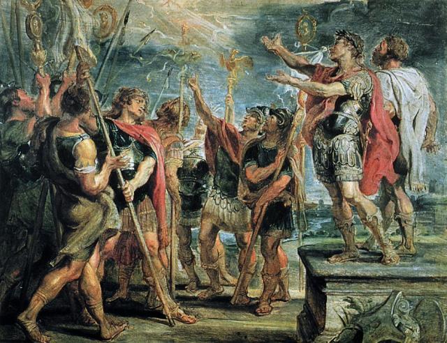
As the first Christian Emperor, Constantine rolled back the institutionalised persecution that Christians had suffered for 250 years. Christian worship was decriminalised, church lands were granted exemptions from tax and the state provided labour and materials for the construction of new churches.5 Having set Christianity on the road to legitimacy, though, it was to be one of Constantine’s descendants who would instigate a last throw of the dice for the old religion.
When Constantine’s nephew Julian became Caesar in 355,6 he brought with him a mystical strand of paganism and a desire to return polytheism to the centre of Roman religion.7 Under the guise of various edicts enforcing religious tolerance, he subtly aimed to reduce Christianity’s influence throughout the Empire. The proponents of this last-gasp pagan revival understood the value of the written word as well as their Christian counterparts: as a reaction against the encroachments of the new religion, several of Rome’s aristocratic families sought to preserve, edit and elucidate old pagan texts.8 Despite this, Julian’s reforms were reversed upon his death, and the turning point finally arrived in 380 when Christianity was adopted as Rome’s official state religion.9
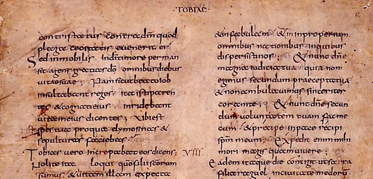
Writing exploded as the new religion swept through Europe, driving the development of much of what we take for granted in modern-day writing and typography. Aristophanes’ venerable system of dots, for example, was revived by the 4th century grammarian Donatus10 and popularised in the 7th century by Saint Isidore of Seville. In his meandering reference work Etymologies, which would remain one of the most important books in print for over 800 years, Isidore described a reorganised system in which the comma, colon and periodos now lived at the bottom, middle and top of the line respectively.11 The comma was only a tail away from its modern form, and the colon made room for a second point to later appear below it. New marks of punctuation appeared, while some old symbols assumed new meanings: the ancient positura, a ‘7’-shaped mark, now signalled the end of a section of text (in contrast to the paragraphos, which marked the start);11 the punctus interrogativus (?) indicated a question, and the diple (>) called attention to quotes from sacred scripture, leading in turn to guillemets (»), the quotation marks still used in many non-English languages.12
In the 8th century the first chinks of light appeared in the claustrophobic scriptio continua that had dominated writing for a millennium. English and Irish priests, seeking to aid readers attempting to decipher texts written in unfamiliar Latin, began to add spaces between words.13 Also in the 8th century, the crusading king Charlemagne sponsored the creation of the first standard lowercase letters to create a unified script which all his literate subjects could read. No longer bound to the solemn, square majuscules that suited the stonemason’s chisel, the monk Alcuin of York took advantage of the scribe’s dextrous quill to create distinctive, legible lowercase letterforms with elaborate ascenders, descenders and flourishes — so-called Carolingian minuscules.14
Amid all this innovation and consolidation, the paragraph mark finally got its moment in the sun. The pilcrow came about in the fertile, scholastic world of the monastic scriptorium.
Just as kaput stood for a section or a paragraph, so its diminutive capitulum, or ‘little head’, denoted a chapter. The general Roman preference for the letter ‘C’ had all but seen off the older Etruscan ‘K’ by 300 BC,15 but ‘K’ for kaput persisted some time longer in written documents. By the 12th century, though, ‘C’ for capitulum had overtaken ‘K’ in this capacity as well.16 The use of capitulum in the sense of a chapter of a written work was so closely identified with ecclesiastical documents that it came to be used in church terminology in a bewildering number of ways: monks went ad capitulum, ‘to the chapter (meeting)’, to hear a chapter from the book of their religious orders, or ‘chapter-book’, read out in the ‘chapter room’.17
Monastic scriptoria worked on the same principle as factory production lines, with each stage of book production delegated to a specialist. A scribe would copy out the body of the text, leaving spaces for a ‘rubricator’ to later embellish the text by adding versals (large, elaborate initial letters), headings and other section marks as required. Taken from the Latin rubrico, ‘to colour red’, rubricators often worked in constrasting red ink, which not only added a decorative flourish but also guided the eye to important divisions in the text.18 In the hands of the rubricators, ‘C’ for capitulum came to be accessorised by a vertical bar, as were other litterae notabiliores in the fashion of the time; later, the resultant bowl was filled in and so ‘¢’ for capitulum became the familiar reversed-P of the pilcrow.16
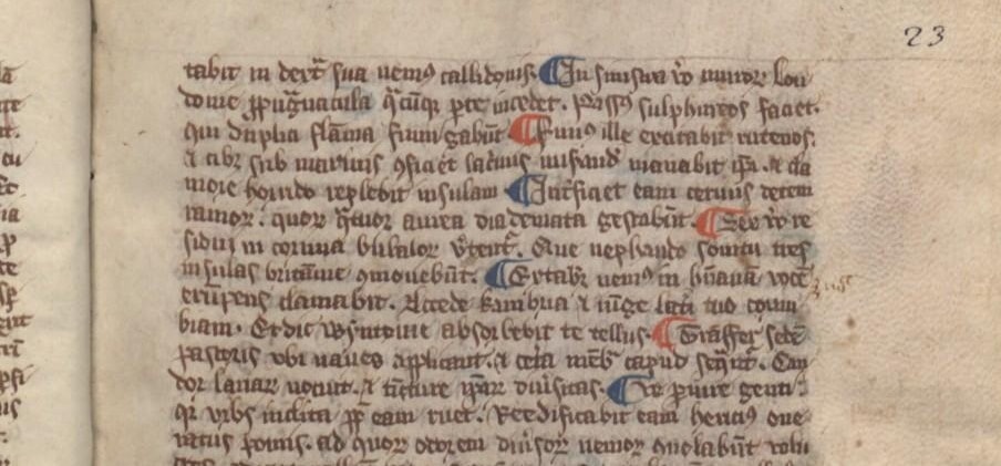
As the capitulum’s appearance changed, so too did its usage. At first used only to mark chapters, it started to pepper texts as a paragraph or even sentence marker so that it broke up a block of running text into meaningful sections as the writer saw fit. ¶ This style of usage yielded very compact text,19 harking back, perhaps, to the still-recent practice of scriptio continua. Ultimately, though, the concept of the paragraph overrode the need for efficiency and became so important as to warrant a new line† — prefixed with a pilcrow, of course, to introduce it.20
¶ The pilcrow’s name — pithy, familiar and archaic at the same time — moved with the character during its transformation from ‘C’ for capitulum to independent symbol in its own right. From the Greek paragraphos, or paragraph mark, came the prosaic Old French paragraphe, which subsequently morphed first into pelagraphe and then pelagreffe. By 1440 the word had entered English, rendered as pylcrafte — its second syllable perhaps influenced by the English crafte, or ‘skill’ — and from there it was a short hop to its modern form.21
¶ The pilcrow had been given form, function and name.
¶ Having attained such a singular importance, the pilcrow then did something remarkable. It committed typographical suicide.
- 1.
- Peter Brown R, “The Rise of Western Christendom : Triumph and Diversity, A.D. 200 - 1000”, in, 2006. ↢
- 2.
- M B Parkes, “Introduction”, in Pause and Effect: Punctuation in the West, 1993, 13-. ↢
- 3.
- Michael Grant, “Constantine and the Christian God”, in, 1993, 139-40. ↢
- 4.
- Paul Veyne, “When Our World Became Christian, 312-394”, in, 2010. ↢
- 5.
- Michael Grant, “Constantine and the Christian Church”, in, 1993, 156-58. ↢
- 6.
- Robert Browning, “The Chance of Power”, in The Emperor Julian, 1978. ↢
- 7.
- Dorothy. Watts, “The Pagan Revival of the Late Fourth Century AD 360-90”, in, 1998. ↢
- 8.
- Herbert Bloch, “A New Document of the Last Pagan Revival in the West, 393-394 A.D.”, 1945. ↢
- 9.
- Malcolm Errington R, “Roman Imperial Policy from Julian to Theodosius (Studies in the History of Greece and Rome)”, in, 2006. ↢
- 10.
- Julian Brown T, “Punctuation”, Encyclopaedia Britannica. ↢
- 11.
- Isidore and Stephen Barney A, “Punctuated Clauses (De Posituris)”, in, 2006. ↢
- 12.
- Unknown entry ↢
- 13.
- Paul Saenger, “Silent Reading: Its Impact on Late Medieval Script and Society”, 1982. ↢
- 14.
- Lane Wilkinson, “The Humanistic Minuscule and the Advent of Roman Type”, 2009 2009. ↢
- 15.
- David Sacks, “K and Its Kompetitors”, in The Alphabet : Unravelling the Mystery of the Alphabet from A to Z, 2003, 206-. ↢
- 16.
- Unknown entry ↢
- 17.
- André Vauchez, Barrie Dobson, and Michael Lapidge, “Capitulum”, Encyclopedia of the Middle Ages. 1, A-J, 2000. ↢
- 18.
- Geoffrey Glaister A, “Rubricator”, Glossary of the Book, 1960. ↢
- 19.
- Ellen Lupton and Abbott Miller, “Period Styles: A Punctuated History”, in Design Writing Research, 1999. ↢
- 20.
- Andrew Haslam, “Articulating Meaning: Paragraphs”, in Book Design, 2006, 73-74. ↢
- 21.
- Walter Skeat W, “Notes on English Etymology; Chiefly Reprinted from the Transactions of the Philological Society”, in, 1901, 215-16. ↢
Comment posted by John Waugh on
I had to share this with my wife, who is a graphic designer. She reminded me of Victor Borge’s phonetic punctuation (http://www.youtube.com/watch?v=IF4qii853gw). It’s too bad that Borge’s not around any longer – I would like to know how he’d pronounce a pilcrow.
Keep up the good work; this journey through the history of the little things that made the big things possible is a great contribution.
Comment posted by bob on
Excellent. I look forward to the next instalment. I was directed here by http://www.languagehat.com which is marvellous. Thank You.
Comment posted by HP on
Having worked as a proofreader in the last days of manual markup, I’d always assumed that the “paragraph mark” was exactly what it looked like: a double-stroked, mirrored P — P for paragraph.
Is there any indication that this folk etymology may have influenced the final shape of the pilcrow as set in type?
Maybe in part 3?
(I also arrived via Language Hat. Thanks, LH!)
Comment posted by Keith Houston on
Hi HP,
I haven’t come across anything which would suggest that’s the case, but I have seen some manuscripts when the capitula have elaborate, trailing tails and I’d always assumed that the pilcrow’s ‘P’ shape came about because of that. If I do find anything to the contrary I’ll be sure to update the site.
Thanks for the comment!
Comment posted by gabe on
I think he suggest something more modern
i mean, he, myself, and probably hundreds of font designers take the mark to literally be a mirrored P nowadays.
didn’t they influenced that when creating famous types?
Comment posted by Keith Houston on
Ah — I see what you mean. I’m afraid I don’t have any particular insight into why type designers draw the pilcrow the way they do, but perhaps some are reading Shady Characters and could give us an insight into this question…?
Comment posted by Jason Black on
You know what would be wicked awesome? If you could somehow manage to track down the people at Microsoft (or, perhaps, now formerly at Microsoft) who re-introduced the pilcrow to the world through MS-Word’s “Show hidden characters” function. Ask them how and why they ended up selecting that mark to represent that function.
Comment posted by Keith Houston on
Hi Jason,
That’s a brilliant idea! I’ll see what I can do before the 3rd instalment.
Comment posted by King Kong on
Hi, I really like the website and this article.
My one suggestion would be to reduce the font a little bit. I don’t know if you’ve specifically decided to use a large font, but it makes it a little hard to read
Comment posted by Keith Houston on
Hi – thanks for the suggestion. You can change the font size by hitting ‘Ctrl +/-‘ on a PC, or ‘Apple +/-‘ on a Mac. I must admit to liking the font size as is, but I’ll investigate changing it if it becomes a wider problem.
Comment posted by Rick on
¶ I have to admit, I find it a relief to visit this site in such a big serif font. But perhaps it would be an idea to add a reduce/increase font size link at the top for those visitors with other preferences who don’t know about their browser’s built-in functionality for this purpose.
Comment posted by Alan Coughlin on
Please! It should not rely on personal preference. Professionals have analyzed such things and understand that there are clear objective standards for legibility of type. This type is way too large! But the serif face and the large leading very much aide legibility, communicate a certain scholastic air, and give it a refreshingly original look. Just take it down a few points. (And it’s an poor GUI design choice to say “they can zoom out if they find it too large.”)
Comment posted by Keith Houston on
Hi Rick, Alan,
Thanks for the feedback.
I must admit that I subscribe to the views of the Large Font Coalition, who recommend body text of at least 16px in size. Body text here is 15pt; at 72 ppi and 96 dpi, this equates to 20px. I might bring the body text down to 14pt, but I’m loath to drop it any further. I’ll have a play with it before publishing the final part of the pilcrow series.
I’ve never been quite convinced by the idea of adding “font size” buttons to websites. In this respect, I agree with Alan’s comment that ‘it’s an [sic] poor GUI design choice to say “they can zoom out if they find it too large”’ — providing buttons to alter font sizes embeds that poor design decision into the site itself. I’d rather have a single canonical design which renders nicely on a variety of devices: those devices with unusual screen sizes and/or resolutions (such as smartphones/tablets) already perform some reformatting/rescaling on the fly, while standard browsers provide those users who must scale the site for whatever reason with the ability to do so.
Thanks again for the comments!
Comment posted by Luke Jones on
I’ll echo what I said previously about it and expand. The site is beautifully typeset and easy to read on my iMac (21.5 at home and 27 at work) and my iPad.
I’m not convinced that the size of the text would be suitable for many sites, but for a site with this subject matter, it’s more than suitable.
I wish I could show you how nice it looks on my iPad, but it’s the end of my lunch break now.
Comment posted by Keith Houston on
Hi Luke – thanks! It’s good to hear that the site travels well between your different devices.
Comment posted by Lyco Notarius on
I’d like to give my vote of confidence to the existing font choice.
Comment posted by John Cowan on
Those “objective standards” work only for average(d) people. I require a larger font to read text on a screen, as do many people of my age: unfortunately, this font is fuzzy at my preferred size, so I end up straining at it either way. (I’m using Chrome for Windows.)
Comment posted by Keith Houston on
Hi John,
Thanks for the comment. I’m sorry you’re having problems with fuzzy fonts — it might help me to sort if out if you could send me a screenshot of Shady Characters with the font set to your desired size.
Comment posted by Solo Owl on
It is a delusion to think a page designer can have control over how his page will appear on every readerʼs screen. Some will be reading on an iPad and others on a 30-inch monitor at 2560×1600. Moreover, different monitors render colors differently, to say nothing about ambient lighting.
Because of an inferior monitor or inferior eyes, or simple fatigue, individual users will want to make adjustments. I enjoy reading on my computers precisely because (1) I can change the type size at will and (2) newspaper ink will not rub off on my hands and shirtcuffs.
When you get old you will see what I mean.
Comment posted by Keith Houston on
I quite agree — hence my decision to make the site as uncluttered and as readable as possible on a variety of devices and to leave tweaks such as zooming to individual users (and their browsers).
Comment posted by Leonardo Boiko on
> and the diple (>) called attention to quotes from sacred scripture
This part made me raise an eyebrow; the Unix computer community that created email and Usenet (the ancestor to today’s web forums) have long used the ASCII greater-than character in the same manner to quote the previous post—to the point that it’s now, eerily enough, called a “canonical quote indicator”! (See (http://tools.ietf.org/html/rfc3676#section-4.5 ). I wonder if whoever started doing that did know about the diple?
Comment posted by Keith Houston on
Hi Leonardo,
That’s very true! I hadn’t made the connection. Maybe the diple is one to cover in the future. Thanks for the comment!
Comment posted by Nick Nicholas on
I’ve posted, on my site on Greek Unicode issues, a sample from the 4th century AD of Greek using both a double diple and a single diple—which looks even more eerily reminiscent of modern email.
Comment posted by Sharon on
Great article, but in 1440 Old English had already died and given way to Middle English.
Best,
Sharon
Comment posted by Keith Houston on
Hi Sharon,
Thanks for the correction — I’ve updated the article. I’m glad you like it!
Comment posted by Sindre Bremnes on
To be really pedantic, 1440 is close to the end of even the Middle English period. The first great literary work of Early Modern English, Le Morte d’Arthur, was written between 1460 and 1470.
Comment posted by Keith Houston on
Hi Sindre — my grasp of the evolution of English is, clearly, on the tenuous side. I’ve updated the text to say just “English” — probably safest!
Thanks for the comment!
Comment posted by Charles Perry on
Medieval Arabic MSS lack much punctuation. Sometimes there’s a squarish circle to indicate the end of a section; some MSS indent a beginning. In some MSS rubricators wrote section heads in a space the scribe had left (but occasionally missing it and leaving the space blank). At least Arabic is written cursively, so you know where a word begins and ends, mostly.
Modern printed Arabic has adopted our punctuation marks, except that the question mark is usually reversed because Arabic is written from right to left. The comma is usually reversed too, and often turned upside down (to make it look less like a letter, I imagine). I can’t remember seeing any semicolons — or pilcrows, for that matter.
Comment posted by Theodore on
Christianity is the “prototypical religion of the Book”? I’m certain that that should be Judaism.
Comment posted by Keith Houston on
Hi Theodore,
You’re quite right. The point I wanted to make was not so much about the technical interpretation of the term but instead the interdependence between Christianity and written language and the manner in which both benefited from it.
I’d rather not update the body of the article in such a fundamental way just yet, but thank you for the feedback! I hope you enjoyed the post in general.
Comment posted by Theodore on
Indeed, I did enjoy the post. But it does make me wonder about historical punctuation in other languages from the region, Hebrew included ….
Comment posted by Keith Houston on
And now I’m thinking about it too. I think I’ll have to stick to Greek/Latin/English punctuation for the moment, though, otherwise I’ll never get anything finished…!
Comment posted by Avi Flax on
I hope you correct this soon. I’m reluctant to share this otherwise fascinating article with friends while it has such an off-putting opening.
Comment posted by Keith Houston on
Hi Avi,
Apologies for the delay, but I’ve now updated the text as described here. I hope this addresses your concerns!
Comment posted by Désirée on
I love type. I love history. You have combined both in a meaningful way. Thank you. I look forward to future installments.
Comment posted by Mark Etherton on
I’m someone else grateful to Language Hat for directing me here, and I have two comments and a quibble.
Comment 1: What an excellent site!
Comment 2: The text size looks fine to me.
Quibble: Is an ampersand really a “mark of punctuation” (caption to second picture)? The OED calls it a character, and it stands for a whole word, which seems to me to make it qualitatively different to punctuation, “the practice, action, or system of inserting points or other small marks into texts, in order to aid interpretation; division of text into sentences, clauses, etc., by means of such marks” (OED again).
Comment posted by Keith Houston on
Hi Mark,
Thanks! I’m glad you like the site.
You’re right in that the ampersand isn’t really a mark of punctuation. I can only hope the ampersand posts are of sufficient interest for you to forgive my blurring of the lines!
Comment posted by John B on
Re the font size comments: One reason to keep it large (in my opinion) is that, while Hoefler Text is a magnificent font, the smaller point sizes tend to look too heavy (at least on a Mac). For 10 or 12 points, Goudy Old Style looks nicer, though it doesn’t offer the elegant italics and automatic ligatures. All in all, I have no problem with the big type, and find the site design very attractive.
Comment posted by Keith Houston on
Hi John,
I’m glad you like the site design. I’ve been surprised at how well it has been received; I’m as much of an amateur at design as I am with regard to punctuation and typography!
The italics are half the reason I chose Hoefler Text. You’re right about it not working so well at smaller sizes, though, which perhaps half the reason I’m reluctant to reduce the font size here. Monotype Imaging have been good enough to grant me permission to use some of Eric Gill’s fonts in the third pilcrow entry, and I’m sorely tempted to give Joanna a whirl as a web font at some point in the future — it looks good at a variety of sizes.
Comment posted by John Cowan on
The capitulum, as distinct from the pilcrow, will be encoded in Unicode 6.0 at U+2E3F. It will be some time before it makes its way into commonly used fonts, however.
Comment posted by Keith Houston on
Hi John — interesting! Thanks for that.
It does feel like a bit of a slippery slope: do we then have to define a ‘C for capitulum’ symbol too, in addition to its descendants the capitulum and pilcrow, or is capital ‘C’ sufficient? Unicode claims to cover “all the characters for all the writing systems of the world, modern and ancient,” but I’m not familiar with how it encodes identical characters which have different semantic meanings…