Neon Genesis Evangelion
Graphic designer Peiran Tan plumbs the typographic psyche of the celebrated anime franchise.
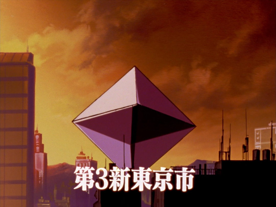
Created and directed by Hideaki Anno, Neon Genesis Evangelion (新世紀エヴァンゲリオン, often abbreviated as NGE or simply EVA) is a Japanese media franchise consisting of four main parts: a twenty-six-episode TV series (1995), two sets of film adaptations (1997 and 2007–), and a manga (1995–2013). Set in the postapocalyptic fortified city Tokyo-3, the series revolves around Shinji Ikari, a teenage boy recruited by his estranged father into a shadowy paramilitary organization known as NERV, for which he and other teenagers must pilot giant biomachines (“Evangelions”) to defeat incoming monsters (“Angels”) who threaten another apocalypse (“Impact”).
After starting out as a typical mechanical-robot (“mecha”) anime, Evangelion gradually evolved into an existentialist deconstruction of its own genre, immediately winning critical acclaim. Its sustained popularity through the years spawned a plethora of spinoff mangas, novel adaptations, games, advertisement tie-ins, and even pachinko gambling machines, leading it to permeate Japanese culture and eventually become a worldwide sensation. Many of its visual motifs became cultural lexicons, including its identity typeface: Matisse EB.
Matisse EB and the Original Evangelion
Evangelion was among the first anime to create a consistent typographic identity across its visual universe, from title cards to NERV’s user interfaces. Subcontractors usually painted anything type-related in an anime by hand, so it was a novel idea at the time for a director to use desktop typesetting to exert typographic control. Although sci-fi anime tended to use either sans serifs or hand lettering that mimicked sans serifs in 1995, Anno decided to buck that trend, choosing a display serif for stronger visual impact. After flipping through Fontworks’ specimen catalog, he personally selected the extra-bold (EB) weight of Matisse (マティス), a Mincho-style serif family.
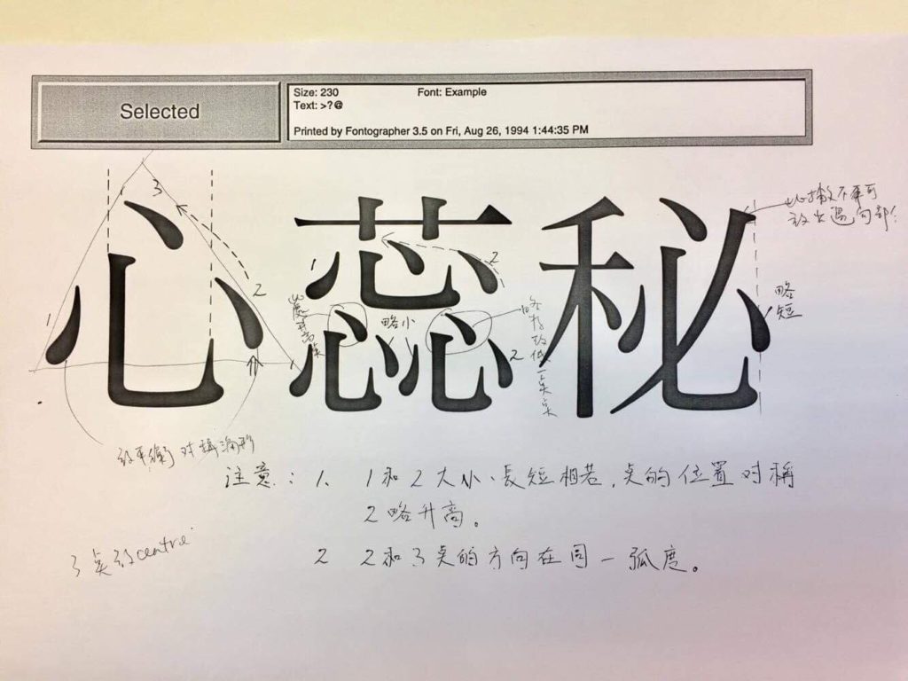
Annotated printout of the L (Light) weight. Courtesy of Francis Chow.
Just as every mature metal type foundry in the West had to have a Garamond, Matisse was Fontworks’ answer to the Mincho genre for desktop typesetting. Since few computer typefaces existed at the time, completing the face quickly was paramount; stylistic exploration could come in later releases. Furthermore, because the typeface’s initial designer, Francis Chow, was working with inexperienced colleagues at the time, he wanted a direction simple enough for them to follow. A combination of haste and inexperience gave Matisse a plain look and feel, which turned out to make sense for Evangelion. The conservative skeletal construction restrained the characters’ personality so it wouldn’t compete with the animation; the extreme stroke contrast delivered the desired visual punch. Despite the fact that Matisse was drawn on the computer, many of its stroke corners were rounded, giving it a hand-drawn, fin-de-siècle quality.
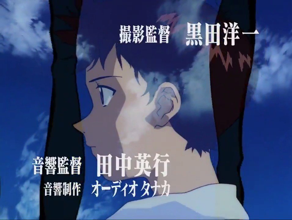
The TV episodes’ opening sequence featured a mechanically compressed Matisse EB.
Matisse EB remained mechanically compressed when used in an episode, though less dramatically than in the title sequence.
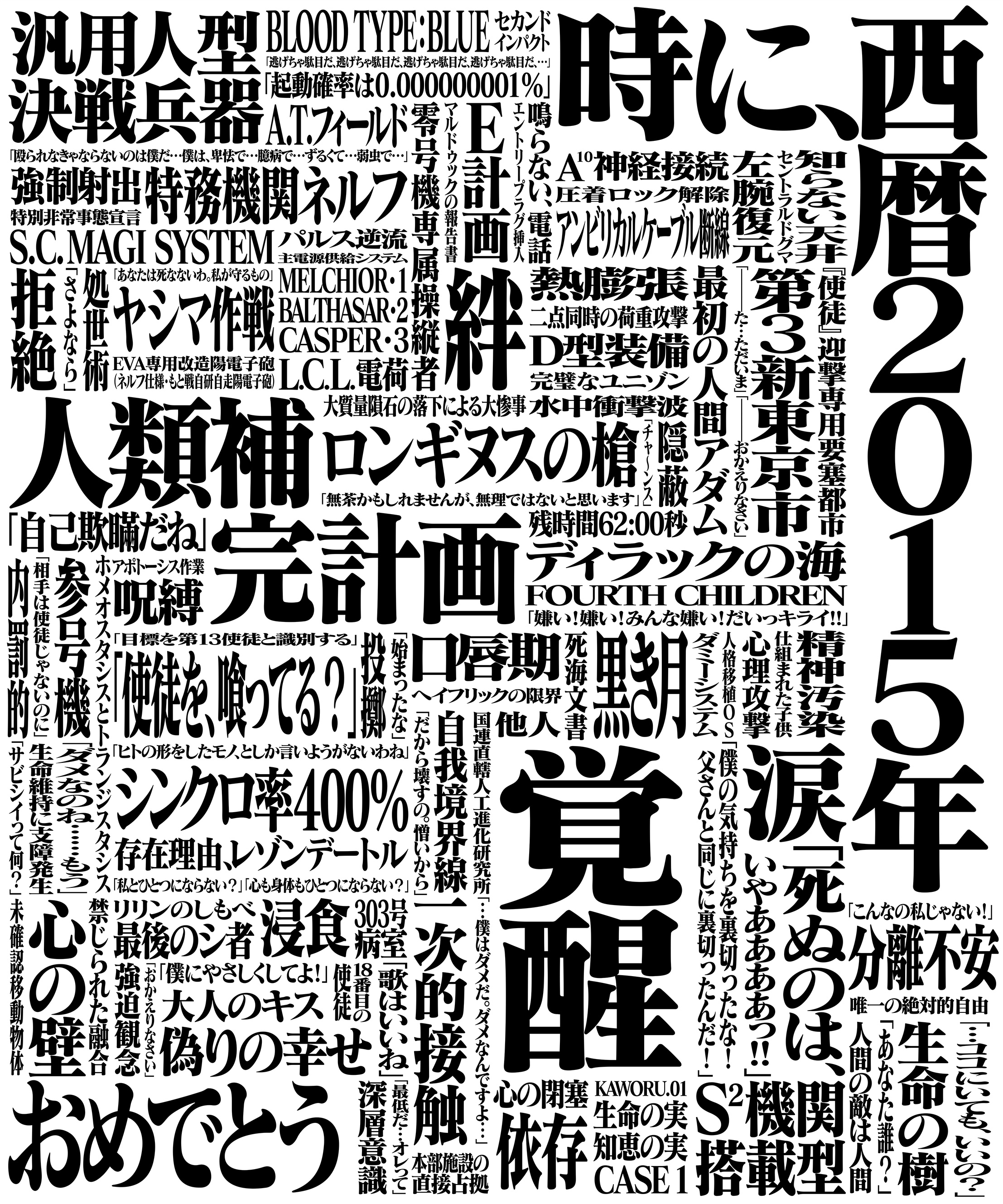
In addition to a thorough graphic identity, Evangelion also pioneered a deep integration of typography as a part of animated storytelling—a technique soon to be imitated by later anime. Prime examples are the show’s title cards and flashing type-only frames mixed in with the animation. The title cards contain nothing but crude, black-and-white Matisse EB, and are often mechanically compressed to fit into interlocking compositions. This brutal treatment started as a hidden homage to the title cards in old Toho movies from the sixties and seventies, but soon became visually synonymous with Evangelion after the show first aired.
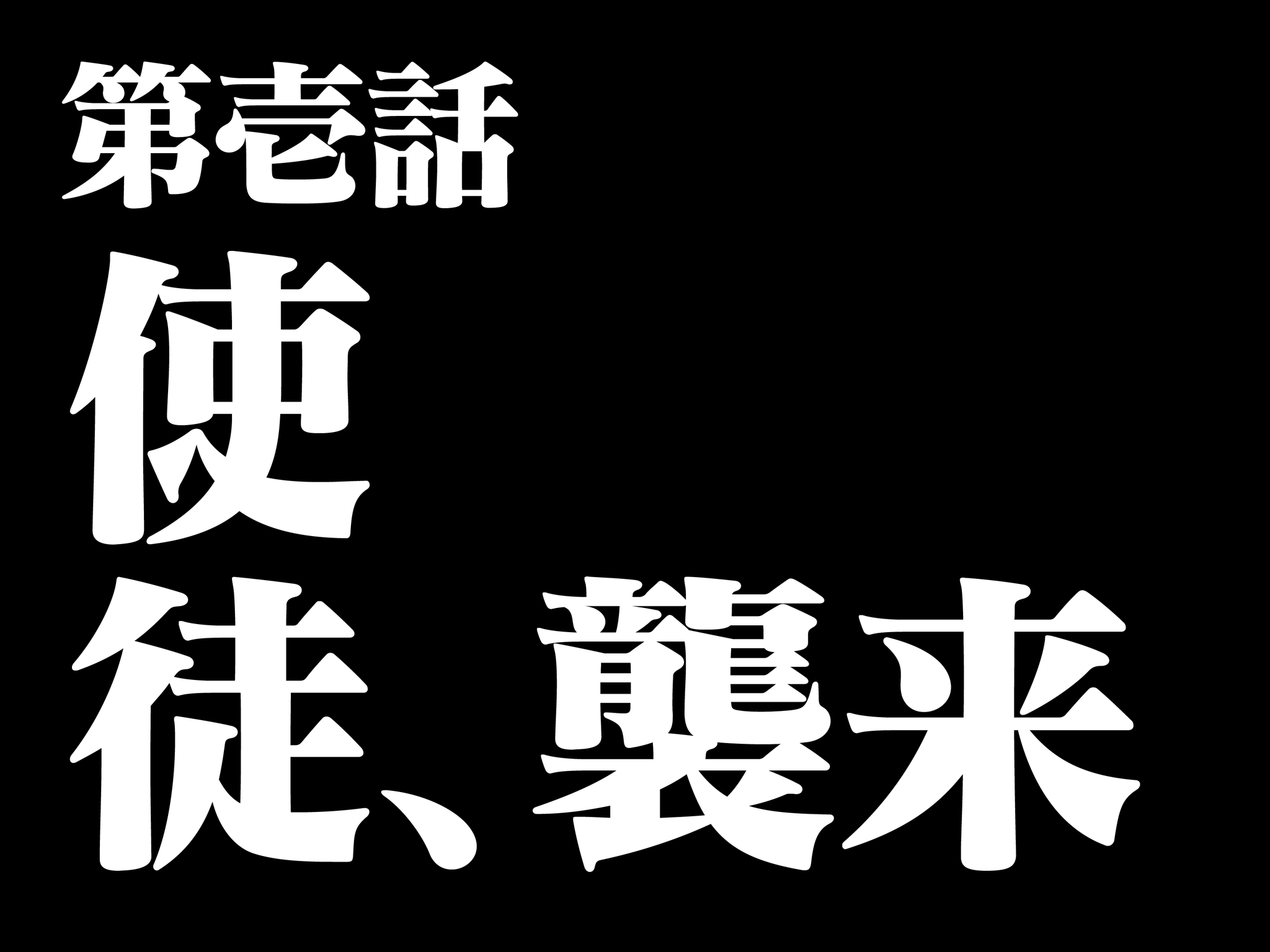
Japanese title card for Episode 1 (“Angel attack”).

Japanese title card for Episode 15 (“Lie and Silence”).

Japanese title cards, Episodes 1–26.
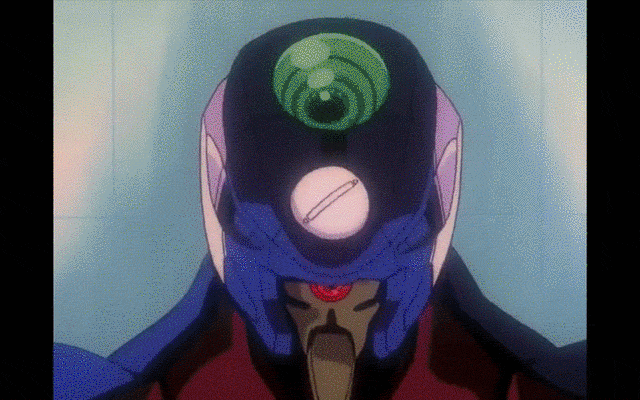
Innovating on the media of animated storytelling, Evangelion also integrates type-only flashes. Back then, these black-and-white, split-second frames were Anno’s attempt at imprinting subliminal messages onto the viewer, but have since become Easter eggs for die-hard Evangelion fans as well as motion signatures for the entire franchise.