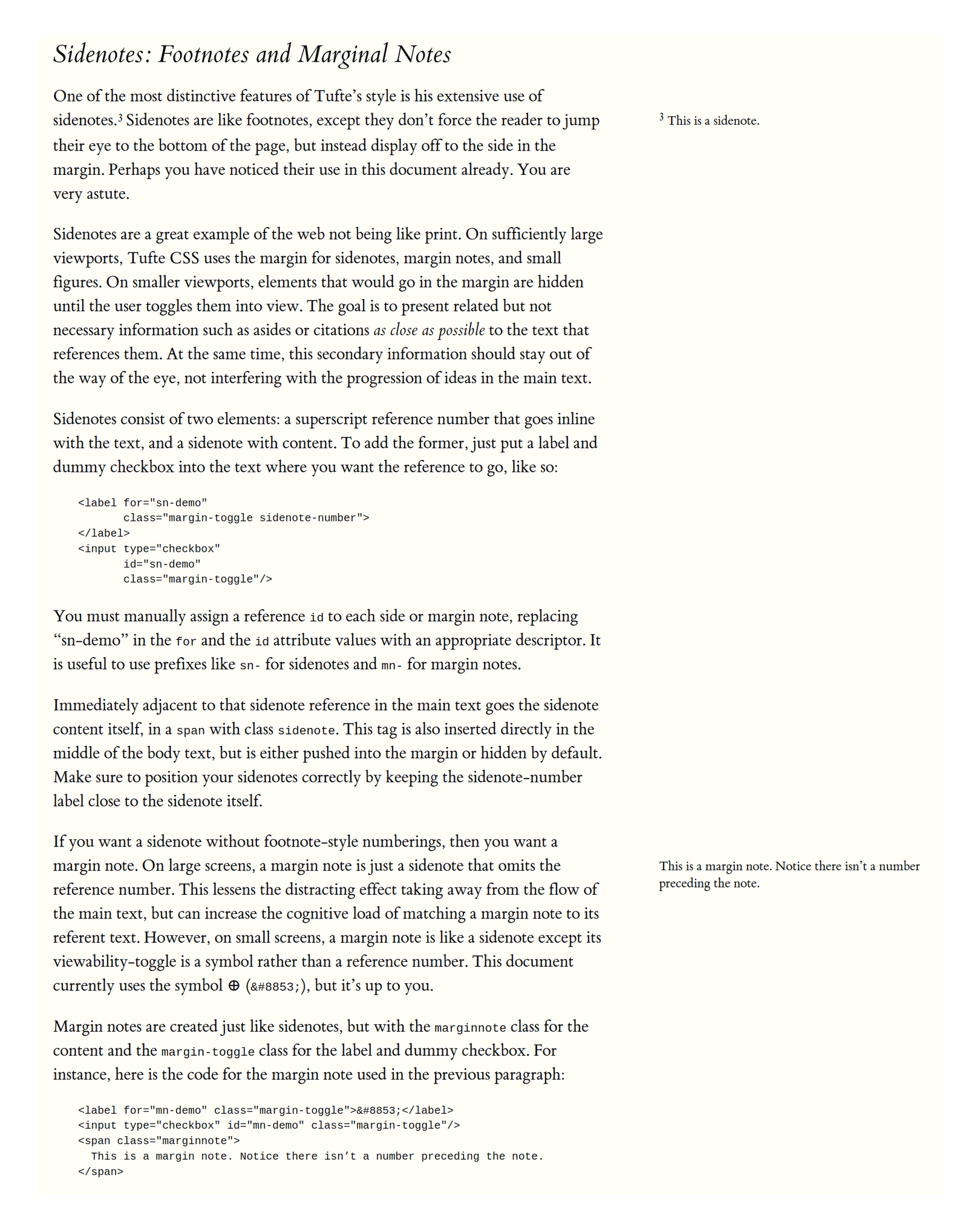
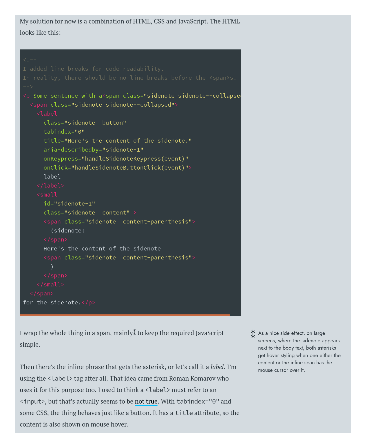
In typography/design, ‘sidenotes’ place footnotes/endnotes in the margins for easier reading. I discuss design choices, HTML implementations and their pros/cons.
Sidenotes & margin notes are a typographic convention which improves on footnotes & endnotes by instead putting the notes in the page margin to let the reader instantly read them without needing to refer back and forth to the end of the document (endnotes) or successive pages (footnotes spilling over).
They are particularly useful for web pages, where ‘footnotes’ are de facto endnotes, and clicking back and forth to endnotes is a pain for readers. (Footnote variants, like “floating footnotes” which pop up on mouse hover, reduce the reader’s effort but don’t eliminate it.)
However, they are not commonly used, perhaps because web browsers until relatively recently made it hard to implement sidenotes easily & reliably. Tufte-CSS has popularized the idea and since then, there has been a proliferation of slightly variant approaches. I review some of the available implementations.
For general users, I recommend Tufte-CSS-style approaches: it is fast & simple (using only compile-time generation of sidenotes, rendered by static HTML/CSS), popular, and Tufte-CSS-esque libraries are easy to integrate into many website workflows. For heavy footnote users or users who want a drop-in, runtime Javascript-based solutions like
sidenotes.jsmay be more useful.
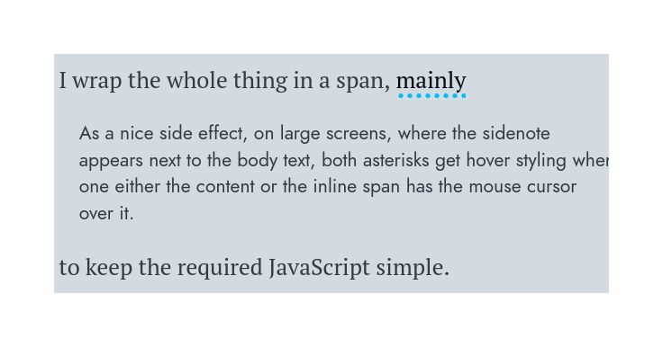
Sidenotes and margin notes (sometimes also called “asides”) are an alternative to footnotes/endnotes in design. Where footnotes put additional material in small sections at the bottom of the page, organized by number, and endnotes stuff them at the end of the document, sidenotes & margin notes instead use the large unused left/right margin of the page. If it is numbered & anchored to a specific point in the text, I call it a ‘sidenote’; if it is unnumbered & is merely placed next to a body of text, then I call it a ‘margin note’. (Margin notes are less useful & more obscure, so tend to be unsupported; I occasionally use margin notes for summarizing paragraphs, like the next paragraph here, where they function as extremely small ‘section headers’.)
Making use of margins. Because it’s uncomfortable to read sentences which wrap from edge to edge, particularly for large widths, documents use short lines. But with large screens, many documents have equally large margins, and wind up looking like a narrow river of text flowing down a vast blank map. This river of text may be studded with the occasional footnote or endnote, including ancillary material like citations or digressions or extended discussion of tricky points or anticipation of objections or just the author being witty, which require constant back and forth from the place in the text where they make sense and where they can actually be read. As a result, who ever reads endnotes in a physical book? Only the most diligent will keep a thumb in the back to actually look up endnotes, and so they are either unread or tend to be relegated to the most utilitarian uses like raw citations.
The situation is even worse on the Internet, because while footnotes in a book aren’t too bad (as long as they stay on the same page), web pages don’t really have ‘pages’ and ‘footnotes’ wind up degrading to simply endnotes.1
Why do we use endnotes? For the most part, we use them for citation metadata, abbreviations/definitions, and more extended discussions (often humorous). But none of these are served well online by endnotes: citation metadata is better provided as hyperlinks to fulltext, definitions (<defn>)/abbreviations (<abbr>) have native HTML support as tooltips/popups—leaving only the extended discussions use-case.
Bringhurst comments on the pros/cons (The Elements of Typographic Style, 2004):
Footnotes are the very emblem of fussiness, but they have their uses. If they are short and infrequent, they can be made economical of space, easy to find when wanted and, when not wanted, easy to ignore. Long footnotes are inevitably a distraction: tedious to read and wearying to look at. Footnotes that extend to a second page (as some long footnotes are bound to do) are an abject failure of design.
Endnotes can be just as economical of space, less trouble to design and less expensive to set, and they can comfortably run to any length. They also leave the text page clean except for a peppering of superscripts. They do, however, require the serious reader to use two bookmarks and to read with both hands as well as both eyes, swapping back and forth between the popular and the persnickety parts of the text.
Sidenotes give more life and variety to the page and are the easiest of all to find and read. If carefully designed, they need not enlarge either the page or the cost of printing it. Footnotes rarely need to be larger than 8 or 9 point. Endnotes are typically set in small text sizes: 9 or 10 point. Sidenotes can be set in anything up to the same size as the main text, depending on their frequency and importance, and on the overall format of the page. If they are not too frequent, sidenotes can be set with no superscripts at all (as in this book), or with the same symbol (normally an asterisk) constantly reused, even when several notes appear on a single page.
Our extended discussions ought to be made easy to read in context and not hidden away at the end of the page. Sidenotes let us reuse some of that unused margin, in a way which is comfortable to read, and which is compatible with existing documents & workflows using endnotes: simply move those endnotes into the margin of the text they refer to. The user can comfortably saccade over to a sidenote instantly to skim it and back, the information density of the layout increases, it requires no exotic technologies or rewrites or user education, it has a long respectable history, and it’s just generally a good idea.
To see native sidenotes & margin notes on Gwern.net, use a wider screen.
Examples
Some examples of sidenotes in books; Bringhurst uses sidenotes himself, of course:
Sidenotes are extensively used in medieval manuscripts and early modern books such as the Geneva Bible (first 2 pages) (see also rubrication), or Bayle’s awe-inspiringly ambitious use of (recursive) margin/side notes:
, showing advanced typography in a single page which contains body text, footnotes, and (recursively) sidenotes to footnotes, of Pierre Bayle's famous Enlightenment text, the 'Historical and Critical Dictionary' (pg900 of volume 4 of the 1737 English edition).")
Sidenotes (and margin notes) have been less used in more contemporary books; the best-known popularizer is Edward Tufte:
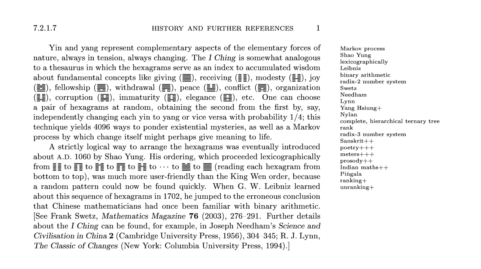
Donald Knuth uses margin notes in Concrete Mathematics for a wide variety of ‘mathematical graffiti’ on the body contents: quotes from famous people or just unhappy students, jokes, criticism, questions to the reader, hints, etc. in his preprint drafts (‘fasicles’) of The Art of Computer Programming uses margin notes as a kind of index, listing keywords in the margin as reminders for indexing in the final print version. The density of keywords can make the margins interesting to read on their own; an example from TAOCP: pre-fascicle 4B: “A Draft of §7.2.1.7: History of Combinatorial Generation”:
Implementations
So, sidenotes are great. They are also easy in LaTeX PDFs.2 But how do we use them online for HTML?
Although sidenotes are ‘just’ snippets of text to the left or right of the main text and it might seem hard to screw it up, as always, there are a lot of ways to accomplish that goal, and many ways we can enhance (or screw up) them.
Do we put them on the left, right, or both sides? What of the several possible HTML elements are our sidenotes delimited as (<span>, <a>, <div>, <aside>, <small>, or even <table>)? Do we use Javascript, accepting that it’ll ‘flash’ an incorrectly rendered page as the JS loads & runs, and outright break for users with JS turned off (as is increasingly sensible on an ever-more-hostile Internet)? Does the user have to click or do anything to make sidenotes visible? If not, what about on mobile or tiny screens, which don’t have any margins worth speaking of—do they get sidenotes in any form, and if so, do they render ‘inline’ as simply part of their paragraph, or do we display them as separate blocks (‘pop-in’) and by default or after a user click? How are many (or large, or both) sidenotes laid out, do they bump each other down the page or just overlap—it would seem that JS is necessary to avoid overlaps in most approaches, but is that too great a price? How does one add sidenotes support to an existing body of documents (typically Markdown)? Are there any known SEO concerns? (No, unless you do it in a bizarre way.) And so on.
Overall, I would say that good sidenotes should ideally: render on either both sides or the right (but not the left), use spans or links where possible, use static HTML/CSS, display by default (any user effort defeats the point!) but collapse to pop-ins (because mobile users don’t have screen real estate to spare for optional material although many authors choose expanded) with inline being an option for margin notes depending on how the writer uses them, with sidenotes overlapping as a tradeoff for not requiring JS (the author will just have to rewrite such excessive sidenote usage to avoid overlapping bugs), and endnotes in existing corpuses can be rewritten by whatever tool compiles the HTML into the appropriate span encoding.
Below I compare implementations I have found, and compile a table of what seems to me to be the key parts of the sidenotes taxonomy.
My recommendation is that for new or lightly-noted writings, one use Tufte-CSS-style sidenotes. For heavy sidenote use, a JS solution like sidenotes.js is probably necessary.
Comparisons
|
Name |
Non-JS? |
Pros/Cons |
||||||||
|---|---|---|---|---|---|---|---|---|---|---|
|
Tufte-CSS, Dave Liepmann |
✅ (2014) |
→ |
✅ |
|
✅ |
✅ |
Pop-in (default: collapsed) |
❌ |
Static, simple, popular; buggy block elements, endnote-incompatible, limited number supported |
|
|
|
✅ (2019) |
↔︎ |
✅ |
|
❌ |
✅ |
Pop-in/Endnotes (eg. on hover) |
✅ |
MIT |
Scales to many, Pandoc-compatible; slow(er). |
|
sidebar, Said Achmiz |
✅ (2020) |
→ |
✅ |
|
✅ |
✅ |
Pop-in/❌ |
? |
? |
Static; not intended for footnotes, one-sided only (currently). |
|
✅ (2016) |
→ |
✅ |
|
✅ |
✅ |
Pop-in |
❌ |
❌ |
Static; non-Free, no sidenotes. |
|
|
✅ (2014) |
→ |
✅ |
|
❌ |
✅ |
Inline |
❌ |
❌ |
Offers inline fallback; custom, non-Free, requires JS. |
|
|
✅ (2013) |
← |
✅ |
|
✅ |
✅ |
Inline |
❌ |
❌ |
Static, simple, offers inline fallback; custom, non-Free, no numbering. |
|
|
✅ (2019) |
→ |
❌ |
|
❌ |
✅ |
Pop-in (collapsed) |
❌ |
❌? |
App/screen-reader-compatible, searchable; relatively complex, requires JS, non-Free. |
|
|
✅ (2016?) |
↔︎ |
❌? |
|
❌ |
❌ |
Pop-in |
✅ (too short! ☹) |
❌ |
Uses both margins; custom, non-Free, requires clicks & JS. |
|
|
✅ (2017?) |
→ |
❌? |
|
❌ |
❌ |
❌/❌ |
✅ (too short! ☹) |
❌ |
Floating footnote fallback; custom, non-Free, requires clicks & JS, entire site unusable on mobile. |
|
|
✅ (?) |
→ |
❌? |
|
❌ |
❌ |
Pop-in (collapsed) |
✅ (too short! ☹) |
❌ |
Somewhat more readable than Harvard/Yale; custom, non-Free, requires clicks & JS. |
|
|
✅ (?) |
← |
❌? |
|
❌ |
❌ |
Floating footnote |
❌ |
MIT? |
Floating footnote fallback; left margin, requires clicks for everything, requires JS, unclear license. |
|
|
jQuery.sidenotes, Clark |
❌ (2013) |
← |
✅ |
|
❌ |
✅ |
Endnotes/Pop-in (expanded) |
❌ |
MIT |
Featureful; slow, unmaintained, limited number, only on the left? |
|
Sidenotes.js, Correia |
❌ (2015) |
↔︎ |
❌? |
|
❌ |
❌ |
Slide-in |
❌ |
MIT |
Unique ‘slide-in’ approach; everything else. |
|
✅ (?) |
→ |
❌ |
|
❌ |
❌ |
Slide-in/Endnotes |
❌ |
❌ |
Improved slide-in shows all footnotes; everything else. |
|
|
NA (NA) |
↔︎ |
✅ |
|
✅ |
✅ |
❌ |
❌ |
NA |
Static, simple; no mobile/narrow compatibility, rigid, no features, hard to write or modify. |
|
|
Annotate, Molly White |
✅ (2022) |
→ |
❌? |
|
❌ |
✅ |
✅/? |
❌ |
MIT |
Annotates ‘ranges’ instead of being limited to an anchor/number; due to intended fisking use-case, can run off screen. |
Table columns:
-
Name: name/creator
-
Active: whether appeared actively maintained when last checked (usually ~2020)
-
Layout: whether it puts notes in the left, right, or both margins
-
Margin Notes: whether it appears to support margin notes (sidenotes without a number & anchor inside the text, just free-floating text)
-
Element: which HTML element/tag is used to denote the sidenote in the HTML source (eg. Markdown puts in a
<a>linking to a definition in the footer) -
Non-JS: whether Javascript required (which is bad if it can be done without JS)
-
No Click: whether the reader has to effortfully click on a note to see it (rather than visible by default or easily seen with hover)
-
Mobile/Narrow: how it handles mobile browsers and/or narrow screens (often the same)
-
Long Collapse: how it handles long notes which would threaten to overload the margin and push notes ‘off-screen’
-
FLOSS: whether OSI-approved copyright license
-
Pros/Cons: miscellaneous comments.
Tufte-CSS
Experiments in using CSS3 for sidenotes date back to at least 2003, but by far the most popular implementation, and the primary inspiration for most sidenotes users, is the c. 2014 Tufte-CSS (Github). Tufte-CSS is outdated in respects, but does sidenotes sensibly:
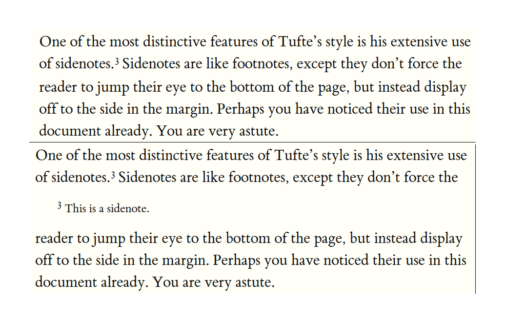
A Tufte-CSS-formatted sidenote looks like this:
<label for="sn-extensive-use-of-sidenotes" class="margin-toggle sidenote-number"></label>

<input type="checkbox" id="sn-extensive-use-of-sidenotes" class="margin-toggle"/>

<span class="sidenote">This is a sidenote.</span>
By default (on desktop), the notes are floated right into the margin; no measures are taken to avoid collisions or overlaps (presumably if you have that problem, you ought to just rewrite your page or fix it yourself). On narrow windows & mobile, a media-query overrides the regular CSS, so the margin notes are not floated, simply indented, and toggled. The CSS looks like:
.sidenote,
.marginnote {
    float: right;
    clear: right;
    margin-right: -60%;
    width: 50%;
    margin-top: 0.3rem;
    margin-bottom: 0;
    font-size: 1.1rem;
    line-height: 1.3;
    vertical-align: baseline;
    position: relative;
}

...
label.sidenote-number {
    display: inline;
}

label.margin-toggle:not(.sidenote-number) {
    display: none;
}

...
/* The mobile fallback: */
@media (max-width: 760px) {
    .sidenote,
        .marginnote {
            display: none;
        }
        .margin-toggle:checked + .sidenote,
        .margin-toggle:checked + .marginnote {
            display: block;
            float: left;
            left: 1rem;
            clear: both;
            width: 95%;
            margin: 1rem 2.5%;
            vertical-align: baseline;
            position: relative;
        }
}
Margin notes are implemented similarly to sidenotes because a margin note can just be a sidenote whose number is hidden (at the possibility of some user confusion at the ‘missing’ endnote/sidenote, fixable with further CSS tweaks using number counters).
One thing to note about Tufte-CSS is that, like books, it displays sidenotes by default. Many websites experimenting with note variations throw away the greatest advantage—the effortlessness of reading sidenotes by simply saccading left/right—in favor of hassling the user and forcing them to do quite as much work by clicking various UI elements to expand/collapse notes, defeating much of the point compared to a normal hyperlinked endnote.
Tufte-CSS requires no JavaScript and is pure HTML/CSS, delegating layout to the browser. It is simple, fast, supports mobile well, and widely-used—it is definitely the most popular of HTML sidenote implementations. Its disadvantages are it will not handle gracefully many complex3 or lengthy sidenotes (which will overlap), and Tufte-CSS-style notes are not generated by default by many systems (so some sort of rewrite step is necessary to integrate Tufte-CSS into however one actually creates one’s website).
Because Tufte-CSS sidenotes/margin notes are located inline, rather than put at the end of the text like most document systems implement it (eg. Pandoc), one needs either to use JS to rewrite endnotes at runtime or to rewrite them at compile-time. Many projects generate Tufte-CSS sidenote spans directly or rewrite standard Markdown <a> endnotes to spans, such as the R packages “tufte” & “Tint Is Not Tufte: An implementation in R Markdown”. For Pandoc, pandoc-sidenote is a Haskell Pandoc filter which rewrites Pandoc’s endnotes in Tufte-CSS-style spans, and can be used with Pandoc-based site builders like Hakyll or Jekyll (for the latter, see tufte-pandoc-jekyll & tufte-jekyll); Guillaume Paumier & Matt Palmer have Lua versions.
Tufte-CSS user examples: Nicolas J. Duquette, David Schmudde, in Hebrew, Robin Schroer, Dan Pittman, Jason Merrill, Andrew Zuckerman, Taeer Bar-Yam, Eric Marsden (Risk Engineering), Tom Critchlow, Phil Crissman.
Similar approaches (some of these are more limited than Tufte-CSS; typically, authors fail to handle narrow/mobile):
-
“How can we develop transformative tools for thought?”, Andy Matuschak & Michael Nielsen 2019 (mobile: floating footnotes)
-
Arxiv Vanity (mobile: floating footnotes)
-
Nintil (mobile: pop-in, expanded)
-
Danila Fedorin’s sidenotes (mobile: pop-in, collapsed) are inspired by Koos Looijesteijn’s approach, Fedorin’s implementation removes the JS but at the cost of guaranteeing accessibility and inheriting Tufte-CSS’s limitations on block elements/Markdown in sidenotes
-
“What does BERT dream of?” (mobile: pop-in, expanded)
-
Increment (mobile: pop-in, expanded)
-
Matt Wilcox, with an unusual use of margin notes for paragraph/section summaries, similar to my use (mobile: pop-in, expanded)
-
“Dictionary of Numbers”, Glen Chiacchieri (mobile: ❌)
-
Roman Gornitsky (The Temporary State) (mobile: ❌)
-
Richard Rutter (mobile: pop-in, expanded)
-
“Singular: Possible futures of the singularity”, James Yu & GPT-3 (mobile: click-to-expand as a sticky pop-up)
-
“The Problem of Detecting Polygenic Selection from Temporal Data”, Vince Buffalo (mobile: pop-in, expanded)
-
“How to do sidenotes in HTML documents using CSS and Javascript”, Frans de 2005 (an early example, with consideration of cross-browser compatibility for the era)
-
Omar Rizwan (Hugo)
-
Darius Kazemi/Emma Winston (‘margin notes’, no apparent use of numbering to support ‘sidenotes’; nice retro theme;
<aside>; pop-in, expanded; no truncation/wrapping; absolute positioning offset based on div around associated paragraph, so can’t handle overlaps which leads to bugs as can be seen in that page; apparently extraneous use of grid?) -
Vale (notable for strange handling of mobile: the sidenotes are hidden and their footnote numbers left in place, by being moved to the end of a section and grouped in a single list while being collapsed; clicking or tapping the footnote jumps to the end-block but does not expand them, and they must be clicked on to expand them all.)
-
Tyler Vigen: pop-in-only; tooltips used for ‘hover’, which is a bad idea4
-
examples with no mobile (❌) support:
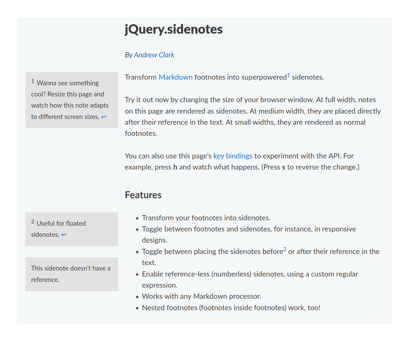
sidenotes.js
sidenotes.js was developed by Said Achmiz in 2019 for use on Gwern.net after looking at Tufte-CSS and deciding that Tufte-CSS’s simple approach (while appropriate for most users) would fail on particularly-heavily endnoted pages:
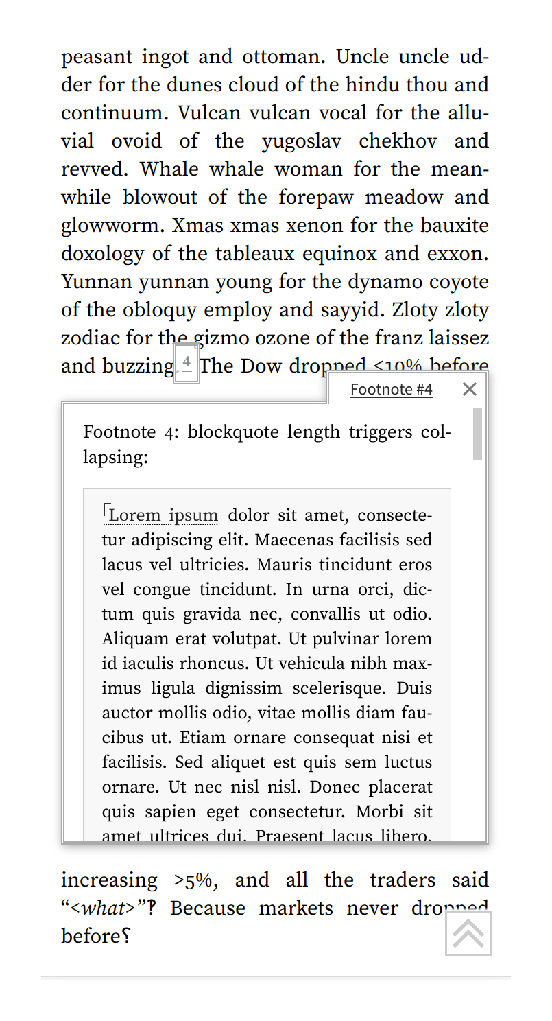
The advantage over Tufte-css is that sidenotes.js ‘manually’ lays out sidenotes at runtime to minimize overlap while trying to keep sidenotes within the same window as the anchor, enabling it to handle almost arbitrarily many long endnotes without rendering any unreadable. Sidenotes/endnotes can be arbitrarily long and contain most block elements like code blocks, blockquotes, lists, images, tables, etc. While it’s at it, sidenotes are highlighted & their matching anchors highlighted on hover, too-long sidenotes are partially collapsed (the user clicks to expand them). Further, it supports a custom “margin note” feature: any HTML spans of text with the class marginnote will be popped out of the text into the margin if there is room, or it will be left in place & italicized. (I place margin notes at the beginning of paragraphs as summaries, letting users more easily skim.)
The disadvantage compared to pure static HTML/CSS approaches is that the JS needs to load and copy the endnotes into sidenotes, reflow as necessary over the whole page, which is user-visible & distracting; this is noticeable even putting the load in the HEAD to speed it up. It can also interact with other complicated features and while it will handle heavy note loads much better than most static approaches (most of which don’t even try to avoid errors like overlaps), it still has the occasional subtle bug.
For narrow windows, other approaches can be used. On Gwern.net, I use floating footnotes which ‘pop up’ when the user hovers over a footnote anchor5, which avoids the need to navigate to the end of the page & back.
sidenotes.js assumes that the document has been generated from Pandoc Markdown and has normal Pandoc endnotes (of the form <a href="#fn1" class="footnote-ref" id="fnref1" role="doc-noteref"><sup>1</sup></a> for the anchor, and <li id="fn1" role="doc-endnote"><p>Example</p></li> for the endnote body at the end of the document). Hence, implementing sidenotes with it requires little more than a JS import like <script src="/static/js/sidenotes.js" async></script>. (This has some advantages: for example, footnotes/sidenotes remain linkable—one can link to #fn1 or #sn1 as desired.6)
Users or similar implementations:
-
Leo Gao (eg. 1, 2) designed his site inspired a little by Gwern.net, and uses sidenotes similarly; his approach seems to be simpler. (mobile: endnotes)
-
OpenAI (eg. 1) (mobile: endnotes)
-
Marshall (Vandegrift) Bockrath, from pre-2012! (mobile: ❌)
Sidebar Tables
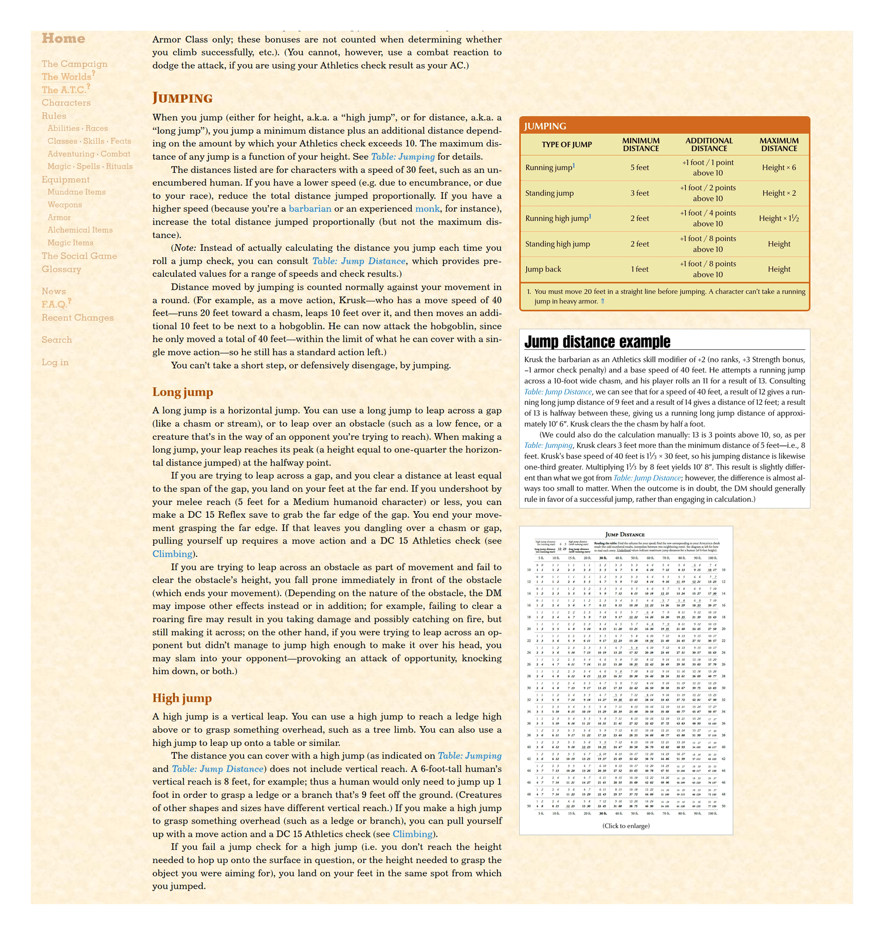
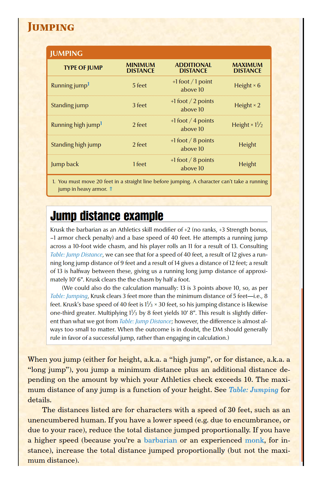
Said Achmiz has developed a pure CSS+HTML variant of sidenotes which is intended for easy cross-referencing of block elements such as small tables rather than footnotes. The block elements are floated inside a double <div> with the main column having a maximum width, so at wider windows the sidebar blocks slip rightwards into the margin (while their inner <div>s make them align left within the margin).
A demonstration of this sidebar is a Dungeons & Dragons manual on the “Athletics” skill, where the tables & specialty skills are conveniently placed in the margin where possible, shrinking as necessary, but ultimately being popped inline for sufficiently narrow windows. There are so many tables that if they were placed in the main column, as usual, the text would be constantly interrupted and widely separated; the sidebar layout more closely replicates the dense layout of D&D manuals, which is important when the players will be frequently consulting it for details.
(Max Kohler abuses <aside> elements + grid layouts to achieve something somewhat similar but inferior in that all his sidenotes get stacked at the end—which defeats the point of having sidenotes.)
Ink & Switch
Ink & Switch’s pages like “Local-first software: You own your data, in spite of the cloud”’s 2016 static margin notes feature looks much like Tufte-CSS in using HTML/CSS to create right-aligned sidenotes, although Ink & Switch eschews explicit footnote numbering and its pop-ins are uncollapsed by default.
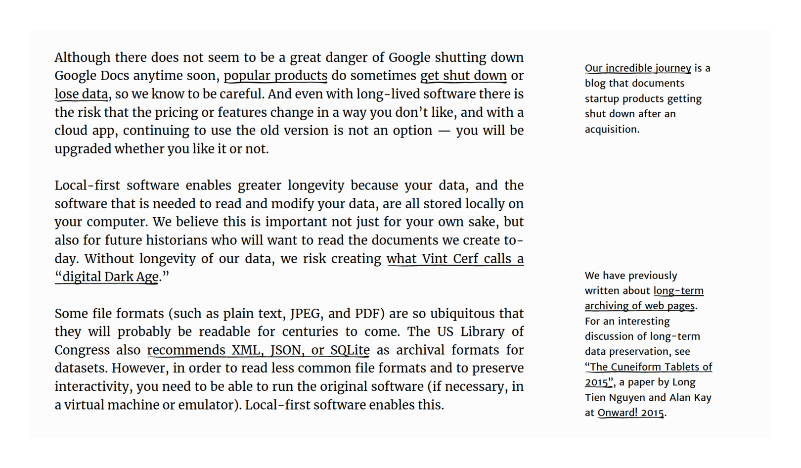
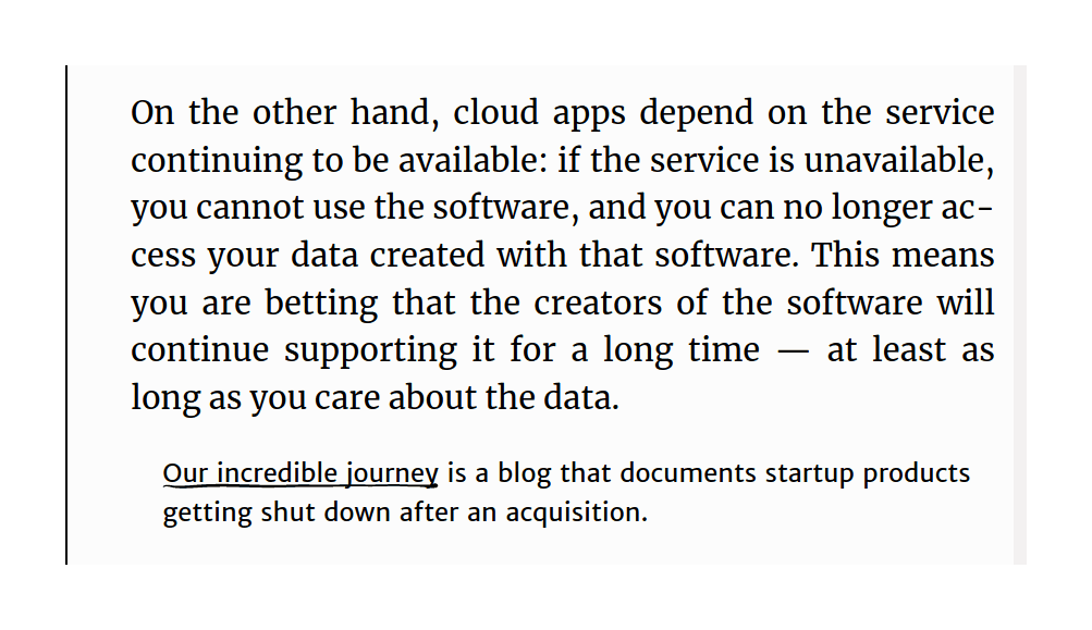
Implementation-wise, it takes a noticeably different tack in which CSS features it uses. The HTML itself is just an <aside> element:
<aside><p><a href="https://ourincrediblejourney.tumblr.com/">Our incredible journey</a>
    is a blog that documents startup products getting shut down after an acquisition.</p></aside>
But their CSS uses calc() extensively to create positioning & readjust overlaps without JS:
article aside, figcaption, header>#byline {
  --aside-offset: 1rem;
  --aside-offset-lineheight: 1.5rem;
  box-sizing: border-box;
  margin-bottom: calc(var(--padding) * 2);
  padding: var(--padding);
  position: absolute;
  right: 0;
  width: var(--aside-width);
}

aside, figcaption, figure img, figure video {
  border-radius: calc(var(--padding)/4);
  max-width: 100%;
}

aside, aside>*, #byline, #byline li, figcaption, figcaption>*, blockquote footer {
  font-size: 0.8125rem;
  font-weight: 400;
  -ms-hyphens: none;
  -webkit-hyphens: none;
  hyphens: none;
  line-height: 1.25rem;
  margin-bottom: 0.5rem;
  text-align: left;
}

...
/* aside and figcaption nudge ---------------- */

/* using these can cause overlapping of elements. if you apply to one aside, you may
    need to apply and adjust other that precede clearing the blocks figcaption or section */

.move-up-1 {
  margin-top: calc((var(--aside-offset) + (var(--aside-offset-lineheight)*1))/-1);
}

.move-up-2 {
  margin-top: calc((var(--aside-offset) + (var(--aside-offset-lineheight)*2))/-1);
}
...
.move-up-25 {
  margin-top: calc((var(--aside-offset) + (var(--aside-offset-lineheight)*25))/-1);
}
One downside is that there is no support for numbering I can see, so they’re all margin notes. The CSS is considerably more complex and I’m not sure what the complexity gains one compared to Tufte-CSS—correctness?
Robert Nystrom
Game programmer Robert 2014 book Game Programming Patterns, makes heavy use of sidenotes implemented in HTML/CSS/JS, mostly similar to Tufte-CSS.
He takes a different approach: sidenotes are written using the HTML <aside> element, and a <span> with each aside’s ID specifies their placement in the text; the JS then moves the aside into the margin. He designed it to handle resizing below <800px not by pop-in footnotes in a block, but by media-queries simply shifting the aside into the text, inline. (With no JS, the fallback is also including it inline.)
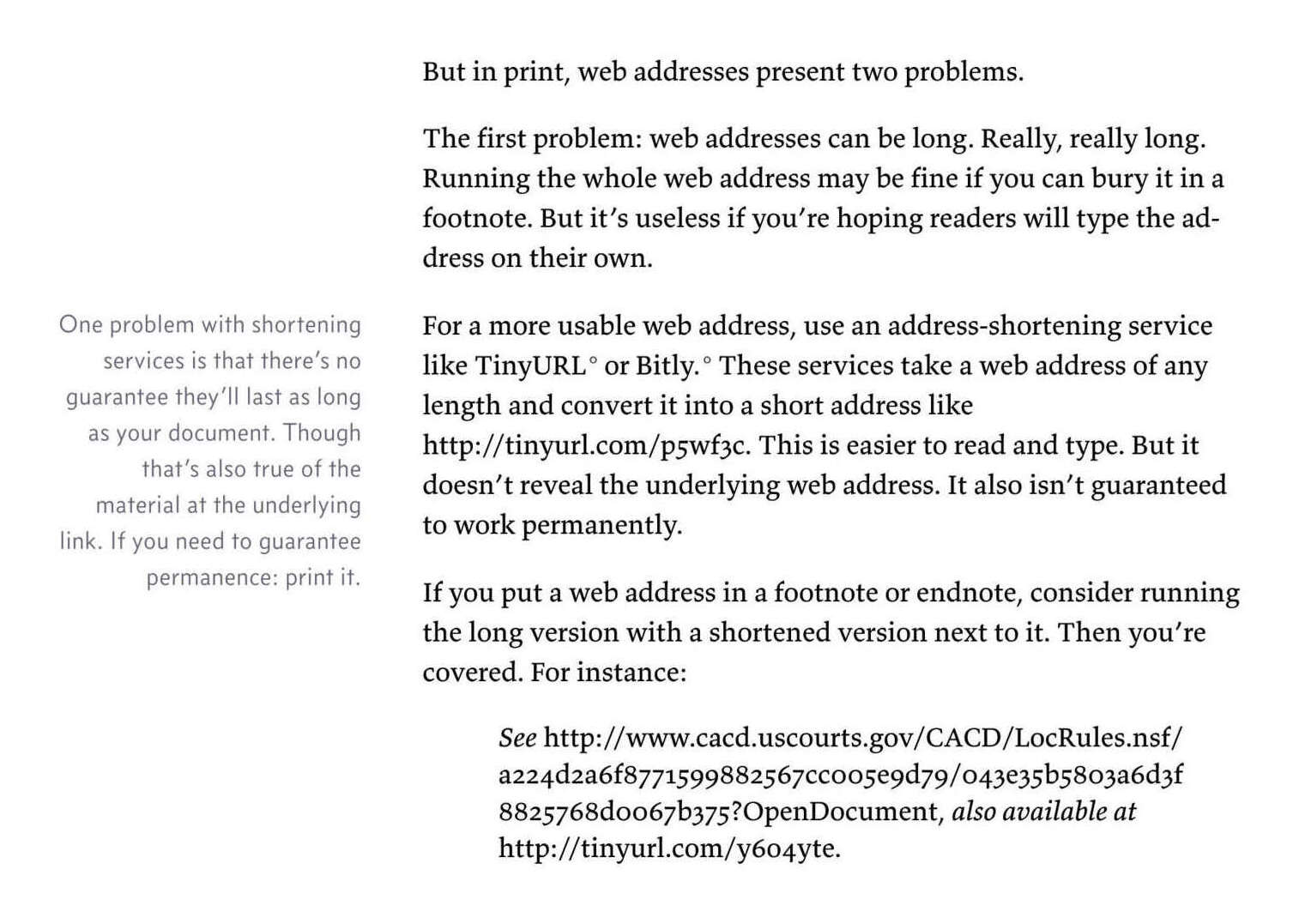
<p>Let’s say we want a happy face to appear on screen. Our program starts looping
through the framebuffer, coloring pixels. What we don’t realize is that the
video driver is pulling from the framebuffer right as we’re writing to it. As it
scans across the pixels we’ve written, our face starts to appear, but then it
outpaces us and moves into pixels we haven’t written yet. The result is
<em>tearing</em>, a hideous visual bug where you see half of something drawn on screen.</p>
<p><span name="tearing"></span></p>
<p><img src="images/double-buffer-tearing.png" alt="A series of images of an in-progress frame
being rendered. A pointer writes pixels while another reads them. The reader outpaces the writer
until it starts reading pixels that haven't been rendered yet." /></p>
<aside name="tearing">
<p>We start drawing pixels just as the video driver starts reading from the
framebuffer (Fig. 1). The video driver eventually catches up to the renderer and
then races past it to pixels we haven’t written yet (Fig. 2). We finish drawing
(Fig. 3), but the driver doesn’t catch those new pixels.</p>
<p>The result (Fig. 4) is that the user sees half of the drawing. The name
“tearing” comes from the fact that it looks like the bottom half was torn off.</p>
</aside>@media only screen and (min-width: 800px) {
.page {
padding-right: 300px; }
aside {
position: absolute;
width: 240px;
right: 30px;
padding: 0;
background: none;
border: none;
padding-left: 22px;
border-radius: 0;
border-left: solid 8px #f0e9db; }
aside p, aside li {
font: 14px/20px "Source Sans Pro", "Lucida Grande", "Lucida Sans Unicode", Verdana, sans-serif; } }It’s unclear to me whether the JS is necessary, or whether inline is the best fallback for sidenotes. The use of <aside> is also a complication, as few formats include any native support for that.
Nystrom’s books are an interesting read for programmers, and also have some other interesting design aspects: see “Zero to 95,688: How I wrote Game Programming Patterns”/“Crafting Crafting Interpreters” on the build system & literate programming & his hand-drawn illustration workflow; & “Zero to 353 Pages: Bringing My Web Book to Print and eBook” on working with EPUB & typesetting the print book.
Matthew Butterick
Matthew Butterick’s 2013 ebook/website Practical Typography uses margin notes, but in a sidenotes way, on the left:
They fallback to pop-ins defaulted to expanded on narrow/mobile windows:
The approach is HTML/CSS, but using <aside> elements, which are styled in CSS:
title-block, aside {
    display: block;
    float: left;
    position: absolute;
    margin-left: 0;
    left: 2.5rem;
    width: calc(2.5rem * 3);
    text-align: right;
    list-style-type: none;
    clear:both; margin-bottom: 1rem;
    font-variant-numeric: normal;
}

@media all and (min-width:1200px) {
    aside {
        left : 0;
        width: calc(2.5rem * 4);
    }
}

@media all and (max-width:520px) {
    title-block, aside { float: inherit;
    position: inherit;
    width: 100%;
    text-align: left;}

    aside {
        background: #fefefe;
        padding: 0.3rem 0.5rem;
        width: 90%;
        border: 1px solid #ccc;
        border-left: 3px solid #ccc;
    }

    aside > p:last-child {
        margin-bottom: 0;
    }
}
Presumably Butterick used his Racket-based Pollen document system with custom tags, since the base system doesn’t cover notes; Sancho McCann & Jonas Hietala has documented Pollen sidenotes.
Koos Looijesteijn
Koos Looijesteijn’s loosely Tufte-CSS-like sidenotes are right-aligned, symbol rather than number incremented, and narrow/mobile collapsed pop-ins:
In “Semantic sidenotes for the web” 2019, he discusses his approach, intended to satisfy additional requirements:
The span that the sidenote refers to should have a proper semantic HTML element (no abuse of elements made for other purposes)
The content of the sidenote should have a similarly valid HTML tag. Additionally:
The sidenote content may contain span elements such as
<a>and<em>.The sidenote content may contain clickable elements that can receive keyboard focus.
The sidenote content must be stylable.
The elements should not cause auto closing of their parent
<p>tag.Reader modes and apps like Pocket and RSS readers should show sidenote content in a typographically acceptable way. That means at the very least that I can’t rely on website’s CSS to place and style the elements correctly.
The sidenote content should be read by screen readers, in a flow that makes sense. That likely means the two parts should be placed together.
He came up with something initially like Tufte-CSS, but rejected pure <span>, <aside> as being not quite the right semantics, purely static as breaking reader mode/apps, and settled on JS-enhanced <span>/<small> combination.
Harvard Law Review
The Harvard Law Review’s website has, since at least 2016, employed sidenotes, as is particularly appropriate for legal writing, which notoriously overuses footnotes for citations, precedents, and digressions. From “The Potential-Use Test and the Northwest Passage” (HLR editors 2020):
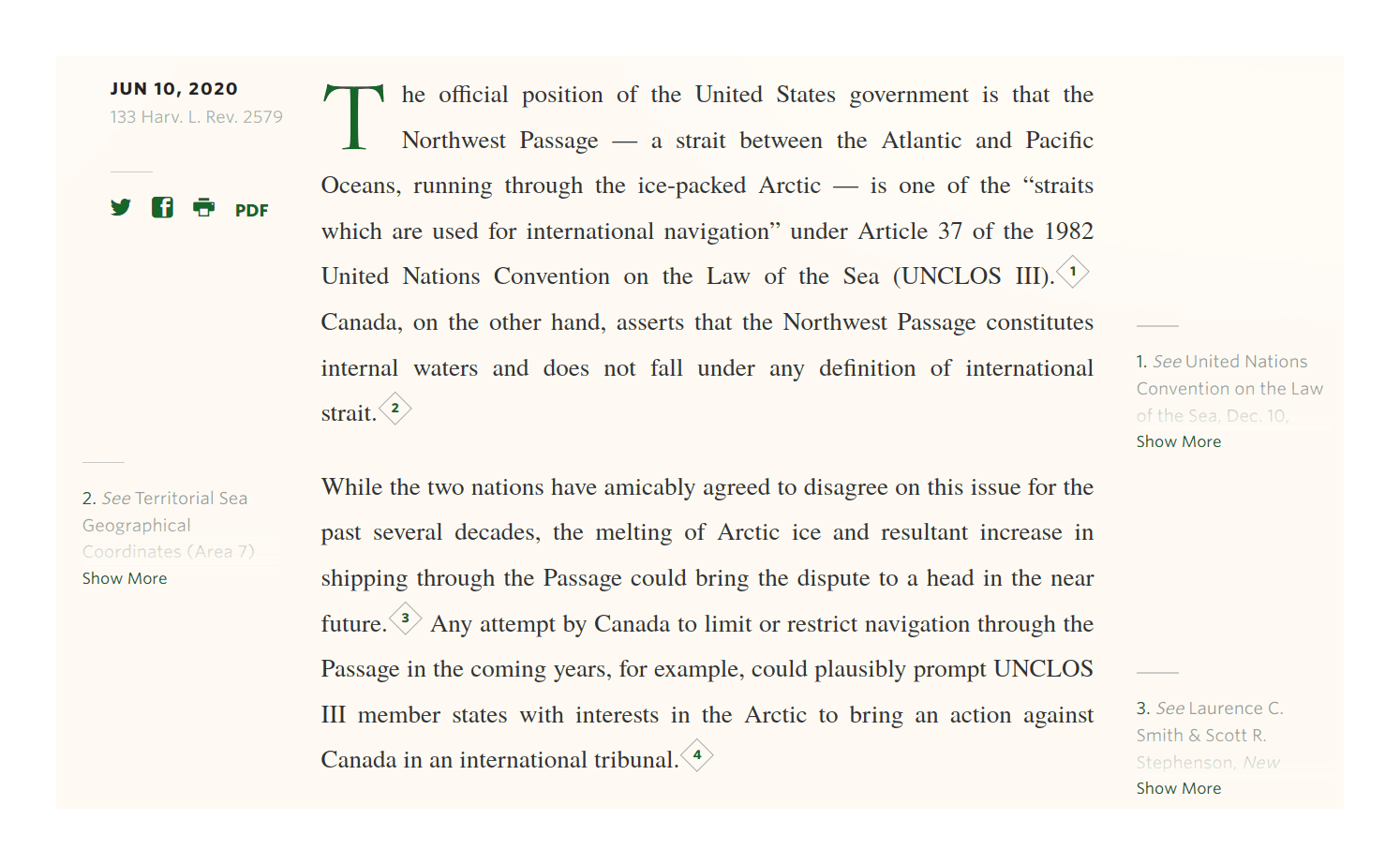
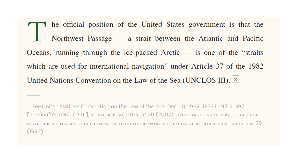
HLR’s proprietary are bidirectional, JS-based, and collapsed pop-in on mobile; they use <span>s which are rearranged by the JS:
Canada, on the other hand, asserts that the Northwest Passage constitutes internal waters and does
not fall under any definition of international strait.
<sup class="footnote-ref js-article-aside-trigger "><i class="ref-txt">2</em><i class="close-txt">×</em></sup>
<cite class="article-aside footnote short-crop">
<span class="article-aside-txt">
<span class="footnote-num">2.</span>
<em>See</em> Territorial Sea Geographical Coordinates (Area 7) Order, SOR/1985-872 (Can.) (detailing Canada’s
claims to land and waters that include the Northwest Passage); Note from the Canadian Embassy, Washington, D.C.,
to the U.S. Department of State (June 11, 1985), <em>reprinted in</em> 2 <span class="small-caps">Marion Nash (Leich),
Dep’t of State, Cumulative Digest of United States Practice in International Law 1981–1988</span>, at 2047 (1994).
</span>
</cite>Since it uses inline <span> in the usual Tufte-CSS, one might wonder why the JS is necessary, but checking with NoScript, one sees that without the JS, the sidenotes are all piled up on the left margin, overlapping badly, so the JS does the ‘alternating’. (Is it possible to use CSS to do this alternation automatically, removing the need for JS to do bidirectional sidenotes?)
More distressingly, HLR’s sidenotes are also on default collapsed on desktop, trimmed at a shockingly short length—typically not even half a sentence! While collapsing long footnotes is a good idea, it’s puzzling to collapse at such a short length that literally every sidenote will be collapsed, since this again defeats the point of having sidenotes, and making it hard to see if a sidenote is worth clicking on since only the first few words are exposed so one cannot even see if the sidenote is short (merely a bit of citation) or long (a more in-depth discussion).
Yale Law Journal
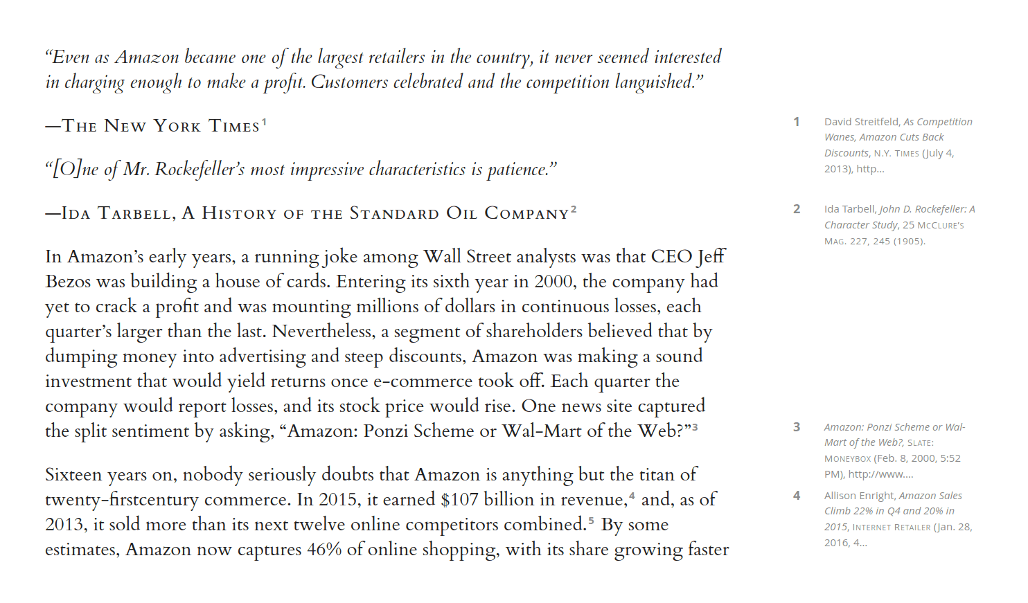
The Yale Law Journal, like HLR, uses sidenotes in online articles like “Amazon’s Antitrust Paradox” (2017), since at least 2016. Like HLR, all sidenotes are aggressively collapsed to near-unreadability, requiring a click to expand, whereupon they turn into floating footnotes.
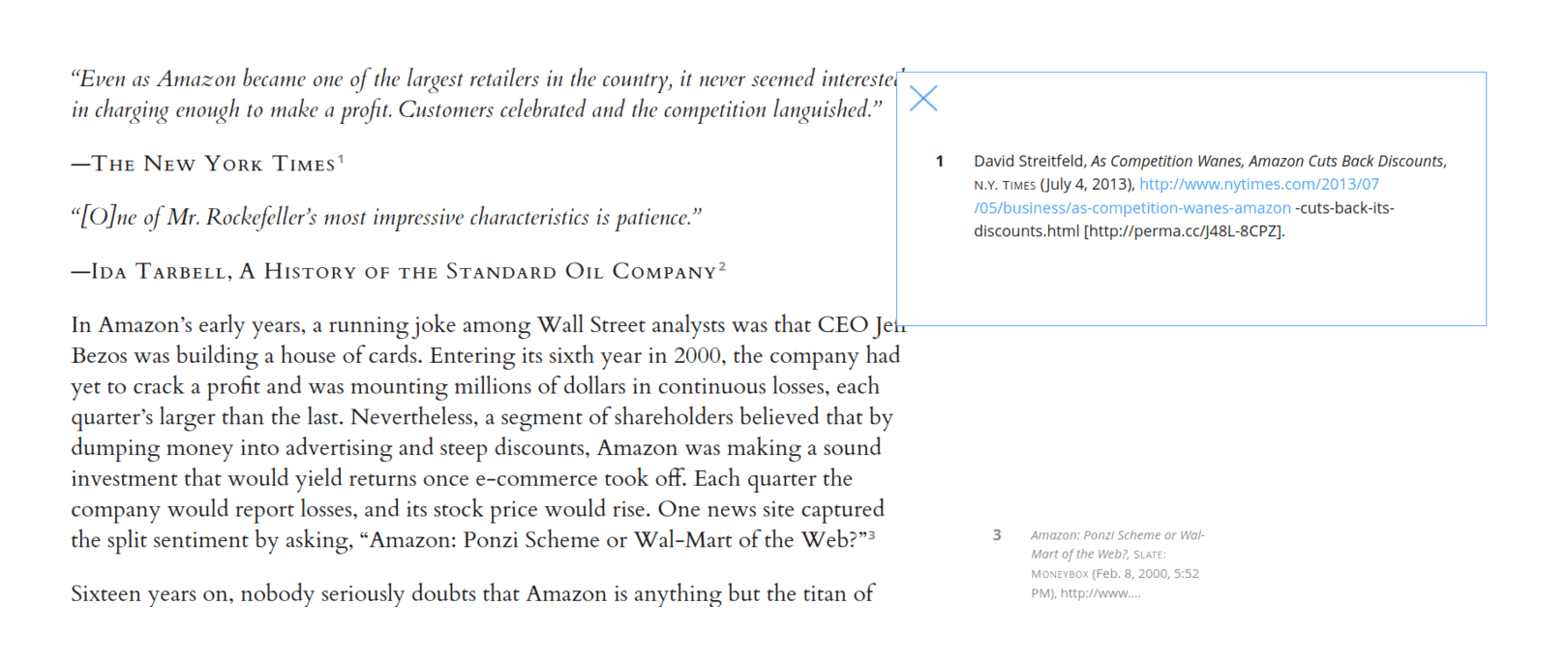
They are JS-based, relocating footnotes grouped at the end of the article, but inside <div> elements rather than <a> elements like usual:
<div id="footnote_wrapper" style="position:relative;">
<div id="footnote_1" style="display:none;" class="footnote_truncated">
<div class="truncated_footnote_number">1</div>
<div class="truncated_footnote_inner"><span> </span>David <span class="SpellE">Streitfeld</span>,
<em>As Competition Wanes, Amazon Cuts Back Discounts</em>,
<span class="forced_sans_reg">N.Y. Times</span> (July 4, 2013), http…
</div>
</div>
...</div>Worse, YLJ appears to have no narrow or mobile support whatsoever—the page just gets smaller. YLJ is unreadable on mobile, requiring zooming & panning.
Knight Institute
The Knight First Amendment Institute of Columbia University uses sidenotes somewhat like HLR/YLJ in its longform pages (eg. “The Case for Digital Public Infrastructure: Harnessing past successes in public broadcasting to build community-oriented digital tools”, 2020):
They are JS-based, right-aligned, collapsed (but with a slightly more generous length limit than HLR/YLJ), and fallback to Tufte-CSS-like pop-in blocks (default collapsed). As similar as it seems to those, Knight appears to have rolled its own JS, as the site.js’s implementation doesn’t have any Google/Github hits.
The fading, font size, and default collapsing of ‘long’ sidenotes are all not nearly as extreme as HLR/YLJ, so the Knight sidenotes are substantially more pleasant to read, as it’s much easier to see what sidenotes are merely a brief citation and what actually include additional commentary. (The use of buttons & chevrons are also nice touches in explaining the functionality to the reader.)
New York
New York’s website CMS Clay/Kiln (used on NYmag.com/Vulture/the Cut/Grub Street/Slate) provide JS-based left sidenotes which require hover to expose and then fall back to click-driven floating footnotes:
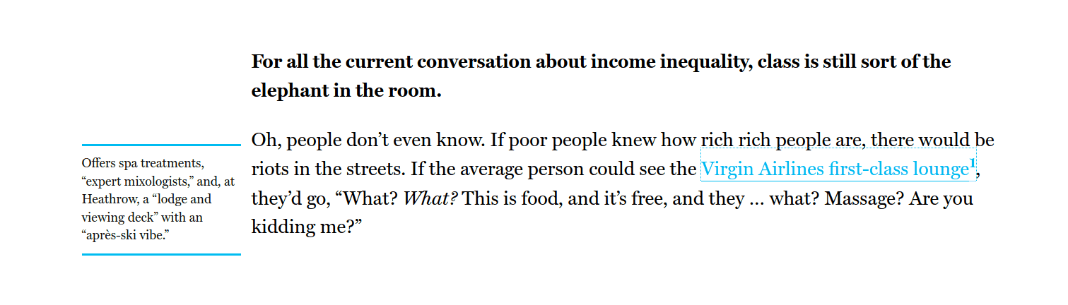
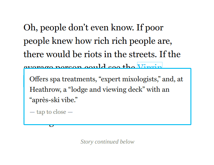
NY uses spans, but they are put at the end and then JS reveals them when the user hovers:
<span class="clay-annotated kiln-phrase" aria-describedby="annotation-1" tabindex="0">Virgin Airlines first-class lounge</span>
...
<div data-uri="www.vulture.com/_components/annotations/instances/cjg2jwsso00c23k62pm0yv0qg@published"
     class="annotations" data-editable="content">
    <span role="tooltip" id="annotation-1" data-uri="www.vulture.com/_components/annotation/instances/cjg2jx3el00c73k62em8v15xy@published"
       class="annotation" data-editable="text">
       Offers spa treatments, “expert mixologists”, and, at Heathrow, a “lodge and viewing deck” with an “après-ski vibe.”
   </span>
</div>
I couldn’t find mention of sidenotes in the various Clay/Kiln Github repos but there are enough of them and it’s all complicated enough I may have missed them, so I don’t know if the relevant JS/CSS is MIT-licensed like the Clay/Kiln ecosystem generally seems to be.
While floating footnotes on mobile is a justifiable choice, the rest is not, and I do not like this sidenote design at all.
JQuery.sidenotes
Andrew 2013 jQuery.sidenotes (Github) JS library implements sidenotes to the left, parsing Markdown endnotes; for narrow windows, it does inlined ‘pop-in’ but expanded by default; and for mobile it is just endnotes. Unusually, Clark’s demo puts sidenotes on the left margin (there doesn’t seem to be an option for placing on the right, or both), and includes some keybindings.
The pop-in appearance looks like Tufte-CSS’s.
The implementation seems to take the expected approach of popping matching elements out into the margin with media queries controlling width-related behavior.
Clark’s jQuery.sidenotes offers more features than usual, but I’m not sure how useful they are. It’s also quite ‘heavyweight’ in being weighed down by jQuery/NPM infrastructure. One further caveat: I think the expected format/classes of endnotes has long since changed and the library has not been updated since 2013, at least for Pandoc, so jQuery.sidenotes’s defaults will probably break for recent Markdown documents.
Sidenotes.js, Correia
Bruno 2015 Sidenotes.js (Github), not to be confused with Said Achmiz’s sidenotes.js, takes an entirely different approach to both presentation & encoding of sidenotes. Instead of reusing the existing margin, Sidenotes.js creates a new view by sliding a sticky-element ‘tab’ into view with the sidenote contents, hiding the original page:
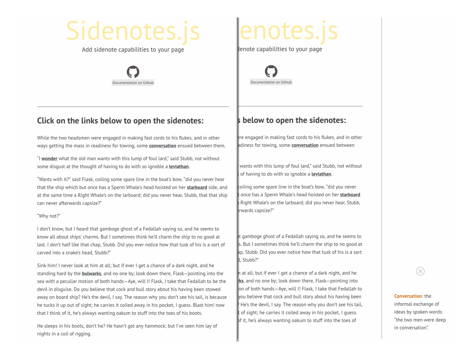
On narrow or mobile, the slid-in new page just takes up the whole screen.
The annotations are themselves written as custom data attributes on elements such as links (by default, others are supported):
<p>While the two headsmen were engaged in making fast cords to his flukes,
and in other ways getting the mass in readiness for towing,
some <a
href="#"
data-sidenote=">strong<Conversation:>/strong< the informal exchange of ideas by spoken words:
'the two men were deep in conversation'.">
conversation</a>
ensued between them.</p>This is a unique approach entirely unlike the others and an interesting experiment, but I do not recommend it for sidenotes.
The India Forum
The India Forum uses jQuery for a slide-in approach but improves over Correia’s by showing all the sidenotes in a pane after clicking:
The ‘slide-in’ approach can be contrasted with the ‘slide-up’ approach used by Wikipedia:
And some other sites, like Justin Duke:
The ‘slide-in’ from left/right can make use of margin on bigger screens, but there is usually no margin on cramped mobile screens, so one faces a fundamental choice between inserting the footnote/sidenote text ‘into’ the body, usually forcing layout shift, and ‘over’ the body, obscuring some of it. (For Gwern.net, pop-ins were the only acceptable solution as they are less modal: they let the reader continue navigating/reading the page, no matter how deep they drill into the recursively-linked pop-ins.)
Tables
Jukka “Yucca” Korpela, ~2007, demonstrates a completely different approach using HTML tables: define two columns with different sizes/style, and put the sidenotes in the second column.
There are many possible approaches to including sidenotes on web pages. Having studied alternate methods like CSS positioning and floating, I have come to the conclusion that the simplest method gives the best results. This method consists of a two-column table, with the main text in one column, the sidenotes in the other. Using the CSS methods, it becomes awkward to control the heights of pieces of text so that each sidenote starts at the same vertical position as the main text that it relates to.
Easy:
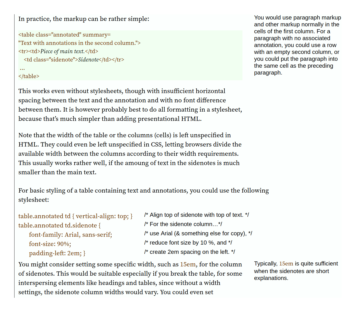
This has the usual advantages/disadvantages of using tables for web design: it is fast, avoids Javascript & (most) CSS complexities, and is straightforward; but it is rigid, degrades on smaller screens, difficult to write (eg. no numbering in Korpela’s examples, making them margin notes, unless the author manually adds superscripts or otherwise complicates it).
I include this for its historical interest—while this strategy may have made sense in 2007, the tradeoffs now are highly unfavorable given that Tufte-CSS etc work, and I’m not sure anyone should use it.
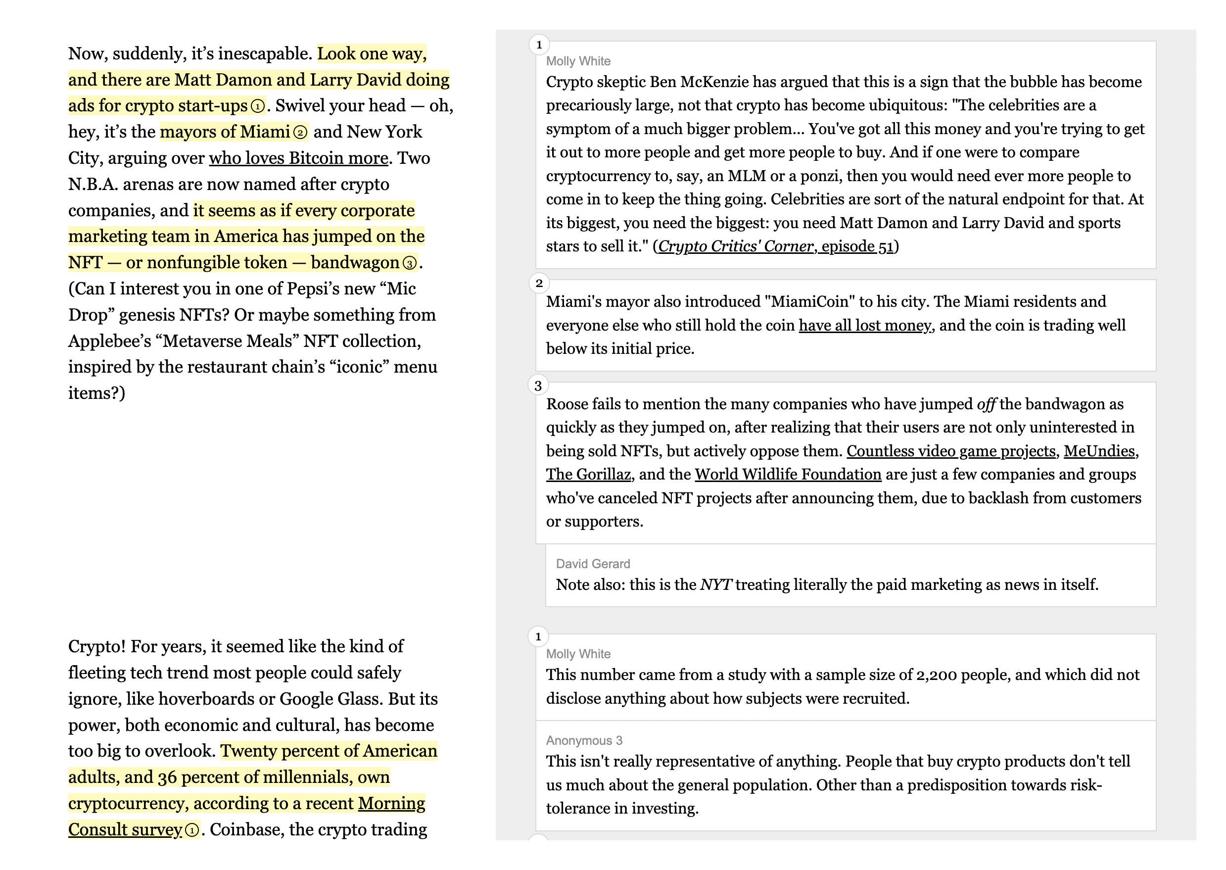
Annotate, Molly White
“Annotate” (demo) is a CSS+JS framework by Molly White, created for her “The Edited Latecomers’ Guide To Crypto”, which is a heavily-commentated (side by side) fisking of an article on cryptocurrency.
Perhaps because the commentary may be longer than the text & complex, Annotate takes a novel approach: text+commentary pairs live in <section> elements, interleaving <div>s (possibly nested or ‘grouped’), with <mark> elements to specify highlighted ranges (eg. in yellow highlighting) for which part of the text a commentary is referring to. The CSS then uses CSS grids (row-based layout) to lay them out side by side. (Javascript is used for live highlighting/focusing of ranges when clicked on, but otherwise appears optional.)
For mobile, it defaults to expanded pop-ins but does not appear to make any effort to interleave or separate pairs to ensure that the commentary for each visible highlighted range is also visible.
Miscellaneous
Some implementations are just bad ideas or not worth discussing in detail with screenshots:
-
ILoveTypography.com uses image captions & margin notes which, like Tufte-CSS, are floated/outdented right, but bizarrely, it uses figure captions—just
<figcaption>with a special class inside an empty<figure>with no images!This is invalid HTML, fails badly in some cases (eg. in the linked example, one margin note is almost unreadable because it overlaps with a giant pull-quote illustration), and has no advantage over a
<span>that I can find; it does at least degrade gracefully into pop-in (default expanded) block elements on narrow/mobile. -
BLDBLOG generally avoids complex layout and footnotes entirely, and doesn’t have much margin to put sidenotes in, so I was surprised while reading the archives to find one post which has a left margin note, and even more surprised to check the HTML source and see that the ‘margin note’ is in fact a header: a
<h6>.Huh‽ It turns out that the header is floated left with some gruesome CSS. Said Achmiz summaries how the Rube Goldberg contraption works:
The CSS uses absolute positioning. The nearest positioned ancestor is
<article>, not.entry-content. Within<article>,.entry-contentis right-floated and has a fixed width. This creates a variable-width space on the left (determined by how much horizontal space is left within<article> after that fixed width is subtracted). The sidenote<h6>is then set withposition:absoluteandleft:0. Vertical position is left unspecified, relying on the way browsers implement absolute positioning (ie. to place an element where it would be placed if position werestatic) to put it in the right place. Fragile, unsemantic, & hacky. -
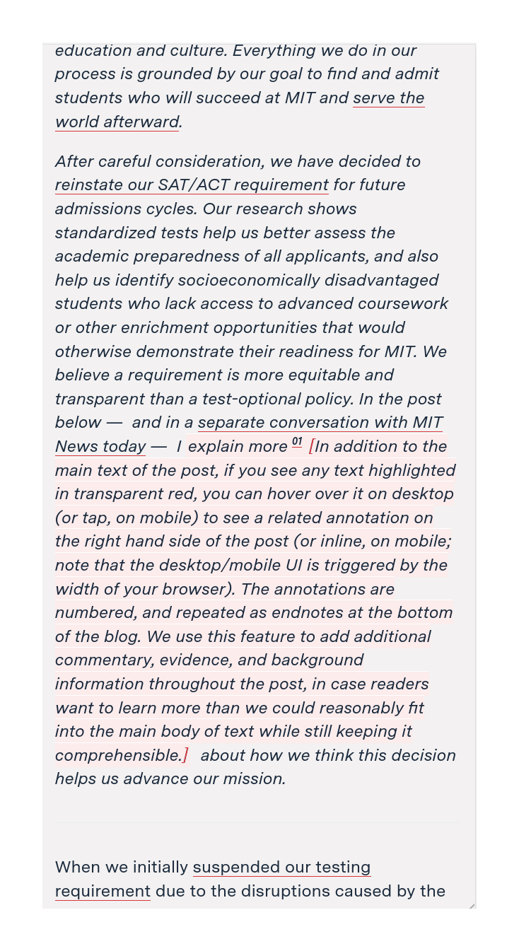
MIT Admissions uses a footnote-sidenote hybrid:
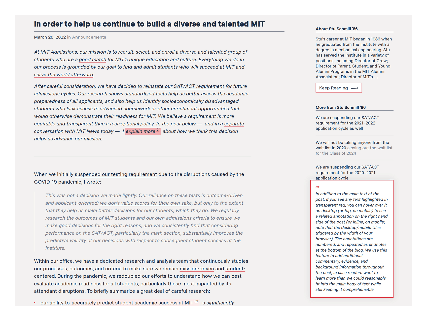
Span-annotated footnote links (with the trigger text lightly highlighted in red), on hover, trigger JS to create a single sticky/floating ‘sidenote’ which is located in the bottom-right corner; hovers on other footnotes replace it with their contents. (Layout does not take into account the sidebar or anything that may already be there, and the footnote popup box simply appears over it.)
For mobile/narrow windows, it uses pop-in, but not as a block element, instead, inline with red-colored brackets to delimit it:
-
Evan Ovadia (eg.): content & sidenotes are put into pairs of columns. Presumably does not handle many long sidenotes gracefully.
For mobile/narrow, it collapses them as a row of numbered links to expand on click.
See Also
External Links
-
Discussion: HN
-
Quotebacks (“Introducing: Quotebacks—A Chrome extension to quote the web”)
-
“Expounder”, Stavros Korokithakis (inline alternative to
<abbr/<defn>tags) -
“Usability of Footnotes”; “A (terrible?) way to do footnotes in HTML”
-
“Nutshell”, Nicky 2021
-
You can imagine web pages with true footnotes: where a sticky bottom margin is created, reserved for footnotes, and JS inserts the relevant footnotes into that as the user scrolls, but I’m not sure I’ve ever seen this outside of book skeuomorph web designs with explicit pagination, and screens are small enough that users would chafe at the loss of vertical pixels.
Then should we put our notes on entirely separate pages? No: this only adds to the reader’s burden, and it’s even more work for the author. (The dedicated might embrace hypertextuality and create an enormous web of small nuggets of text which include and go beyond endnotes, but for people writing online, URLs/pages tend to be “heavyweight”, and a commitment, often corresponding to a single file on disk; creating hundreds of endnote-sized URLs also creates its own problems like naming, refinding, and navigating them.)↩︎
-
You can use the
sidenotes/sidenotesplus/snotezpackages, or the somewhat differentmarginnote(where the native\marginpar{}command fails) packages.↩︎ -
Tufte-CSS sidenotes do not correctly support block elements like lists or paragraphs, because spans are inline and those are block elements; but this is fixable.↩︎
-
A simple way to provide ‘on hover’ annotations is to use HTML title tooltips, which was my first popup system attempt; Tyler Vigen attempts to provide his collapsed-inline footnotes as tooltips as well to minimize clicking & effort.
But while simple, tooltips bring in many problem discussed in my tooltip post-mortem, and several of them show up here: there is no way to ‘expand’ or search any of the tooltips, and because tooltips are capable only of containing plain text, while footnotes can (and Vigen’s do) contain multiple block elements like blockquotes or photos. There is no useful way to condense such footnotes into a tooltip, and Vigen’s tooltips often silently drop large parts of the footnote—rendering them worse than useless.↩︎
-
Some websites, like Grantland or Stratechery, support floating footnotes… but only when the user clicks! (Better is Grantland’s history of the Gracies, which helps the reader keep the clan straight by popping into the left margin an annotated family tree whenever they click a Gracie name.) FiveThirtyEight, on the other hand, does pop-in footnotes—but not sidenotes, despite ample margin. Compare Atlantic’s web rendering using pop-ins with the original 2005 David Foster Wallace print essay which used elaborate recursive sidenotes integrated in unusual geometries. (Said Achmiz offers an example of a less ugly redesign of that.)↩︎
-
Although arguably one should not (and I avoid doing so). If a footnote needs to be linked, it should be given a
<span>anchor with a name. Pandoc footnote anchors/numbers are inherently unstable, and worse, tend to fail silently: the link just changes to a different footnote, and continues to ‘work’. And if anyone needs to link a specific footnote it may be time to rewrite that footnote into a more-linkable section or appendix.↩︎